Design Inspiration: What Colors Go With Black?
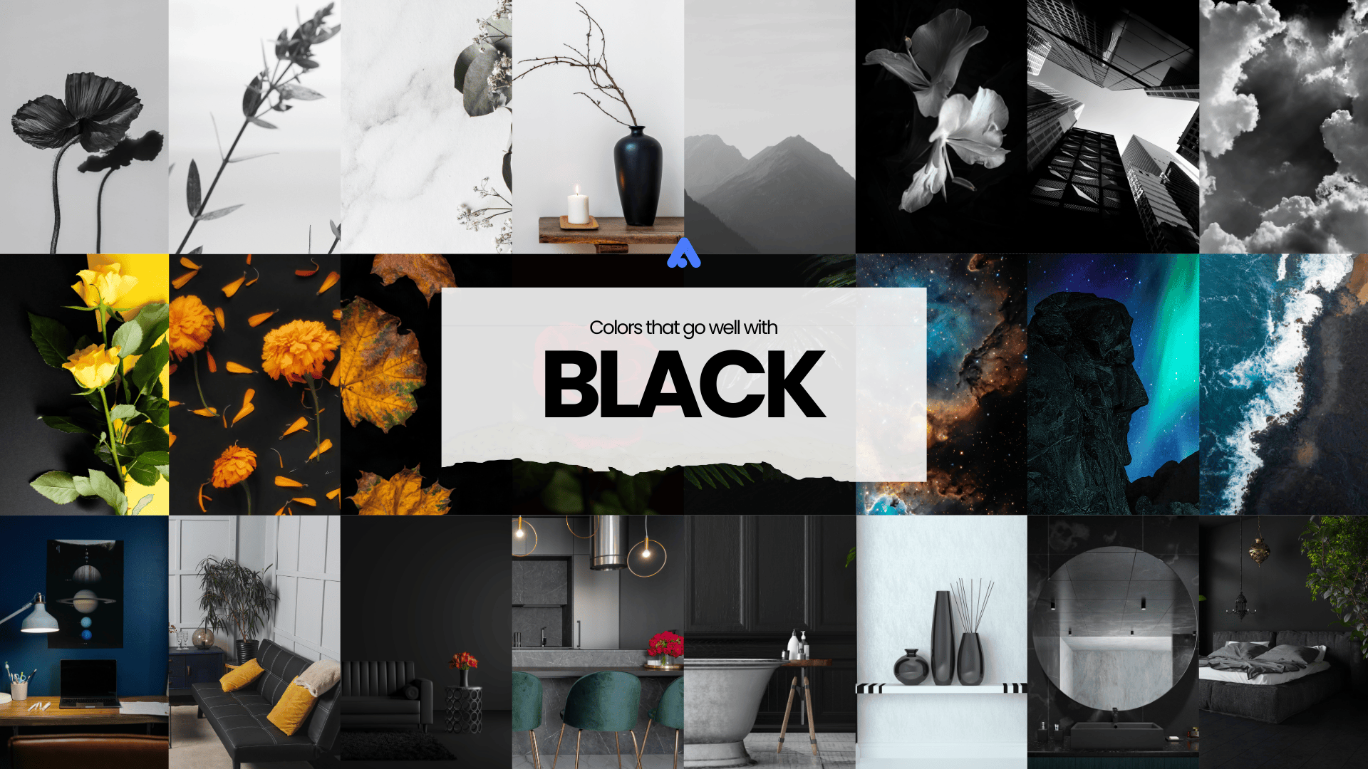
Black is an amazing color that can be paired beautifully with a wide range of colors. It can complement bright colors like white, red, and orange and cool colors like blues and greens.
Those who love to experiment with different styles prefer to start with this color because they can generate simple and elegant designs that are bold and dramatic.
The Black Color
The black color is produced from the absence of light. Unlike other colors, black absorbs all wavelengths of visible light without reflecting any back, which is why it appears as the darkest color in the spectrum. The word “black” has its roots in the Old English “blæc,” meaning “dark” or “burnt.” This originates from the Proto-Germanic word “blakaz,” which referred to something that was “burnt” or “charred.”

In graphic design, the black hex code represents a complete absence of all RGB values (Red: 0, Green: 0, Blue: 0), making black the default non-color in digital spaces. Thus, the standard hex code for black is: #000000
The Other Shades of Black
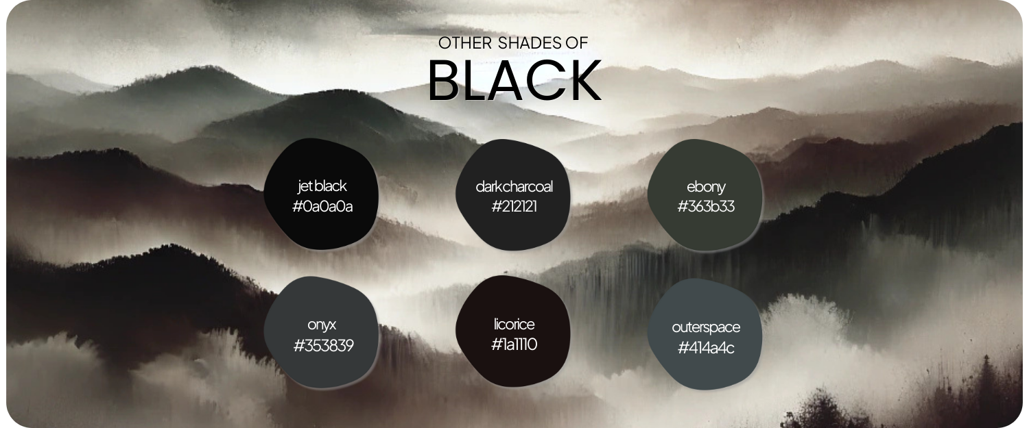
Although black is typically understood as one solid color, different hues and variations of black exist, offering subtle differences in tone. Here are a few notable shades of black with their hex codes:
- Jet Black (#0A0A0A): A slightly lighter shade with a more charcoal-like appearance.
- Dark Charcoal (#212121): A muted, grayish-black with a softer edge.
- Ebony (#363B33): A deep, rich black with slight green or brown undertones.
- Onyx (#353839): A sleek, slightly metallic black with a modern feel.
- Licorice (#1A1110): A very dark, slightly warm black with a brownish tint.
- Outer Space (#414A4C): A cool, grayish-black with a slight blue undertone.
Each of these shades adds a unique twist to the classic black color, making them suitable for different design contexts, from fashion to graphic design.
What Colors Go Well with Black?
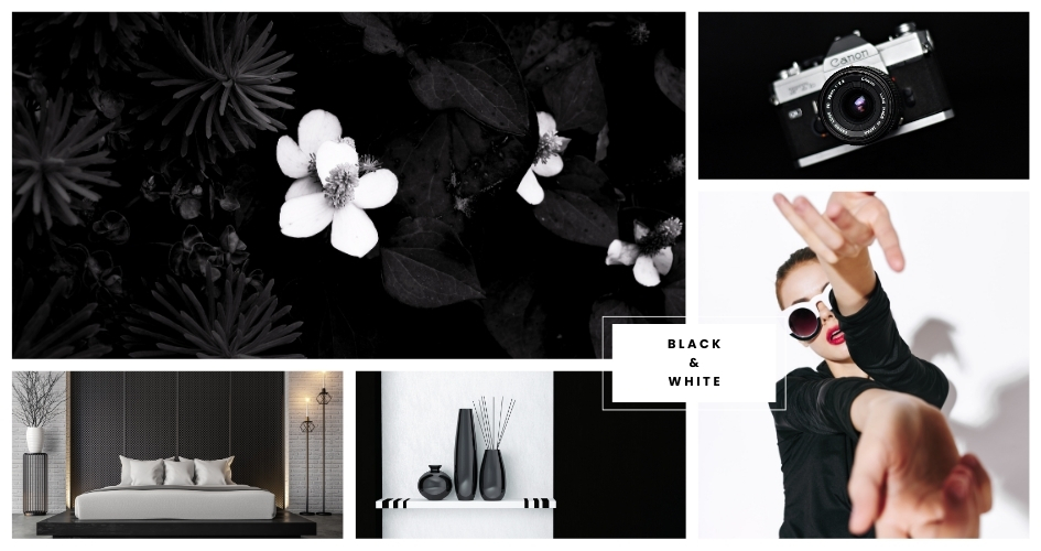
- White (Classic, Elegant, and Timeless): The combination of black and white is timeless and classic. This pairing creates a striking contrast that is clean, sophisticated, and elegant. It’s widely used in modern, minimalist, and high-fashion designs.
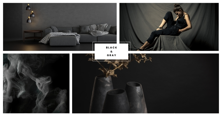
- Gray (Modern, Sleek, and Versatile): Black and gray together provide a modern and sleek look. This combination is versatile and often used in contemporary designs, offering a subtle yet refined aesthetic.
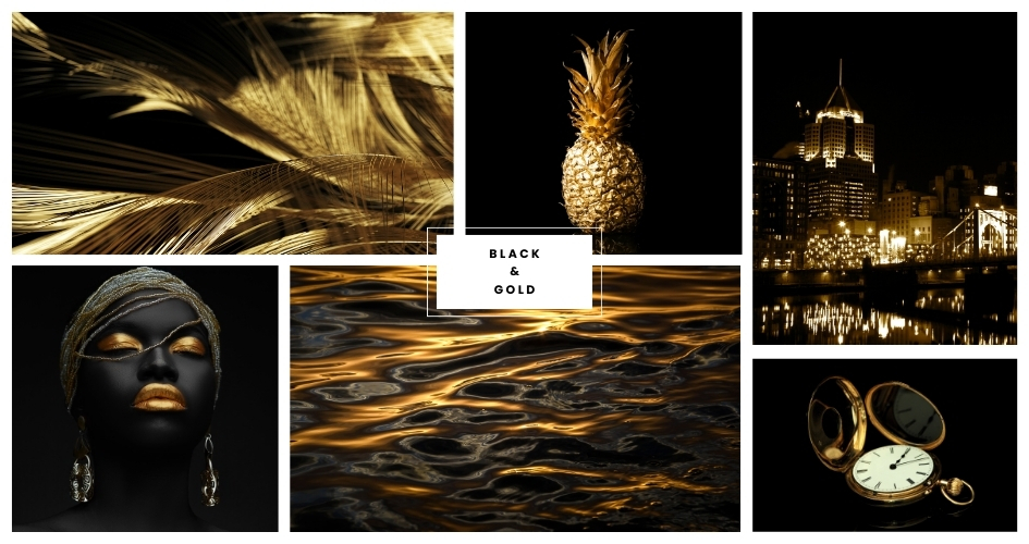
- Gold (Luxurious, Rich, and Glamorous): The pairing of black and gold exudes luxury and sophistication. This combination is often associated with wealth and glamour, making it perfect for high-end designs and special occasions.
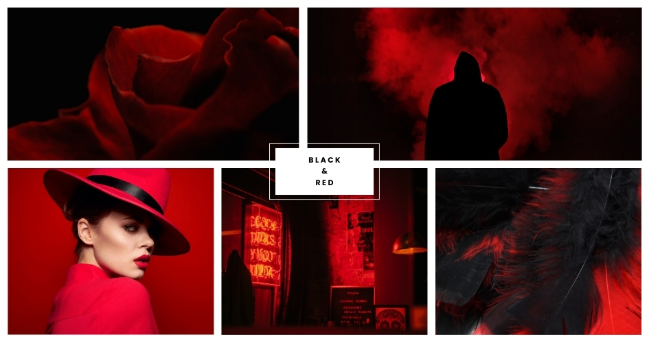
- Red (Bold, Passionate, and Striking): Red and black together create a bold and passionate palette. This combination is eye-catching and conveys a sense of drama, intensity, and power.
- Silver (Futuristic, Cool, and Sleek): Black and silver create a sleek and modern look. This pairing is often associated with technology, innovation, and a futuristic vibe.

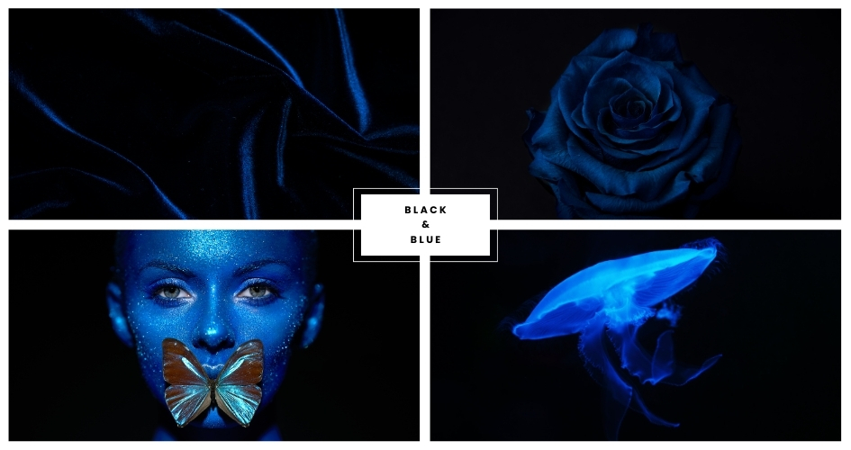
- Blue (Trustworthy, Calm, and Professional): Blue and black together offer a professional and trustworthy aesthetic. This combination is calming and often used in corporate and formal designs.
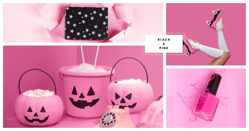
- Pink (Playful, Romantic, and Energetic): Pink and black can create a playful and energetic palette. This combination adds a touch of romance and vibrancy to designs.
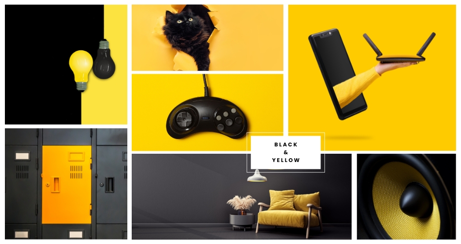
- Yellow (Bold, Energetic, and Eye-catching): The contrast between black and yellow is bold and energetic. This combination commands attention and is often used to create a strong, authoritative presence.
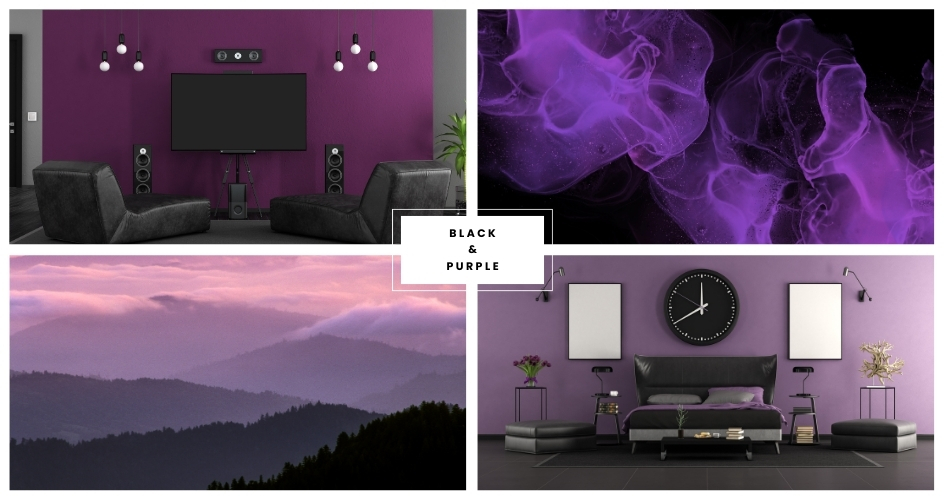
- Purple (Mysterious, Luxurious, and Regal): Black and purple together create a mysterious and luxurious feel. This combination is often associated with creativity, royalty, and sophistication.
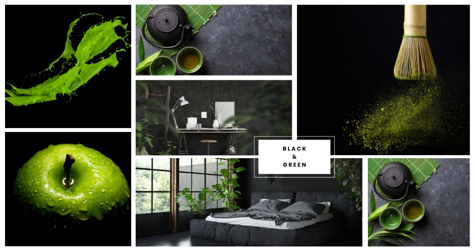
- Green (Natural, Refreshing, and Calming): Green and black together evoke a sense of nature and tranquility. This combination is refreshing and calming, ideal for creating a grounded and stable atmosphere.
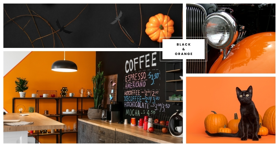
- Orange (Warm, Vibrant, and Energetic): Orange and black create a warm and vibrant palette. This combination is energetic and often used to evoke a sense of enthusiasm and adventure.
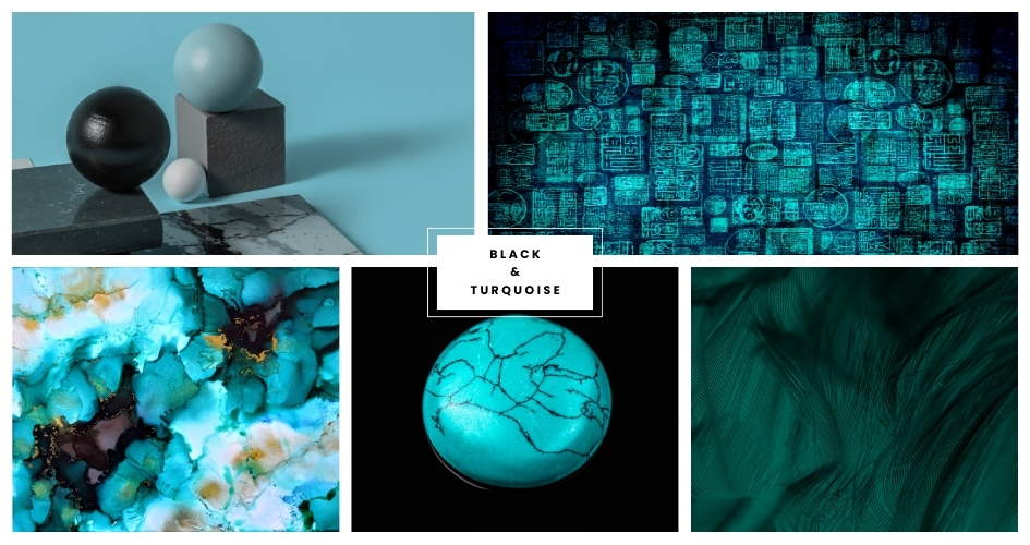
- Turquoise (Fresh, Invigorating, and Contemporary): Turquoise and black together create a fresh and invigorating look. This pairing is contemporary and can evoke feelings of tropical freshness and creativity.
How To Use The Black Color in Design?
With a clear understanding of what colors go with black, let’s see how we can utilize them.
1. ECommerce
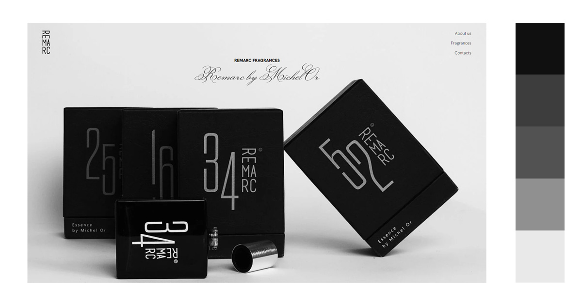
Use a black background in your e-commerce website to exude luxury, elegance, sophistication, and glamor. This will give off the feeling of legitimacy of being a high-class e-commerce website. At the same time, a lot of online buyers are attracted to this color scheme.
Black can also reflect power and authority. If your products are focused on technology, you can use black to appear established and a leader in your industry. They use this to build trust with your potential customers.
2. Website Design
You can choose a plethora of colors to combine with the color black for your website design.
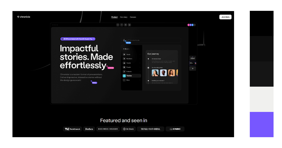
Usually though, black is used as a background. This is because a black background makes elements or images pop and they become more visible and catch your viewers’ attention. Black color recedes, so images or bright colors stand out.
Using a black background also makes the navigation of your website easier since it is easier to see bright-colored actionable elements on a dark background.
READ: Sites to Download Over 100K Free Black Background Images
3. Interior Design
Black is also used in interior design to give a luxurious feel to the room.
When you choose black furniture, it makes the ambiance feel timeless and classic. It also adds a little bit of drama to the room.
Most modern designs call for the black color. It has a timeless elegance that is attractive to a lot of people. Modern black interiors are sophisticated. Adding black elements like light fixtures and furniture must have a sleek and industrial look. Your drapes and linens must have smooth and even texture to complete the look.
Since your interior is dark, make sure to have enough natural light. Big windows are needed to make your black interior room not appear small or cramped.


4. Graphic Design
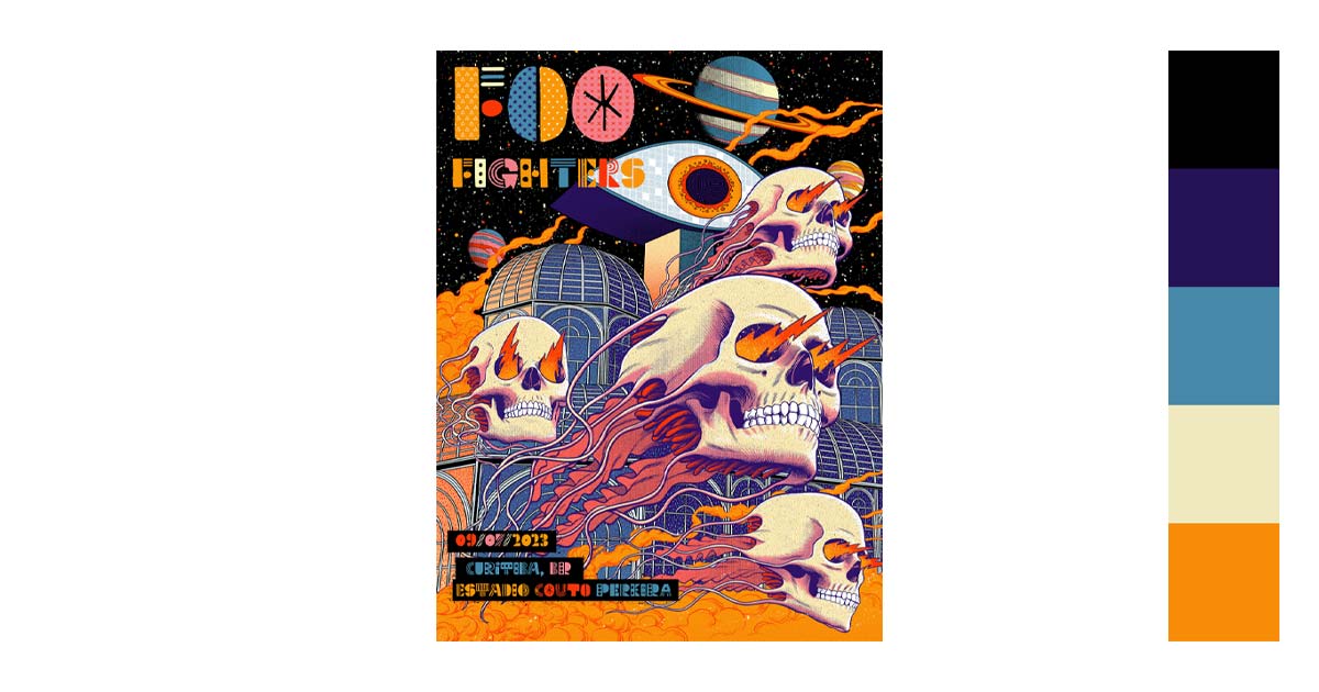
In graphic design, black is mainly used for contrast and emphasis. You can direct your viewers’ attention by using contrasts. It creates a powerful message that can sway your viewers’ actions.
Designers know the impact of colors on people’s emotions. Black is one of those powerful colors. It is authority, power, elegance, and boldness. Using the color in your designs depicts that your product is linked to power. Designers use it to express superiority over other brands.

5. Photography
More often than not, black and white pictures are seen to be more artistic than colored ones. The reason may be that it is harder to compose. You need to focus on shapes, textures, and contrast to create a strong composition.
You can also say that black and white pictures capture an “honest” image. It reveals the character of your subject since there are no colors to take your attention away.
There is a feeling of nostalgia and mystery in black and white. We often associate them with old pictures. It evokes an atmosphere, in a sense. That is why it will not go out of style anytime soon.
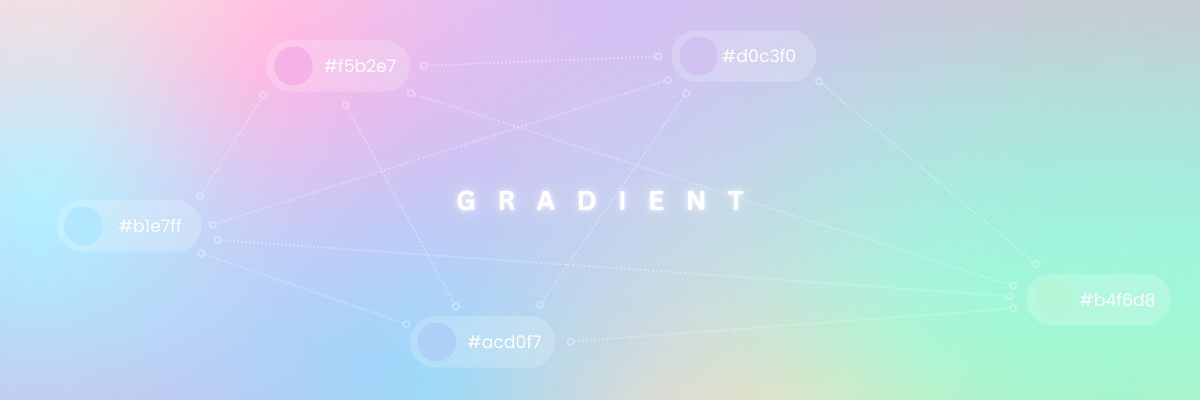
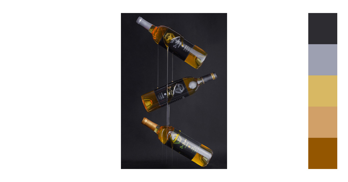
But when paired with color gradients, black becomes even more versatile. Gradients that blend black with jewel tones like emerald green, deep purple, or crimson create a dramatic, high-fashion effect. Softer gradients—such as black fading into gold, silver, or even pastel hues—bring elegance and modernity. In photography, these combinations highlight how black works as a grounding base, while the gradient provides movement, depth, and emotional tone.
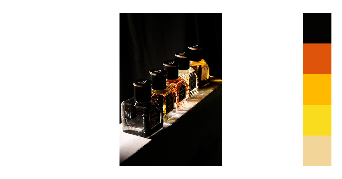
Try a black background for your graphic design.
Tips When Using the Color Black in Designs
How can contrasting colors enhance a black design?
Contrasting colors, like white, gold, or bright hues, enhance a black design by creating visual interest and focus. The stark difference highlights key elements, making them pop and appear more dynamic, while black adds depth and sophistication.
What are the best accent colors to pair with black for a minimalist look?
The best accent colors for a minimalist look with black are white, gray, beige, and soft pastels like pale pink or muted blue. These tones create a clean, modern, and balanced aesthetic.
How does black affect the perception of color combinations in a design?
What color palettes create a sleek, modern feel when used with black?
Color palettes that create a sleek, modern feel with black include monochrome (black, white, gray), black and metallics (gold, silver), or black with muted tones like deep blues or soft neutrals. These combinations offer clean, contemporary vibes.
What role does texture play when combining black with other colors?
Texture adds depth and dimension when combining black with other colors. It enhances contrast by creating tactile variety, making flat designs more dynamic, and preventing black from feeling too harsh or overpowering.
How do warm vs. cool tones interact with black in design?
Warm tones (like reds and oranges) with black create a bold, energetic contrast, while cool tones (blues and greens) with black offer a sleek, calm, and sophisticated feel. Both add depth but evoke different emotions and moods.
What are some creative ways to add vibrancy to a predominantly black design?
Your Turn

The black color may be the color of the unknown. But, it is also the color of power and self-confidence. The color’s duality is what makes it fascinating to use. It has hidden depths that add interest to your work. Use these qualities and take advantage of them.
Who knows what you might end up with? Try it out!
You might want to read more from this series:
Disclaimer: We do not own some of the images, videos, and content being shared on this page. Please note that some of the images, and videos we used have copyrights belonging to their original owners. No copyright infringement intended. If you originally owned the images, videos, and content we shared and distributed on our website, and do not wish to have your work published or distributed should make your wishes known to us. You can email us at hello@removal.ai. We will take your content down and never publish it on any of our pages.
