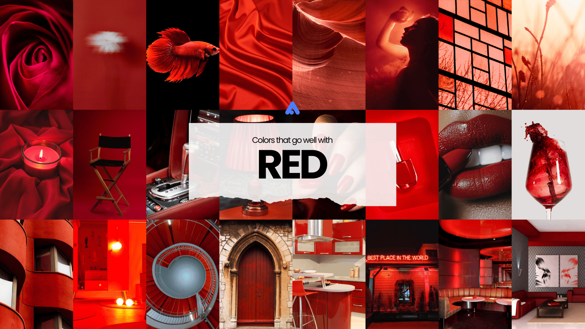
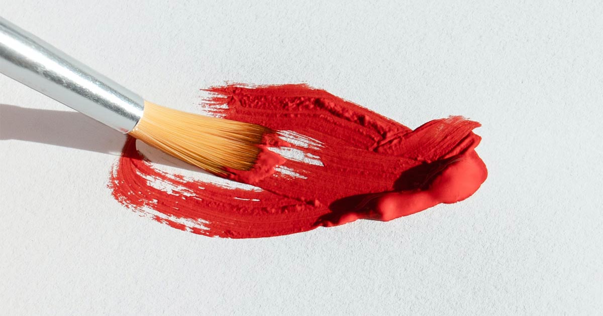
Design Inspiration: What Colors Go Well with Red?
The allure of red has captured the imagination of societies for centuries, becoming an emblem of passion, power, and drama. From ancient civilizations using red ochre to create breathtaking cave paintings to its prominent display on national flags and fashion runways, red has consistently remained a color of significance and beauty. However, its charm does not rest solely on its historical relevance.
Red’s versatility allows it to harmoniously pair with a myriad of colors, resulting in stunning combinations that evoke a range of emotions. In this article, we will explore the vibrant world of red and journey through its illustrious history. We will also discuss the most captivating combination color for red that will inspire your next design, illustration, and other creative endeavors.
The History of Red Color
The color has been in existence since the dawn of mankind. As early as the Paleolithic age, the color was the first to be used. This is because the color is widely available as the pigments can be found naturally. They can be found in minerals, insects, and plants.
Red hematite powder was found in an ancient grave site in Beijing. The location is believed to be inhabited by people as early as 700,000 years ago. The red powder was to symbolize blood and be used as an offering to the dead.
Late Stone Age people are found to use ochre. Iron oxide causes that clay to turn red. This clay is then ground for them to apply the clay to color their bodies.
There is a red dye called Kermes, which is made by drying and crushing the bodies of tiny insects. The insects live on the sap of Kermes oak trees that can be found in the Mediterranean regions. Various jars of these dyes were later found in cave burial sites in Adaoutse, Bouches-du-Rhone. The ancient Assyrians and Persians would use a similar dye but theirs come from Armenian cochineal, scale insects that lived on the roots and stems of herbs.
A red dye can also be produced from a plant called Madder, which grew widely in Europe, Africa, and Asia.
The red color has an important association with the daily lives of various civilizations.
- Red in religious ceremonies. The color is mainly used in religious ceremonies. They are often depicted in cave drawings to symbolize blood or life. It can also be associated with wealth and abundant harvest.The Church also made use of the color. It symbolizes the blood of Christ. Later on, it was also used as a symbol of martyrdom and sacrifice. This is one of the reasons why the Pope and the Cardinals wear red.And since the Church is the main patron of all artworks in the Renaissance, most if not all masterpieces of famous painters depict biblical sceneries and characters. It is often that the Virgin Mary and Jesus Christ would wear cloaks or clothes with vibrant reds.
- Red is a symbol of war and politics. War, especially victory in war also uses the red color.Historically, the color symbolizes blood. And with blood, comes the image of war, sacrifice, and danger. Often ancient rituals are performed in times of war and red is the color of choice of the priests. Mayans and Ancient Egyptians would put ground ochre clay into their bodies to celebrate victories. The Roman generals would also color their bodies red when they found success in their military campaigns.In Rome, red is associated with the god of war, Mars. The Roman Army wore red tunics and their officers had red cloaks called paludamentum. If a Roman general was successful in his military campaign or conquest, his entire body would be painted in red to honor him.The red color was also prevalent in the Middle Ages. Royalty regards the color as that of majesty and authority, especially in the Byzantine Empire. Emperor Charlemagne painted his palace red to show his authority.The 19th and 20th centuries saw the color as that of revolution. Feelings of dissent and anger towards the ruling class have made people march to the streets and take down the nobility. It became the color of the French Revolution.Later on, the color would be adopted by socialist and communist movements.
- Red in Cosmetics. Ancient Egyptians believed the color to be of life, health, and victory. They would often color themselves with red ochre on celebrations. The color is also popular with the women as they would use red ochre as cosmetics. They would also use henna to color their hair and paint their nails.
- Using Red in Art and Lifestyle. The red dye from cochineal insects became a precious import from Spanish Mexico to Europe in the 16th to 19th centuries.Renaissance painters loved the color as it drew the attention of the viewers. Painters like Titian, Pieter Bruegel the Elder, and Johannes Vermeer would often use the color.By 1868, a synthetic red dye was created by Carl Graebe and Liebermann. This made the use of the color red more economical and widely available. In so doing, natural dyes from madder plants and cochineal were no longer needed.
Fast-forward to recent times, the use of the color red has not diminished but has become more wide-spread. The color is very well-liked because of its vividness and vibrancy. Its eye-catching attribute has made it the color of choice if you want to capture the attention of your audience.
The Psychology Behind the Red Color
If you are going to describe the color in technical terms, it is the primary color in the RGB color model and a secondary color in the CMYK color model. It is approximately 625-740 in the dominant wavelength.
Its symbolism and meaning, however, have a much more extensive description. After all, the color has a worldwide appeal and has been in existence since prehistoric times.
- Nobility. The rich, nobility, and the Catholic Church had a monopoly of the color in early times since the red dye is very expensive to produce. Because of this reason, it has been elevated as the color for the wealthy and powerful. With the advances in technology, the production of synthetic dye has become easier and cheaper. More people gain access to color and have incorporated it into their daily lives.
- Prosperity, Power, and Luck. Red is a warm color. It is positive and exuberant. The color energizes you and keeps you excited. There is the push to move or to act and gives you confidence. In Eastern/ Asian culture, red is the color of long life, luck, celebrations, and prosperity. Red is a universal color that means power, courage, and strength. It is also believed to have life-generating energy.
- Appetite. The color stimulates your senses. It is often associated with enhanced metabolism and increased appetites. It can also cause an increase in respiration rate and might raise your blood pressure.
- Love, Passion, and Death. Western countries would view the color as that of love, passion, and excitement. It is also associated with Valentine’s Day. In Africa, red is viewed much more bleaker as it represents death and bloodshed. The Middle East also sees red as a caution for danger. But, it balances out because they see red also as bravery and love. In Latin America, red symbolizes religion, passion, and death.
- Anger and Danger. The color is not all positive, however. The color is widely known to also symbolize anger and hatred. The color exudes strong emotions. People would often say that they “see red” when they are really angry. It is also used to warn of danger. All major road signs would have this color for “stop”. Studies have shown that people have the strongest reaction to red compared to all of the other colors. It is also the brightest color in the daytime. That is why they are often used as warning devices.
The perception of the meaning behind the color red is subjective. Our perception is defined by a lot of variables such as history, culture, and living environment. But, various studies have given us an idea of how colors affect our decisions. They may not apply to all, but there is always a significant percentage that will lead you to the same conclusion.
What are the Different Shades of Red?
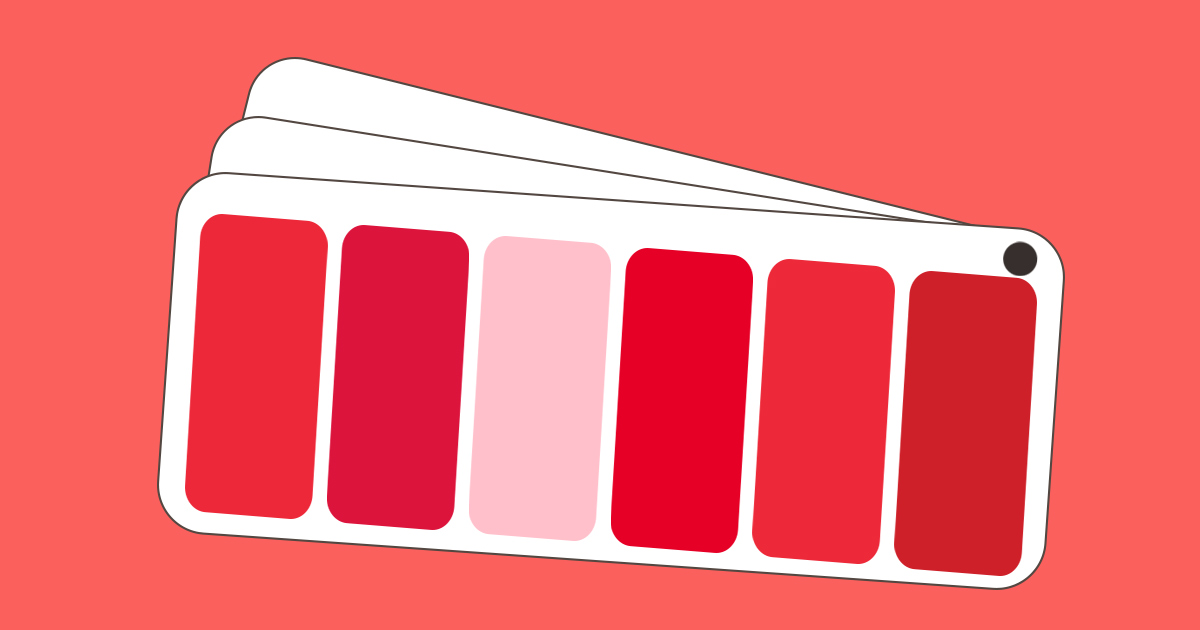
There are numerous shades that can be used for design or art. We are talking about hundreds of shades in various tints and tones. You will find some samples below with their respective RGB color model or sRGB and Hex triplet for better identification.
1. Red (Pantone) (237, 40, 57) (#ED2839)
For designers in various industries the Pantone Matching System (PMS) has been the default color identification system that they use for producing the exact color shade for the physical or digital forms of their products. Colors are even identified as they appear if used in various materials such as cotton, polyester, plastic, and nylon.
2. Crimson (220, 20, 60) (#DC143C)
This color is achieved by combining red with some blue or violet. This will result in a strong and deep color.
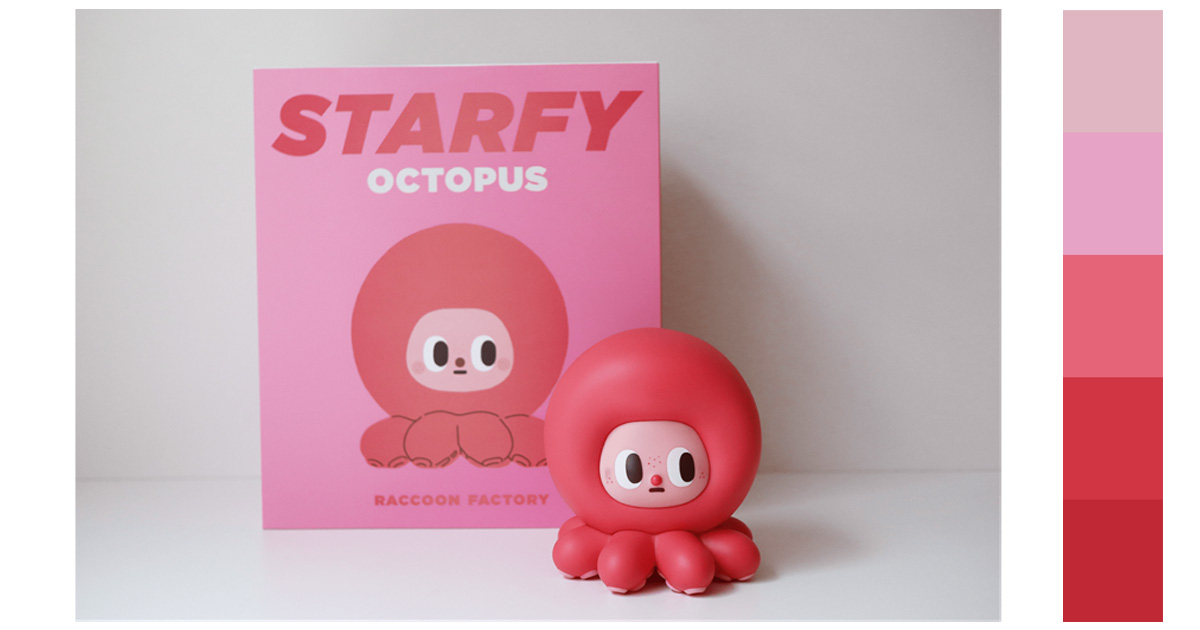
3. Pink (255, 192, 203) (#FFC0CB)
A lot of people have this as a favorite color. It is a lighter tint of red.
4. Spanish Red ( 230, 0, 38) (#E60026)
This color is also known as torch red. Juan Carlos Sanz and Rosa Gallego called the color ”rojo” in their color dictionary published in 2005.
5. Imperial Red (237, 41, 57) (#ED2939)
Harking back to the glory of Napoleon Bonaparte, this is the representation of the color red in the Imperial Standard of Napoleon 1.
6. Fire Engine Red (206, 32, 41) (#CE2029)
This is a well-known color as most firetrucks and emergency vehicles would have this color. The intense bright red is easily seen and would prompt people that there is an urgent situation going on.
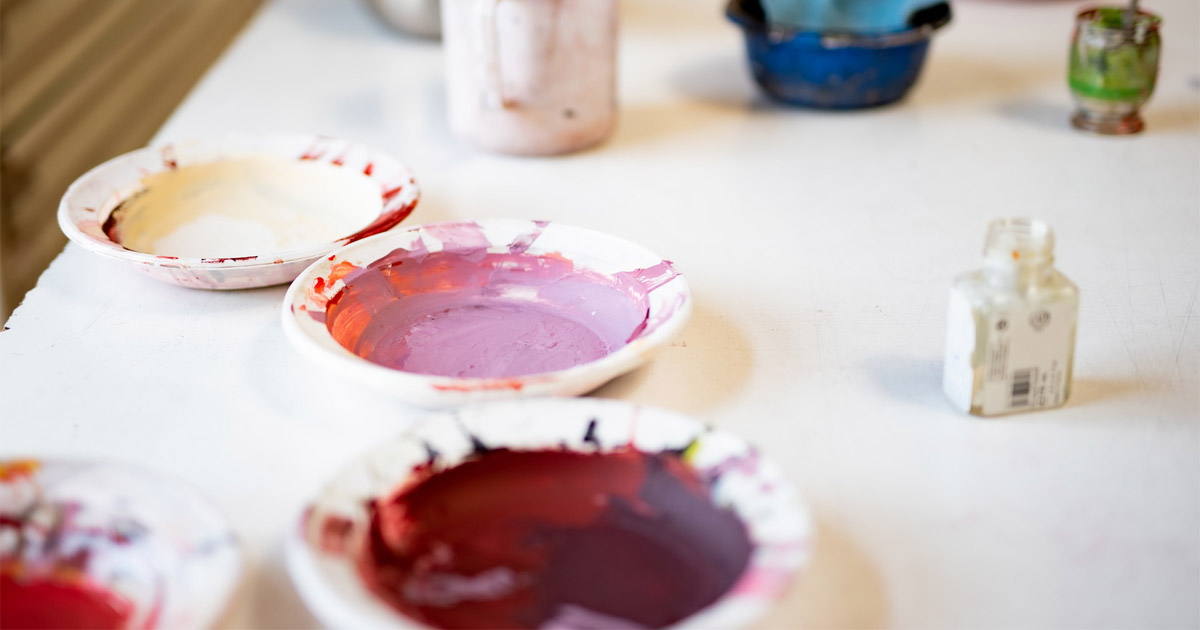
The Best Color Combination for Red
The following are examples of combination colors for red. Be inspired by the best red color combination we’ve provided.
These combinations are not uncompromising or inflexible. Try to find out which ones are working for your design.
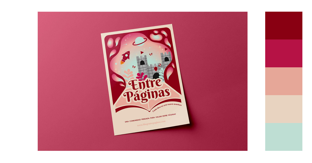
1. Analogous/Hue
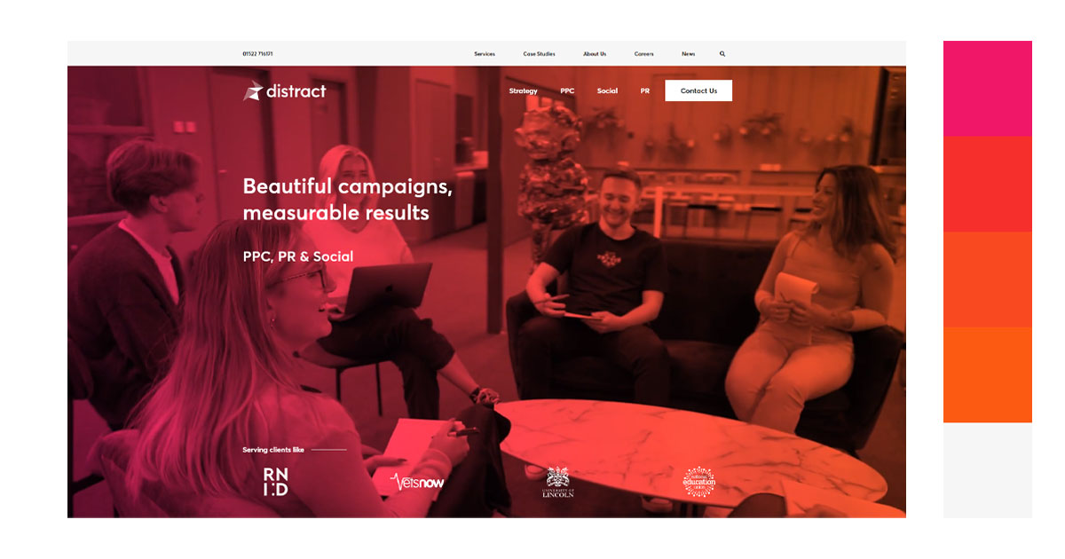
A. Red Violet-Red-Red Orange-Orange
This color combination for red exudes subtle energy. There is a close relationship with these colors. This combination creates color harmony.
Distract
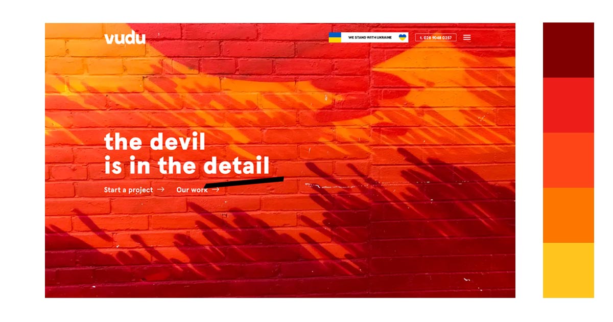
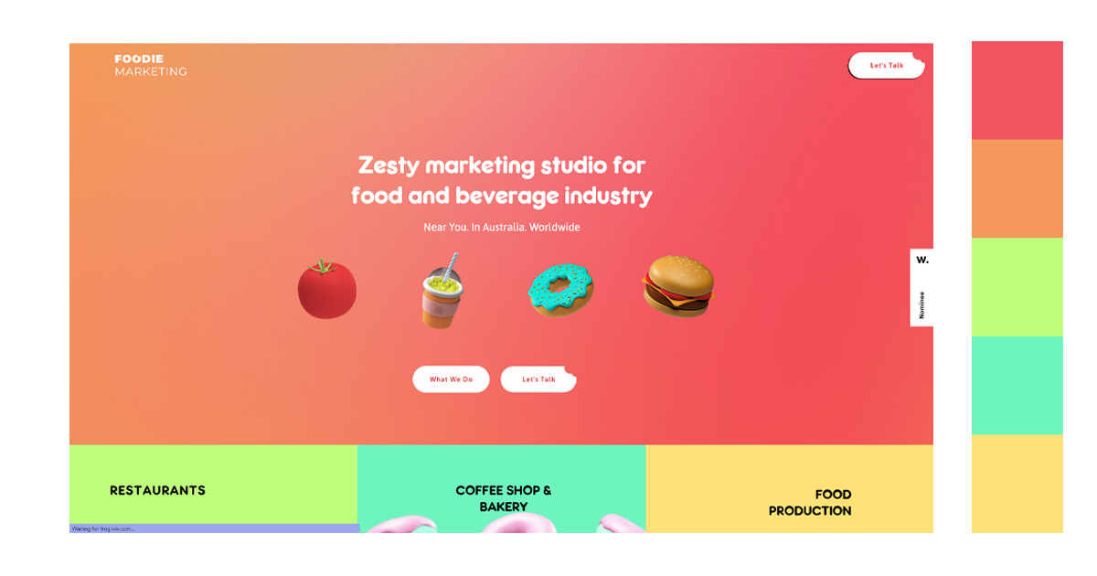
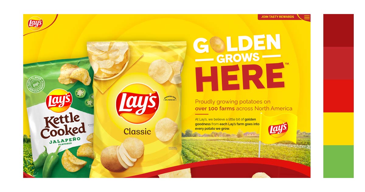
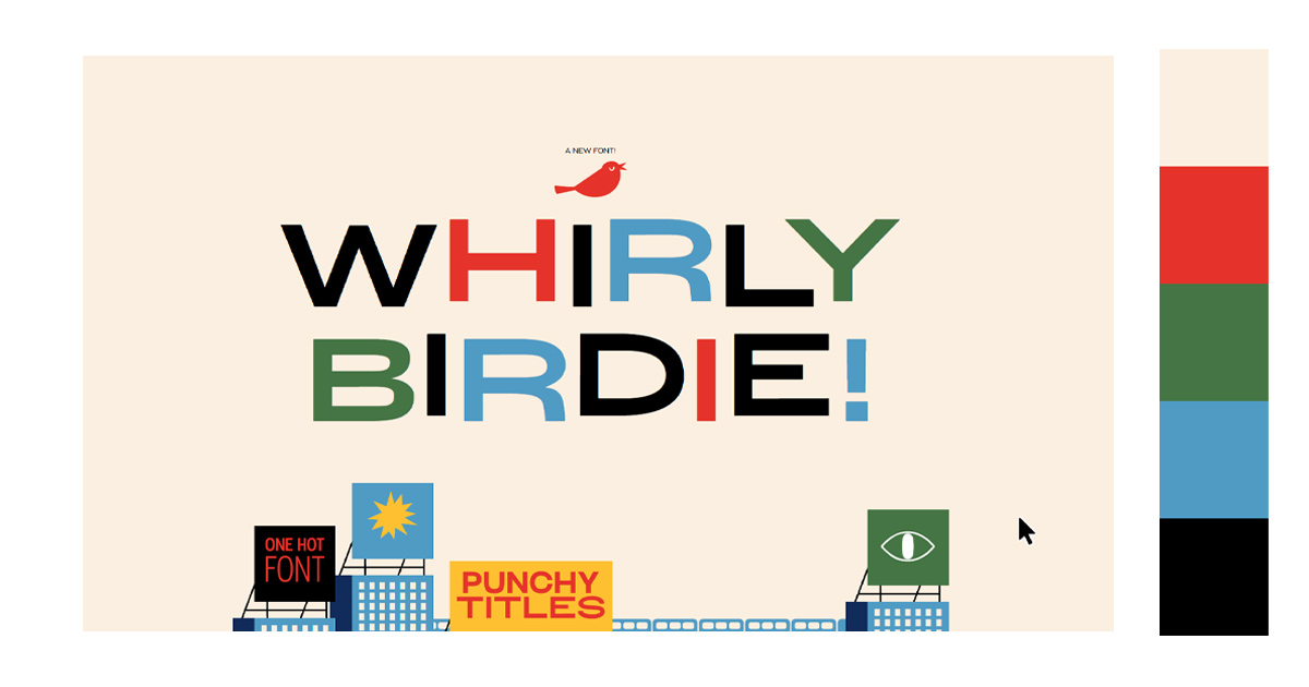
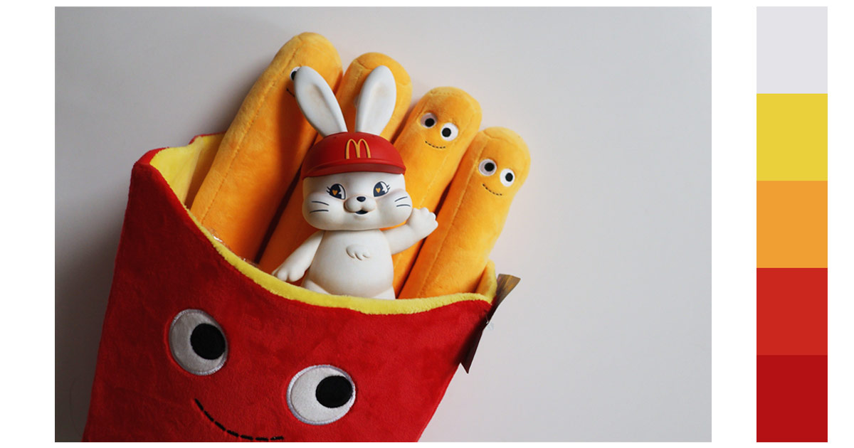
B. Red-Orange-Yellow
The colors are very vibrant and eye-catching. They use the color red as the dominant color and have orange and yellow acts as accent colors. The warm colors are pleasant to the eyes.
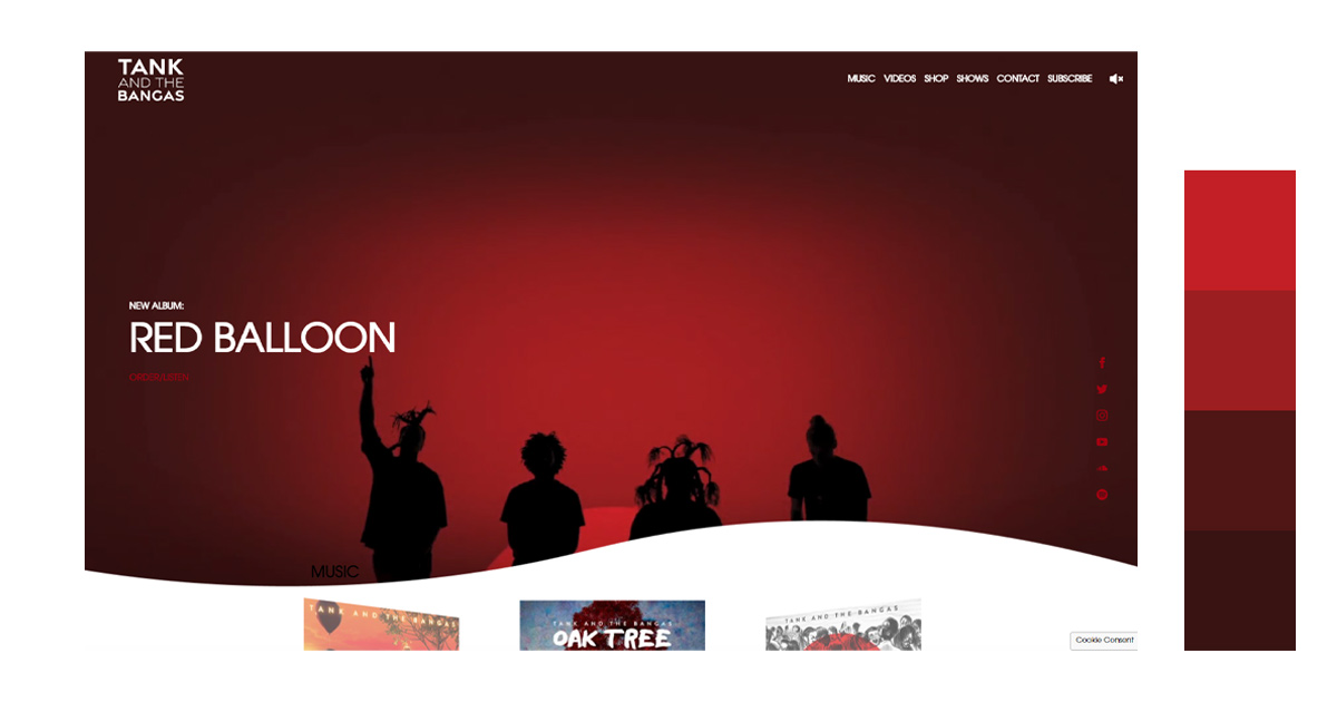
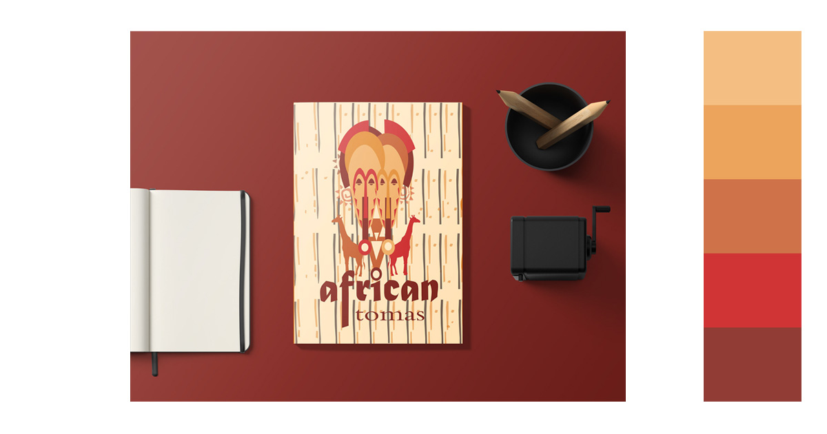
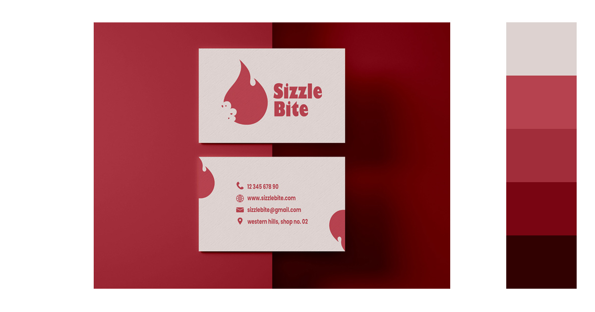
2. Monochromatic/Tint
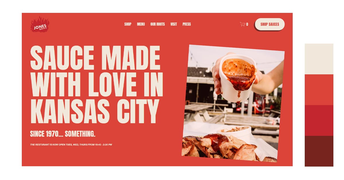
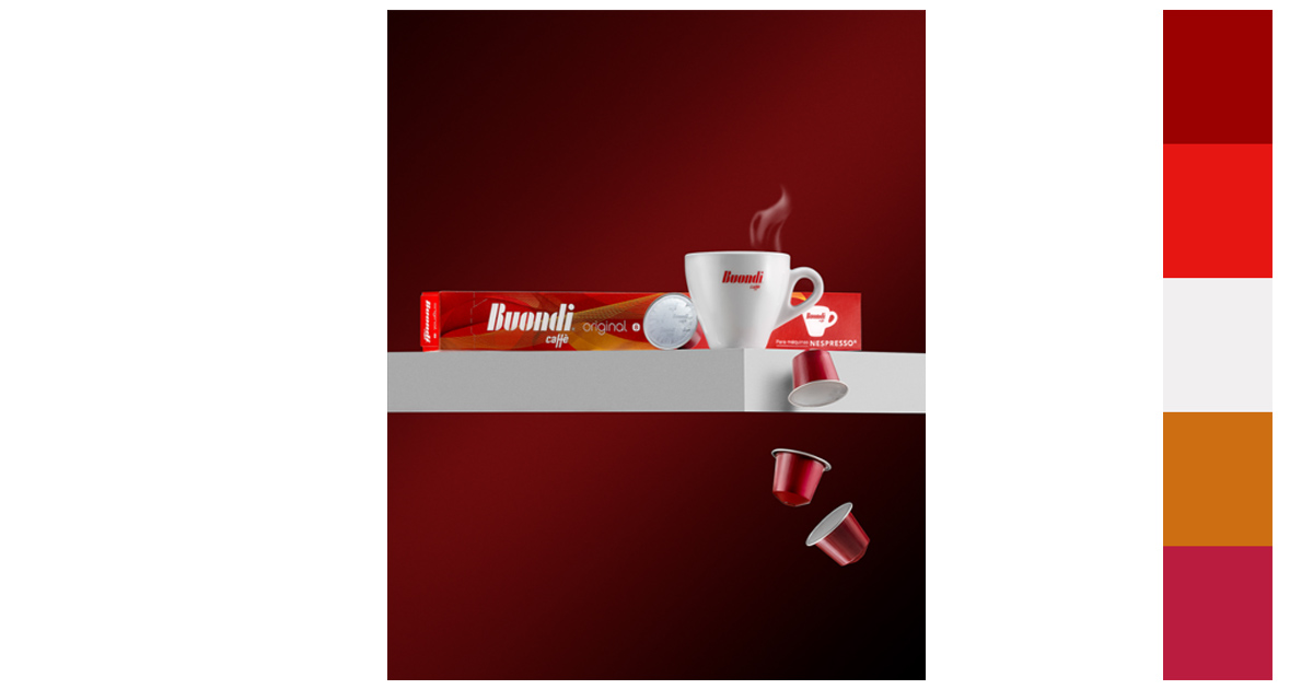
A. Red-Maroon-Brown
The darker earth tones balance out the vibrant red of the sauce. The combination color for red is enough to catch your attention but creates a calming effect.
Jones Bar-B-Q
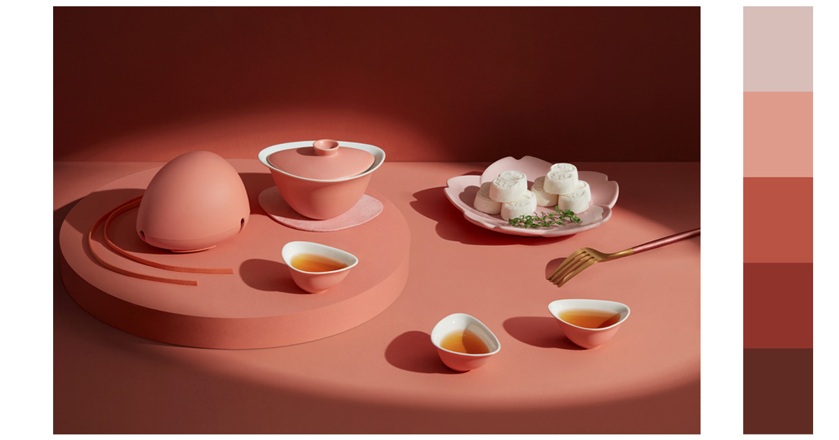
B. Pale Pink-Pink-Red
The colors are calm and harmonious. It creates a cohesive look. The design is simple to the eyes and easier to understand.
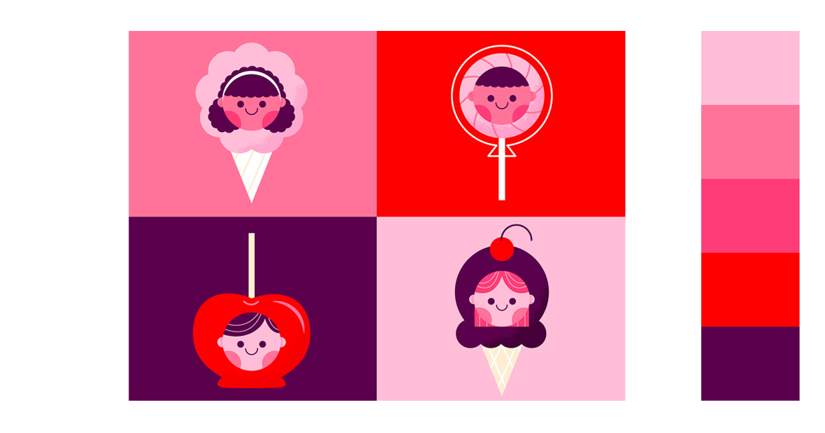
3. Complementary
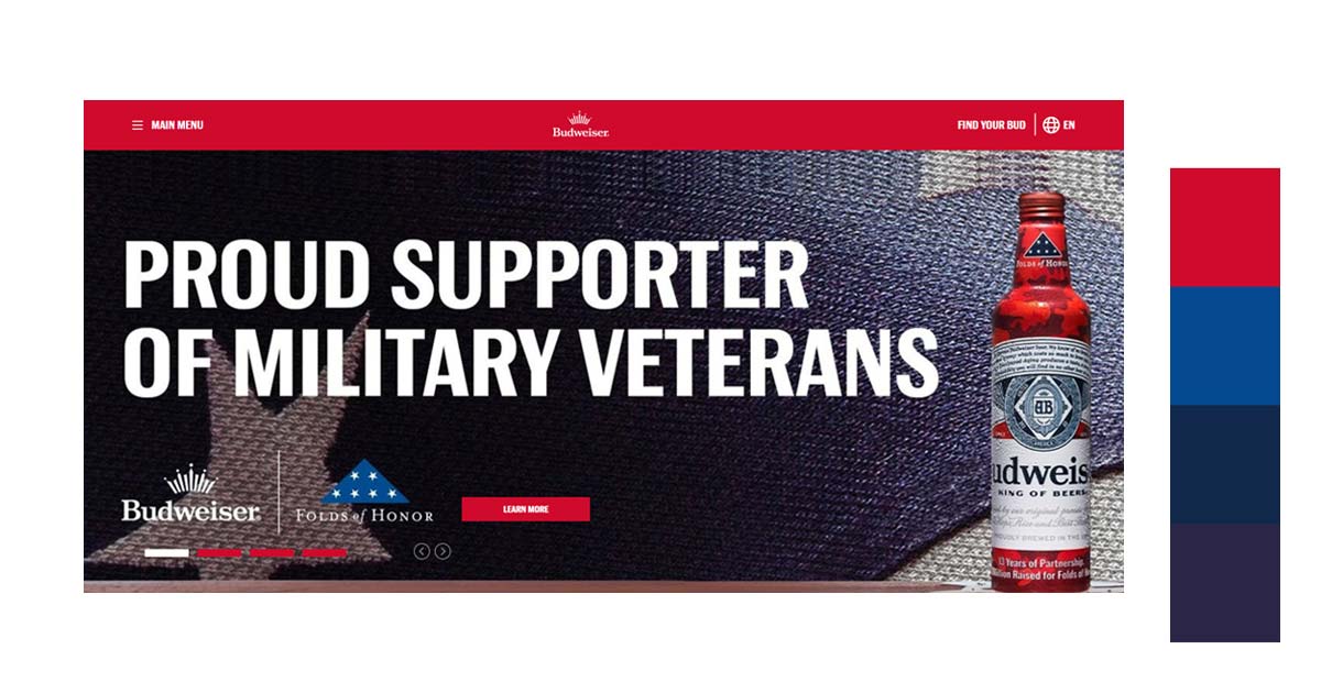
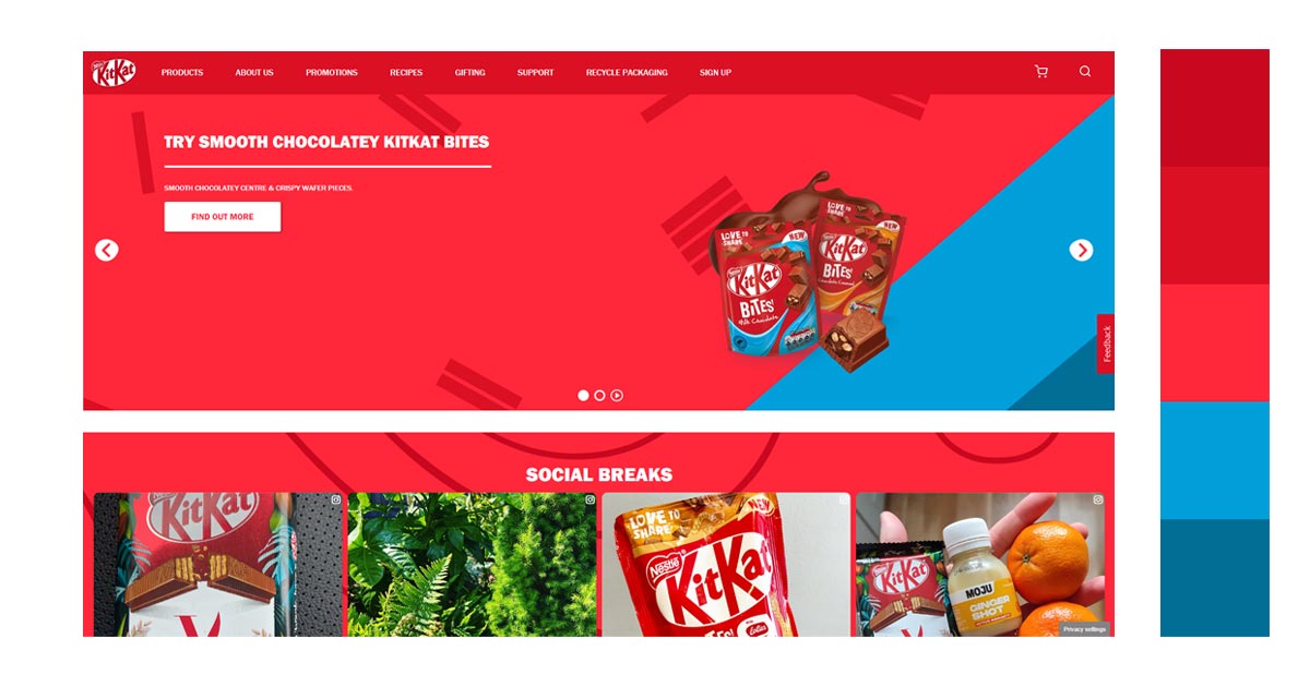
A. Red-Green
These complementary colors that can be found on opposite sides of the color wheel. This combination color for red creates a strong contrast when placed side by side. This helps highlight shapes and objects that you want to be more visible. The combination is energetic and very vibrant.
Have one of the colors as a background. The other color will be predominantly used by the main subject in the design. In this way, you can clearly give importance to the main subject. You can use remove bg to help you edit background of your project.
4. Split Complementary
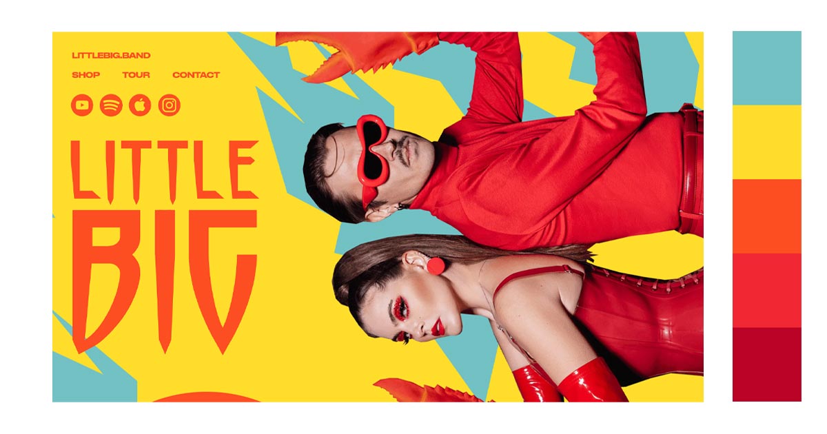
A. Red-Orange-Blue Green
If you want to achieve the vibrancy and visibility of using complementary colors but have it more subtle, you can use split complementary. There is balance with the warm colors of red and orange with the cool colors of blue and green. This is one of the best red color combinations as it is vibrant yet appears understated.
B. Red-Yellow Green-Violet
5. Triadic/Primary
A. Red-Yellow-Blue
Another combination color for red is yellow and blue. This color scheme has three colors equally spaced around the color wheel. They are easier on the eyes compared to complementary colors.
6. Tetradic
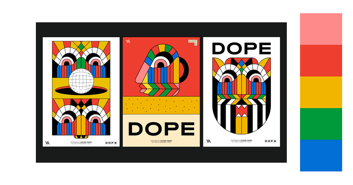
A. Red-Orange-Green-Blue
If you want your project to be bold, vibrant and loud, use this combination color for red. Your project will look cheerful and very colorful.
How Can You Use These Red Color Combinations?
1. ECommerce
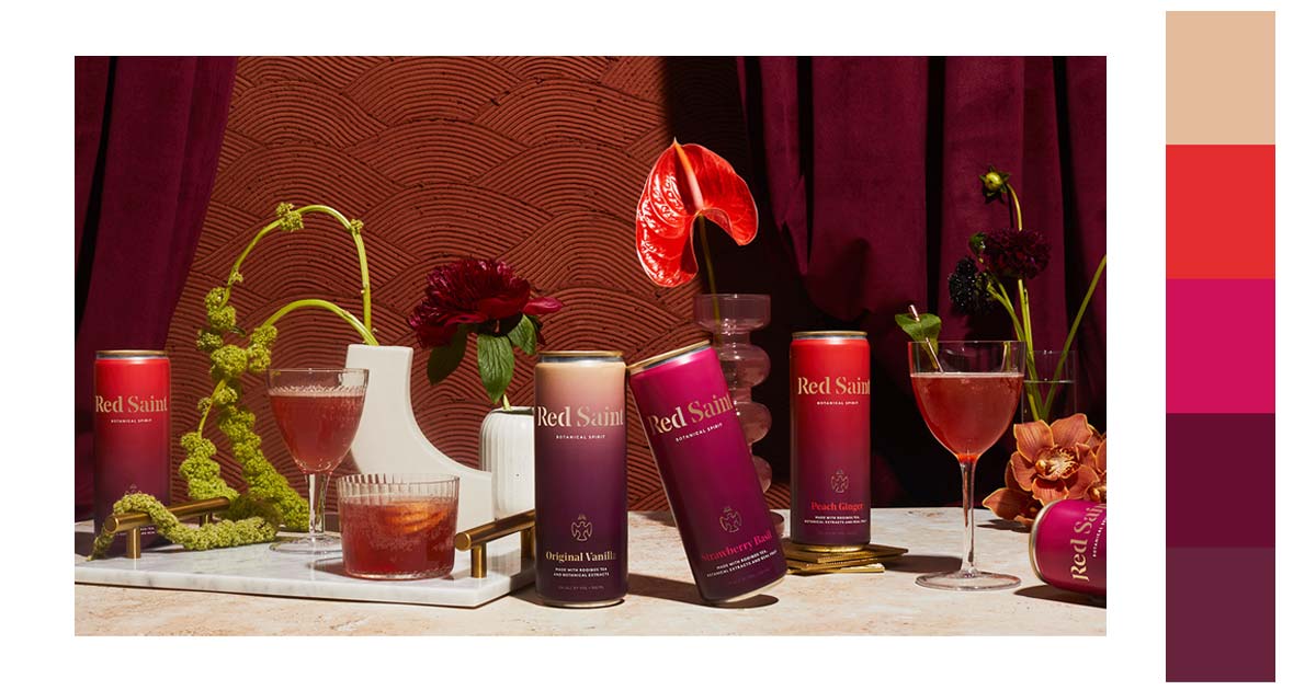
As the color red is very prominent, you can consider the color for your product packaging. Usually, the color is often used when promoting or selling food and beverages. Color psychology says that the red color stimulates appetite. It is also easier to spot on a grocery aisle.
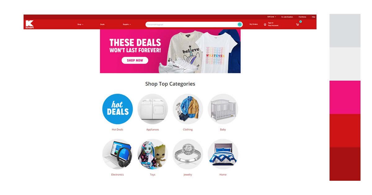
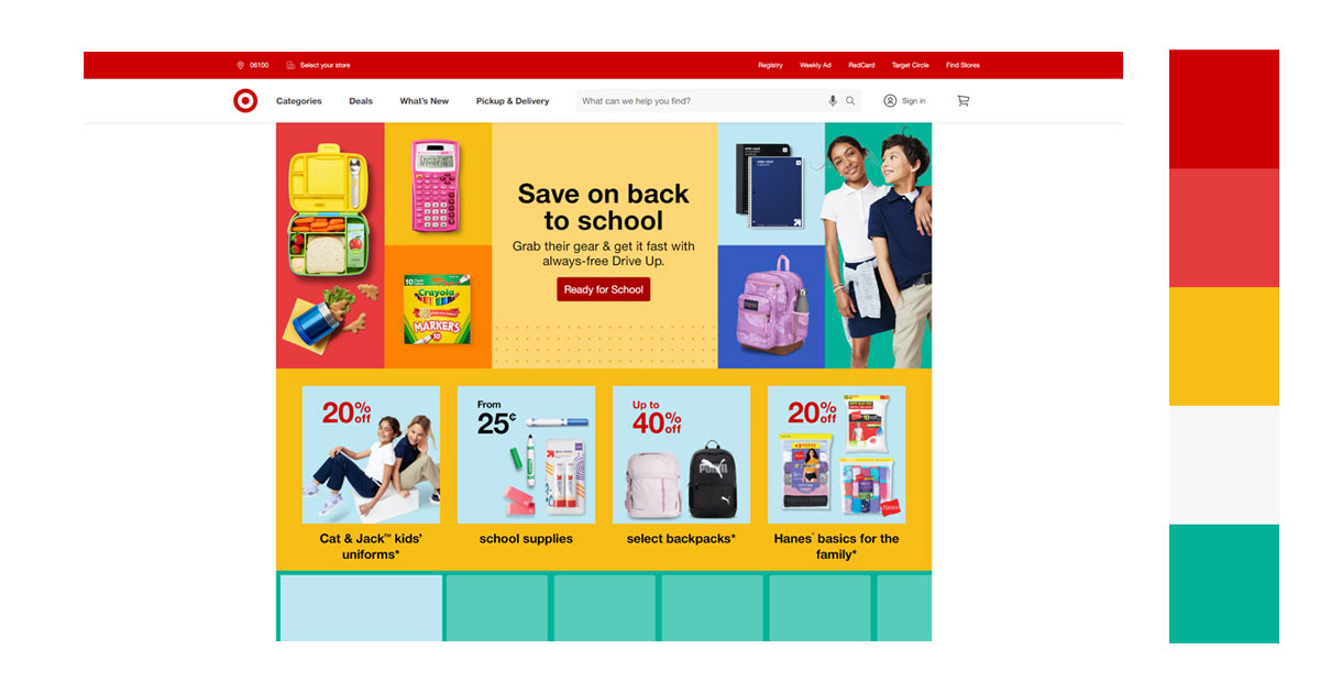
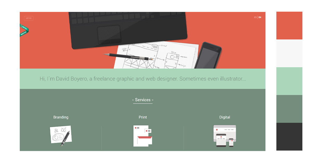
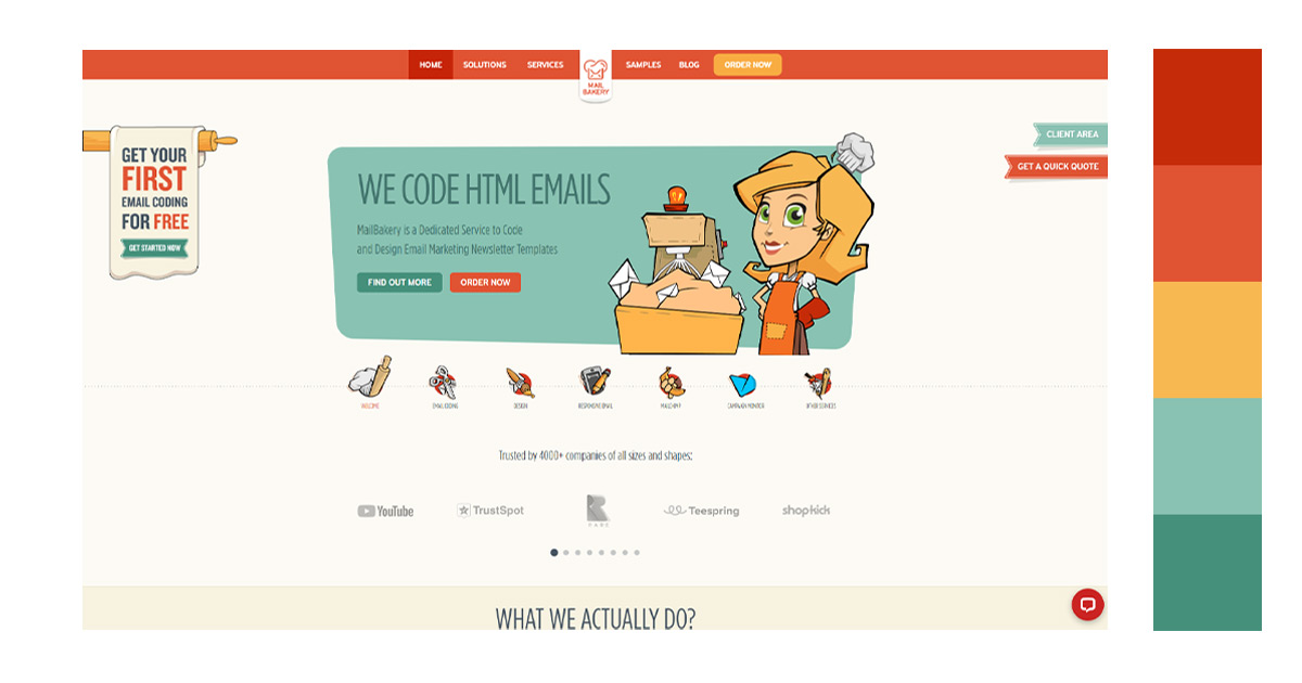
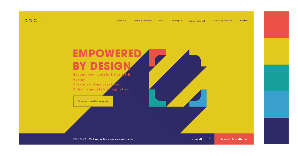
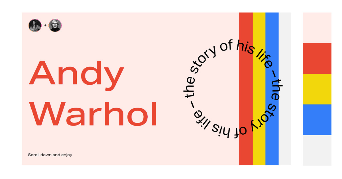
2. Website Design
The red color is very attractive. It is vibrant and immediately catches your attention. Incorporate the color in your website design to direct the attention of your visitors on specific parts of the site you want to be noticed.
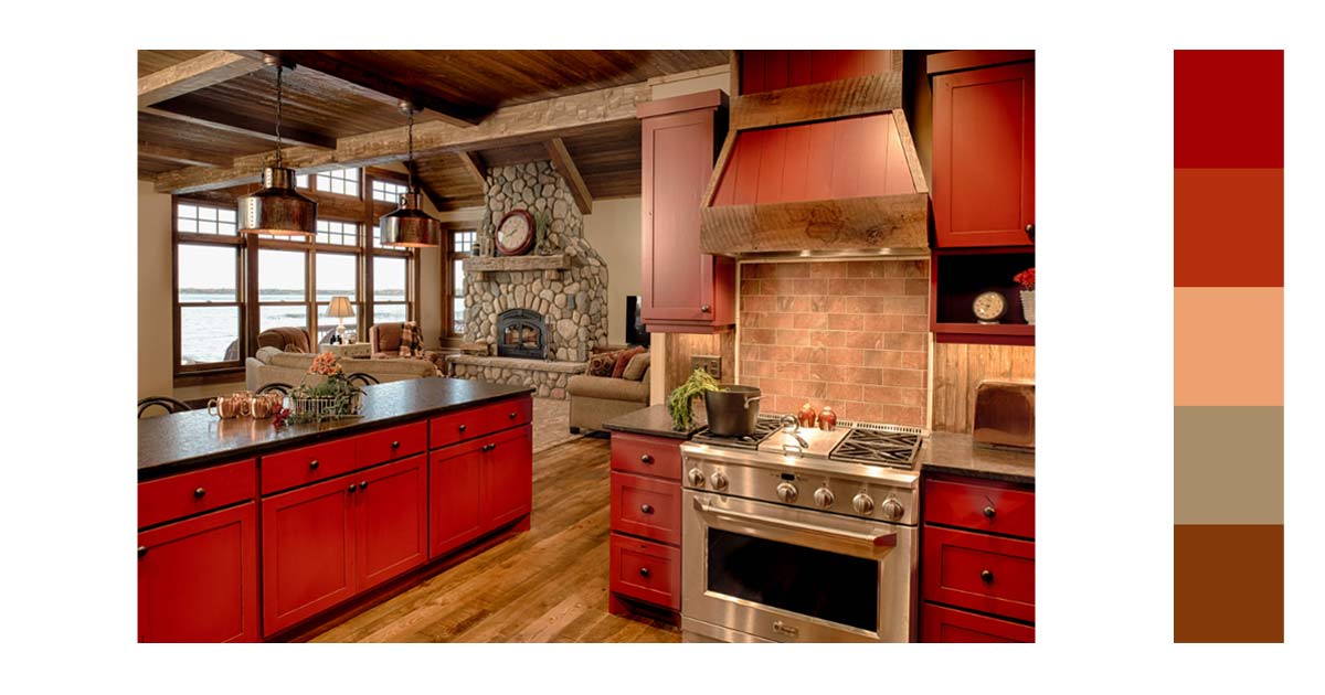
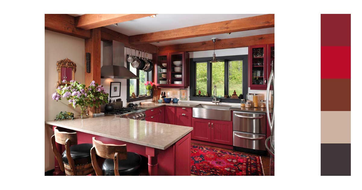
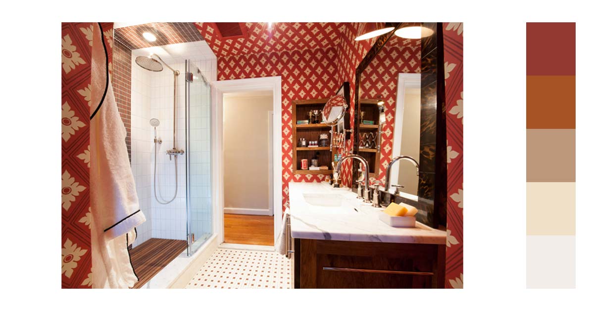
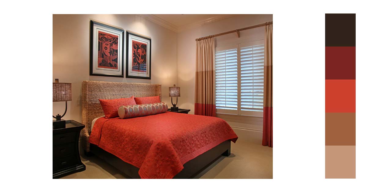
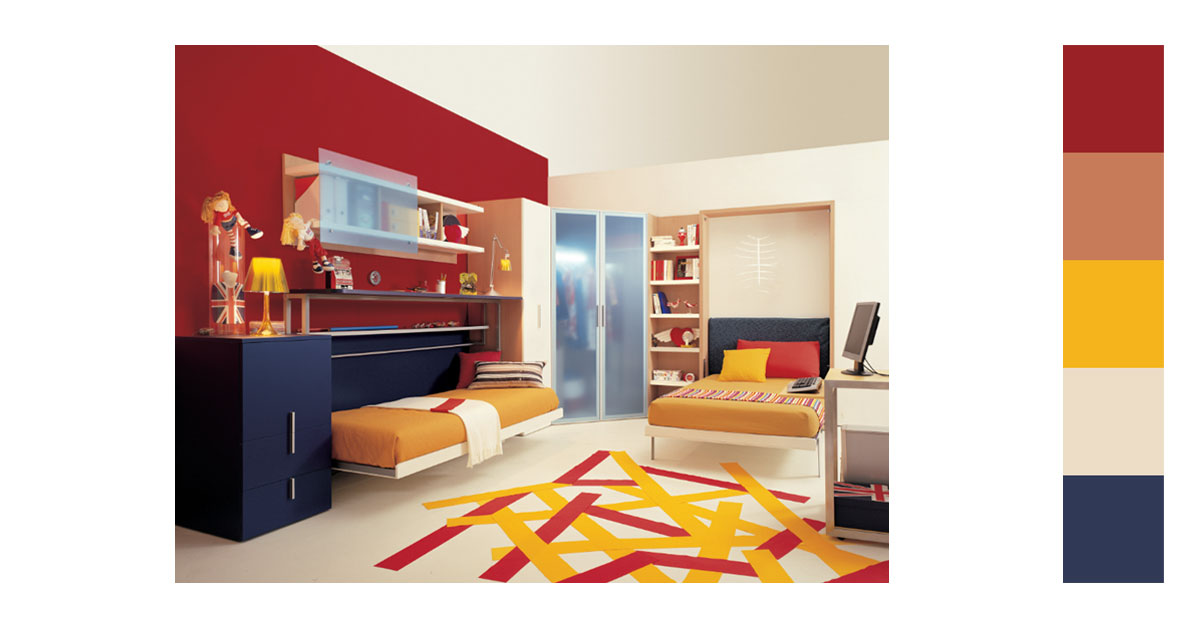
3. Interior Design
In designing various spaces, red can stimulate and heighten your senses. The color is warm and cozy if used aptly. You can use the color of the walls to make a room more intimate. If your space is full of neutral colors adding a red accent piece could liven up the atmosphere.
Red is never boring. Reds with orange-tinged colors will make you feel energized. The color is fun to work with. It gives a certain zest to any space it is used to.
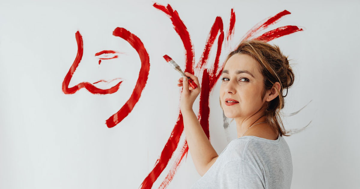
4. Graphic Design
Use the color red if you want to highlight certain elements in your project. The color is hard to miss and would be the first one the eye would gravitate towards. You can also use the color as a contrast to make your main object more visible.
5. Photography
Red is always associated with love and passion. The color signifies strong and bold emotions. It commands attention. If this is what you want to show in your photos, then use the paint. But be mindful that sometimes you need to underexpose your photos to not lose details in red objects.
Relevant Questions:
How does the cultural context influence the choice of red’s combination colors for global brands?
The cultural context significantly influences the choice of combination colors with red in global branding, as colors carry different meanings in various cultures. For instance, red may signify luck and prosperity in some Asian cultures, while in other contexts, it might represent danger or warning. Designers often navigate these cultural nuances to ensure their color choices resonate positively with their target audience globally. There are a lot of sites where you can get free red background images to make sure that you can design images that are considerate and fitting for your target audience and demogaraphics.
What are some common mistakes to avoid when pairing red with other colors in design?
When pairing red with other colors, it’s crucial to maintain balance and harmony to avoid overwhelming visuals. Overuse of red or pairing it with overly vibrant colors without careful consideration can lead to designs that are visually jarring or convey unintended messages.
Can the choice of red’s combination colors influence consumer behavior in specific industries, and if so, how?
The choice of red’s combination colors can indeed influence consumer behavior in specific industries. For example, in the food and beverage industry, red combined with warm colors like yellow or orange can stimulate appetite and attract attention, making it a popular choice for restaurants and food products. It can be used as one of background colors for product photography. In technology, red might be used to create a sense of urgency or highlight important features, affecting consumer decisions and actions. Each industry must consider how color combinations align with their brand identity and the psychological impact on their target audience.
Use the Color Red for Your Next Designs
The color red is all about emotions. If you want to be poetic about a color, red symbolizes a person’s heart. It is powerful and strong in its conviction. But, it is also warm and cozy at the same time.
Your design is a reflection of who you are. Your passion would clearly be translated to your work. So, do not hesitate to be bold and aggressive. Add liveliness to your life.
Dabble in a little bit of excitement. Use red.
Latest