Design Inspiration: What Colors Go Well with Blue?
The color blue is one of the most popular colors in the world. It is seen everywhere. We have them in fashion, interior design, the arts, and even the military. And with the advances in technology, digital media is creating multitudes of blue color shades. This means that there are more applications that we can have for this color.
To harness the power of the color blue, we must understand its origin and its impact on our psyche. Because there is more to the color than being visually pleasing.
The History of Blue Color
In ancient times, blue was really a difficult color to come by. It was so uncommon there wasn’t even a word to describe the color.
Cave paintings dating from 20,0000 years ago don’t have any blue color. Early humans began seeing the color when they started developing blue pigments around 6,000 years ago. The Egyptians began using lapis or lapis lazuli, a semi-precious stone that is mined in Afghanistan. The bright blue mineral is often mixed with other ingredients like calcium and limestone to further saturate the blue pigment.
Because of trade with other nations, the blue dyes and pigments spread from Asia to Europe. They are still scarce and very expensive, so only royalty could be able to afford them. They were made into ceramics, sculptures, and jewelry
In the year 431 AD, the Catholic Church decided to assign colors to the various saints. The color blue was given to Mary. She wore a blue robe. Because of this, color was associated with being innocent and trustworthy.
Blue was also referred to as “ultramarine”, the pigment was very sought after by painters during the 14th and 15th centuries. But it was still very expensive so it is only reserved for the most important commissions.
Throughout the years, various breakthroughs in discovering synthetic dyes have led to their widespread use. The color is now easy to acquire and is more affordable. Their application has also increased. The color is widely used in fashion and interior design. There is the art world and the military. Various military uniforms use the color for its perceived trustworthiness.
The color has also evolved into various shades. There are multitudes of shades of the color blue like light blue, navy blue, cobalt blue, turquoise, teal, azure, etc. A blue pigment called YInMn Blue was discovered in 2009. With the advances in technology, more pigment or shades will be discovered.
The Psychology Behind the Blue Color
Studies have shown that color affects people. It affects our mood, behavior, and stress level. That is why color selection is very important in terms of marketing campaigns and branding. Colors can influence initial impressions up to 90%. People usually form an opinion about a product in 90 seconds and it is mostly based on the assessment of its color.
If you are thinking of using blue in your designs, the odds are in your favor. According to reports, blue is the most popular color disregarding gender and age. Why is it then that 35% of women and 57% of men prefer this color?
The color blue has always been associated with calmness and peace. It is not an aggressive color so a lot of people find it soothing. It makes you feel relaxed and at ease with your environment.
The color might be associated with masculinity. But, a lighter shade of the color is associated with childhood, youth, and innocence. Light blue promotes healing and softness.
Since it was associated with the divine, the color represented security, stability, and trustworthiness. That is why most military uniforms are such in color. They wanted to appear true and dependable. This then creates the idea of being honest and loyal. Blue represents power, knowledge, and integrity. Because of these traits, most financial businesses will adopt the color in their branding because they want to appear dependable, secure, and loyal.
This color also gives other psychological effects. Darker shades of blue help you improve your problem-solving skills. Lighter shades make you focus on the details of a given task. The blue color palette is very relaxing. This leads to lower blood pressure and slow heart rate.
For creatives, the color blue boosts productivity. It has mentally stimulating effects even under pressure, inspires you to think outside the box, and encourages you to use your imagination.
The color blue is very positive in its meaning. But, the color also has negative traits. It could appear cold and unfriendly. There are times that the color is also associated with being sad and lonely. There is emotional fragility, depression, and anxiety.
Other countries have their own symbolism and interpretation of the color. In Latin America, it is a symbol of good luck and hope. It stands for truth and clarity in the United States. India sees blue as the third eye of wisdom and knowledge. China believes that blue represents immortality. Judaism on the other hand believes that stands for redemption.
So, if you are designing with the blue color palette in mind, take note of the various psychological effects and cultural significance the color might bring to your project.
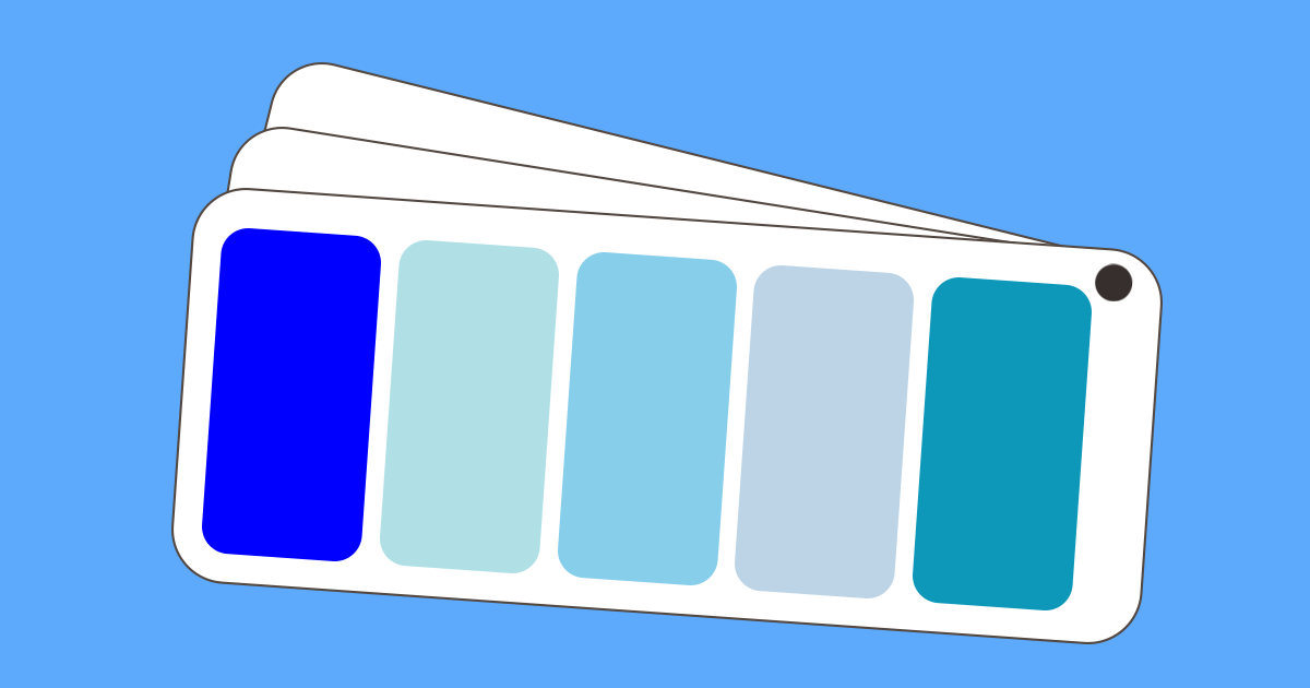
What are the Different Shades of Blue?
With the invention of synthetic colors, the color blue has been used in a lot more applications. A multitude of shades has been created in order to accommodate the demands of various artists, painters, and designers. And, with the introduction of digital media, the degree to which the blue color combination could be possible has increased significantly.
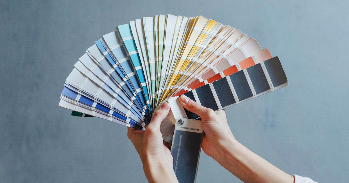
Nowadays, gone are the pigments and minerals you need to mix to create a variation in a particular color. There is also no need for color-matching using your sight alone. Computers will do the mixing and the color matching for you. We have an RGB color wheel, HSV color wheel, and Pantone color chart to give you the numerical value for the exact shade of color that you want.
Here are some shades of blue for you to include in your design. We would be following the RGB color model to make it easier for you to find the exact shade you’d want to use.
-
Blue (RGB 0, 0, 255)
We start with one of the primary colors along with red and green. This is the traditional color “blue”. Isaac Newton classified it as “indigo”. This is the brightest possible blue that can be reproduced on the computer screen.
-
Powder Blue (RGB 176, 224, 230)
This is a paler shade in the blue spectrum. It has a colder tone like gray-blues. It is relaxing and calming which is best for interior spaces.
-
Sky Blue (RGB 135, 206, 235)
One of the most popular lighter shades of blue. It is soft and relaxing. Like the sky, it is infinite in possibilities. It is frequently used in company branding because it exudes reliability and credibility.
-
Beau Blue ( RGB 188, 212, 230)
If you want a simpler shade of blue this is the one for you. It is still very cool to the eyes but does not have the vibrancy.
-
Blue Green (RGB 13, 152, 186)
This is a shade on the blue spectrum located midway between green and blue. In branding, it is used to convey the ideals of blue and green which are creativity and nature.
These examples are just a few of the shades of blue available. There are more shades to learn and discover it might as well be infinite. Play around with the colors and choose the shade that applies perfectly to your design.
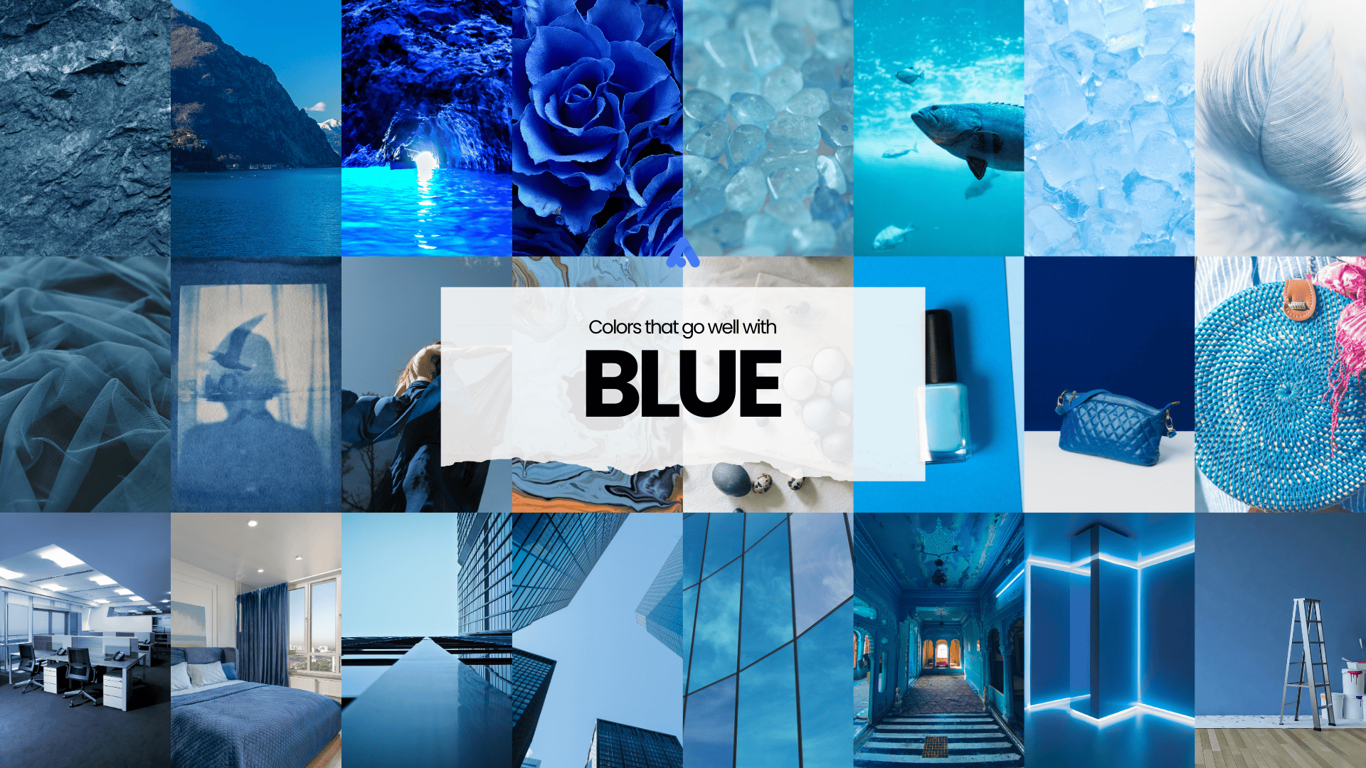
What Colors Go Well with Blue?
Your design can not be in all shades of blue. It may be too overwhelming for your audience. Maybe it would work for a dramatic effect but the response would be limited and short-lived.
Adding other colors will create visual interest and can be used to highlight certain points in your design.
Here are some blue color combinations to give you an idea of what colors go with blue.
1. Analogous/Hue (the cool colors)
1. Green-Blue-Violet
Located next to each other in the color wheel, they create a visually pleasing and calming display. In this example, green is the dominant color, blue is a supporting color, and violet is used as an accent.
2. Blue Green-Blue-Blue Violet
In this example, blue-violet appears as the dominant color with blue as supporting. Blue green and green are used as accents.
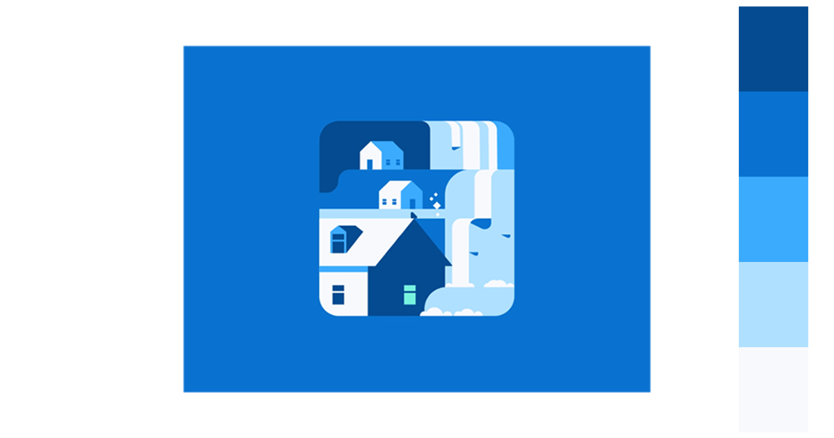
2. Monochromatic/Tint
1. Sky Blue-Cerulean-Blue-Navy Blue-Midnight Blue
You can use a color scheme made up of various variations of one color. It is a great way to simplify an image.
3. Complementary
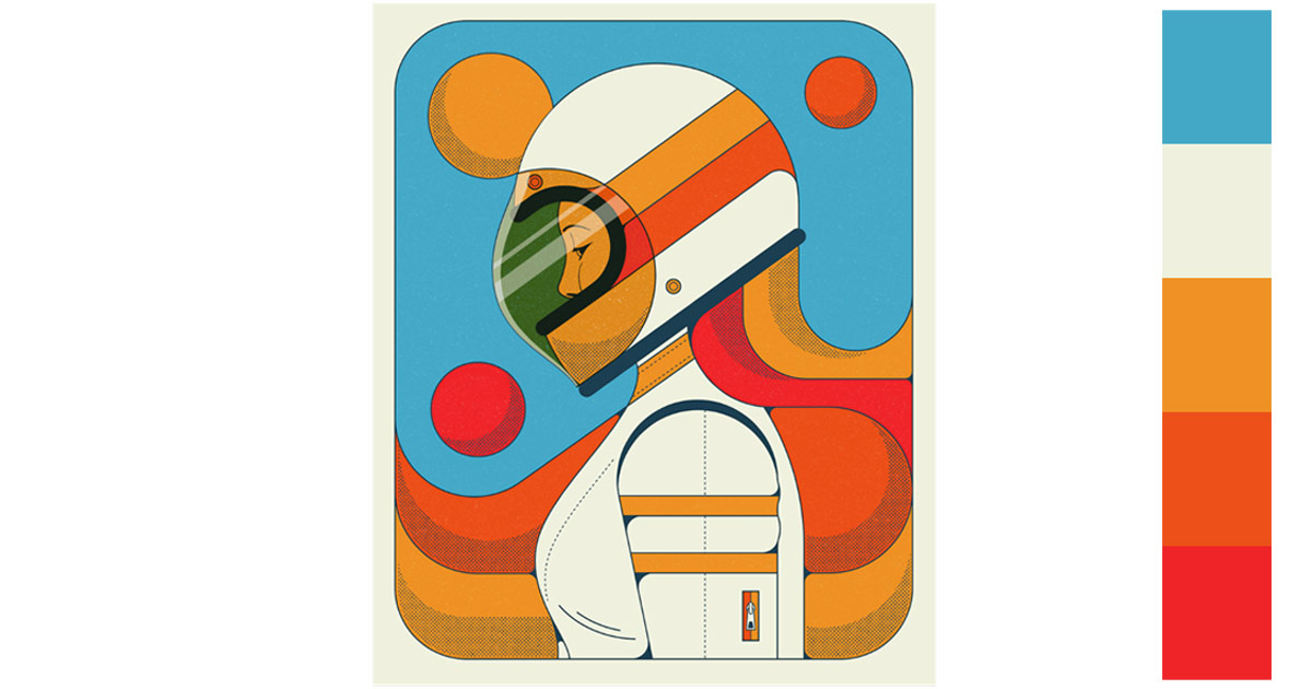
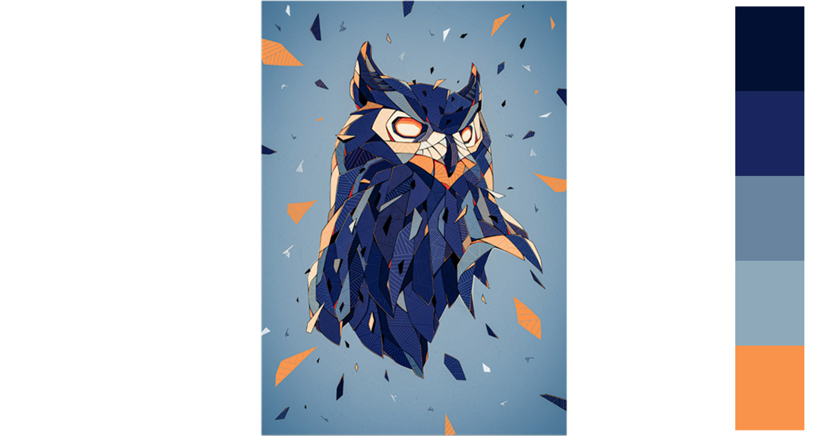
1. Blue-Orange
Complementary colors are bold and eye-catching. In this example the darker shades of blue and the color black highlights the color orange. This makes the orange elements more visible.
4. Split Complementary
1. Blue-Red Orange-Yellow Orange
Using this combination is versatile. The colors are not so bright that they will clash. There are also more cool and warm tones.
5. Triadic/Primary
1. Red-Yellow-Blue
Here is another example to help you visualize what colors go with blue.
6. Tetradic
1. Blue-Violet-Orange-Yellow
You can use this color scheme to achieve maximum contrast and balance.
1. Blue-Green-Red Orange
This color scheme creates more visual interest for its depth and vibrant composition.
How Can You Use These Blue Color Combinations?
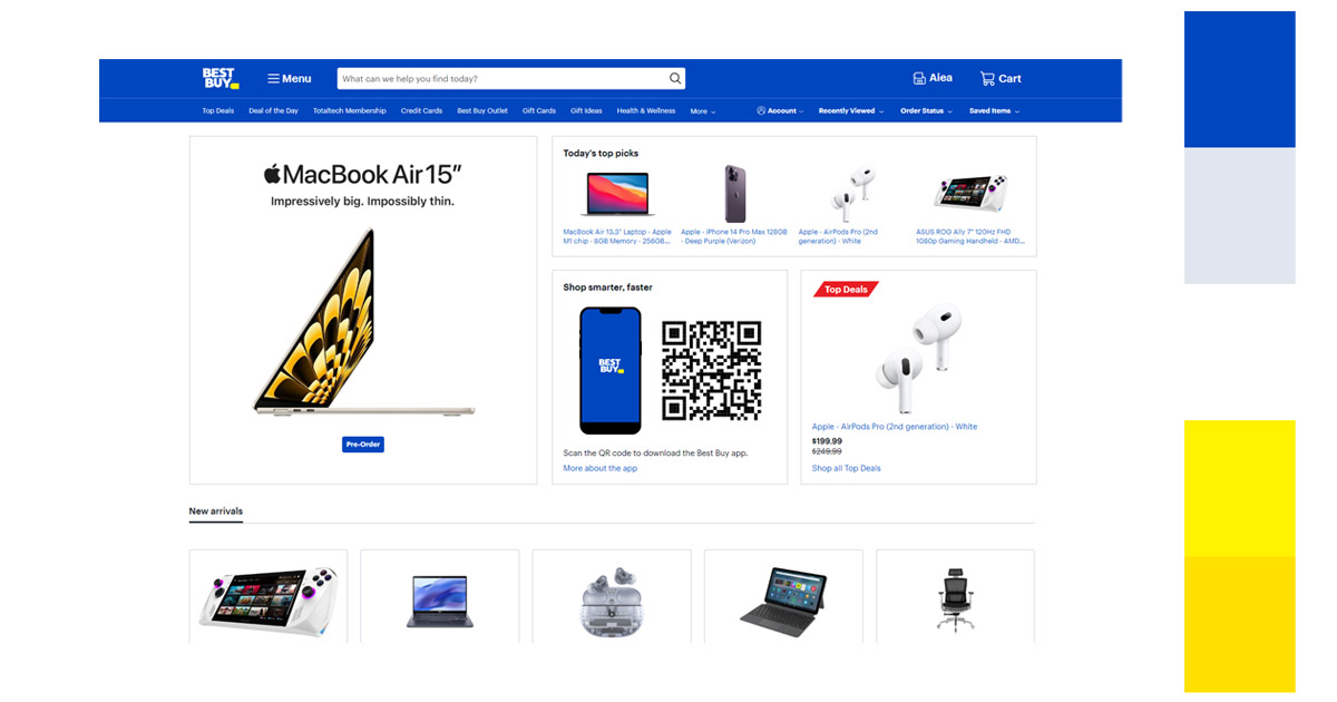
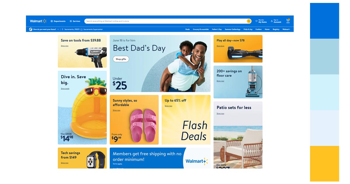
1. ECommerce
If you are selling a product, you have to convey to your potential customers that you are trustworthy and dependable. You have to carefully choose a color that represents your brand.
Blue has always been associated with stability and trust. This is the reason that almost 40% of companies often use the color in their logos. As per Dulux’s paintings, 42% of men and 30% of women pick blue as their favorite color. That is a significant number of potential customers you’d be able to attract.
The blue color is also relaxing. This is the state you want your customers to be in while they are browsing your wares. Your customer’s purchase is influenced by color by 85%. This is because 93% of shoppers will focus on the visual appearance alone when they are considering a purchase. It is good then that the attractive color and its various shades are very appealing to the eyes.
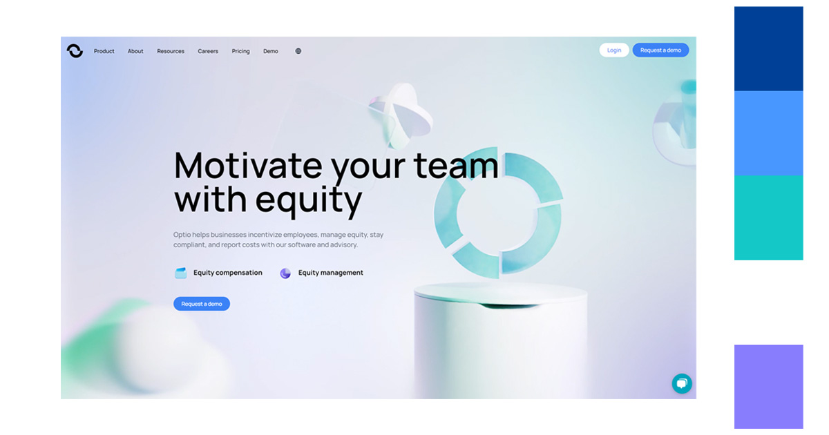
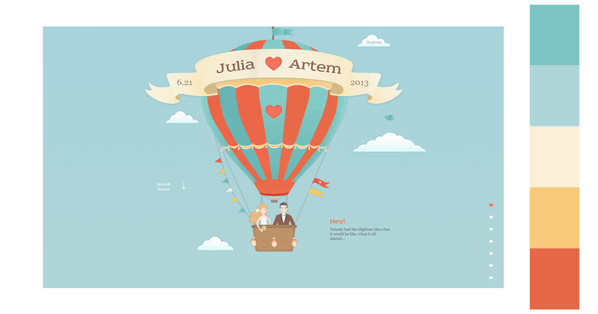
The following are websites that incorporate the color blue in their e-commerce site. Notice how the various blue shades are either the dominant color or the accent color. Try to see what colors go with blue.
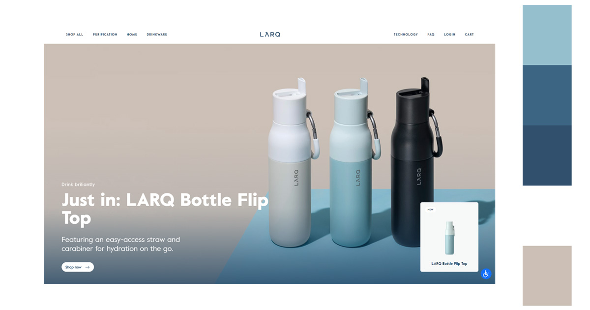

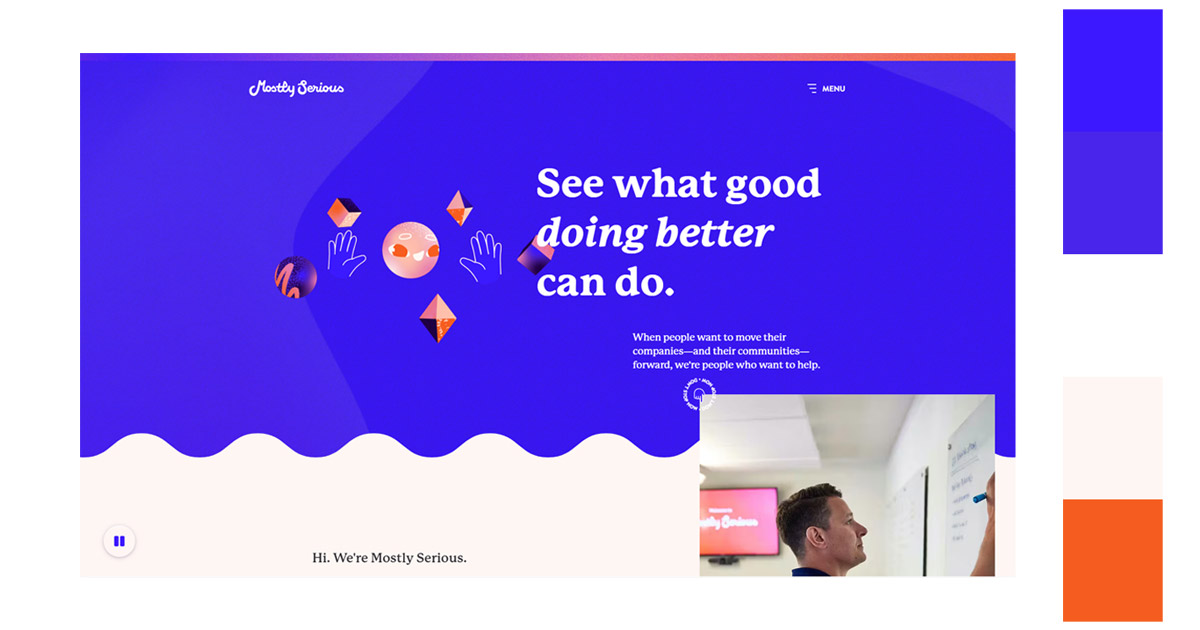
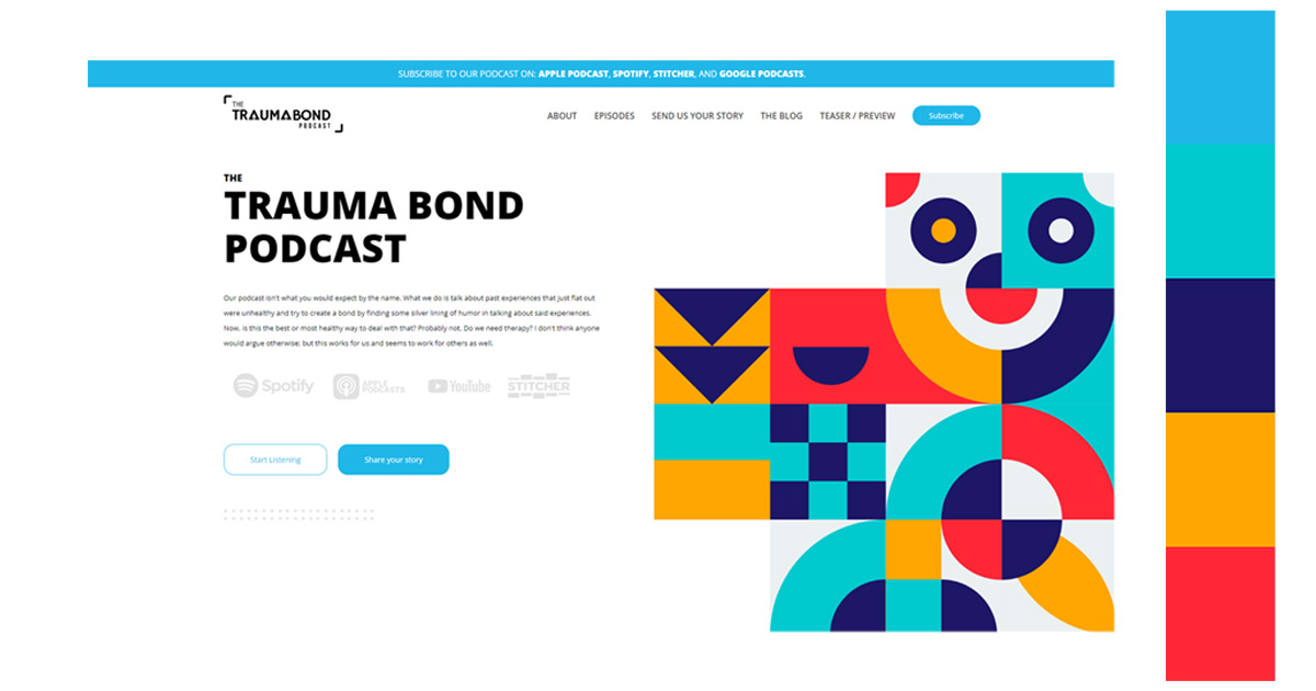
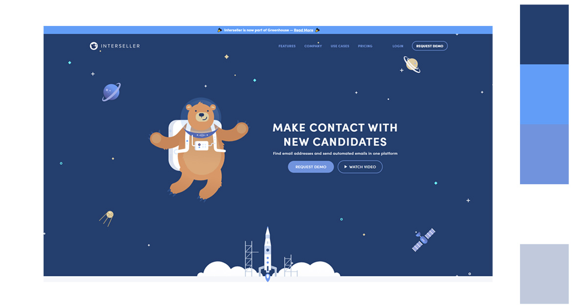
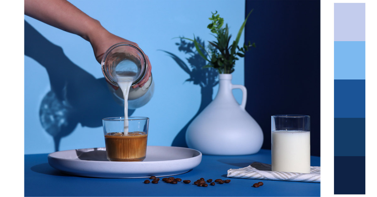
2. Website Design
The color blue reigns supreme in terms of color preference when it comes to websites. Accordingly, 46% of consumers prefer the color over green (30%) and red (22%).
If you are designing a website, cooler colors are preferable to warmer colors. They are much easier on the eyes. But, for company logos use dark blue and black to express sober authority. This is good to use for start-up tech companies to appear serious and dependable.
The blue color scheme conveys feelings of tranquility, trust, intelligence and confidence. Color is also associated with power and success. Make sure that your blue color combination is on point and what colors go with blue because your color scheme also conveys a message.
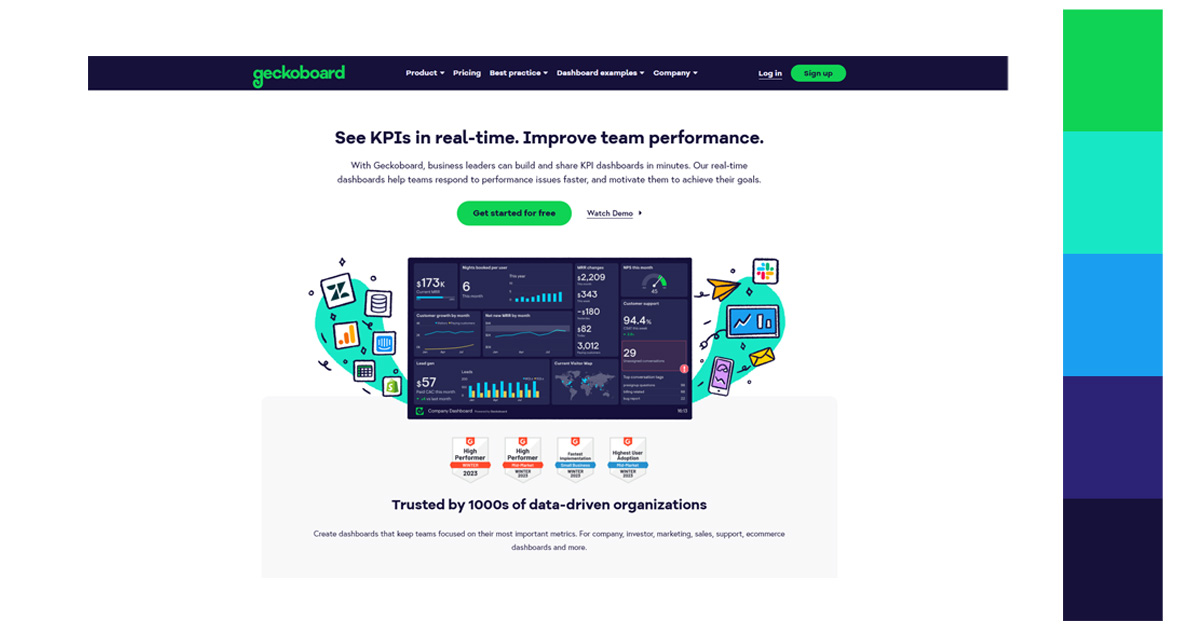
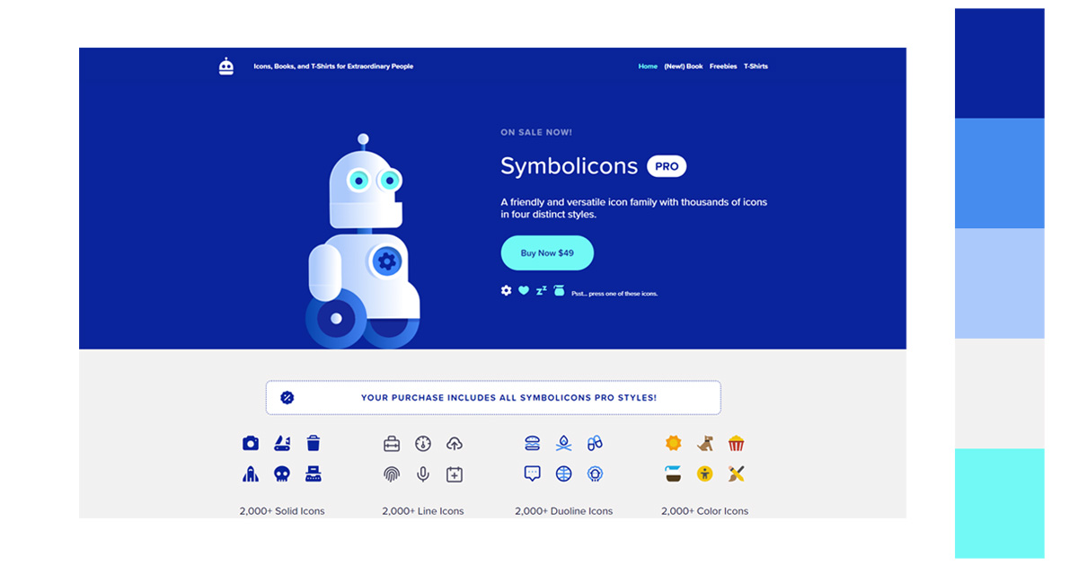
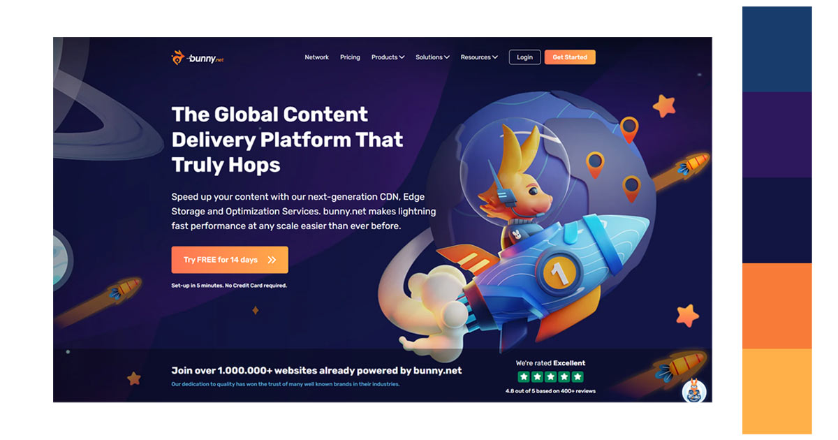
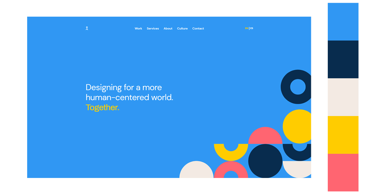
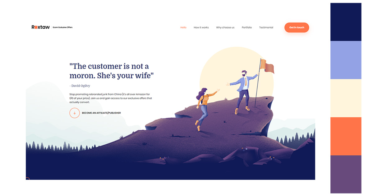
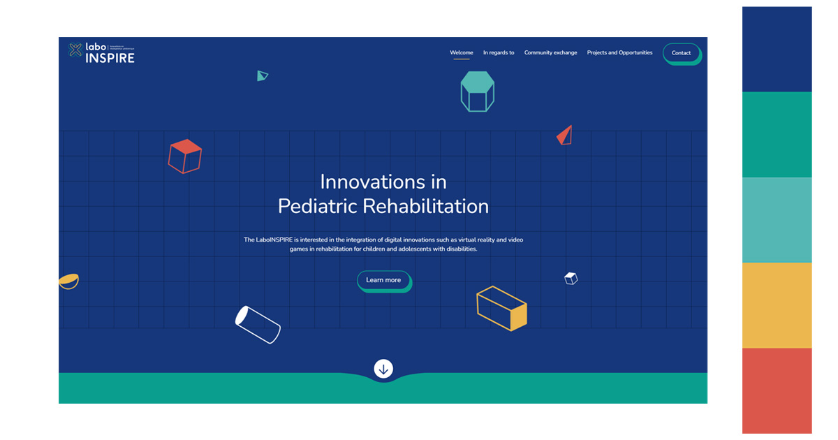
Look into the following website designs. Understand how the color blue is featured.
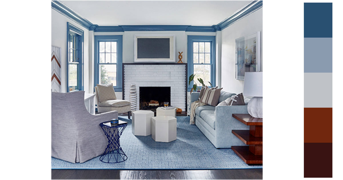
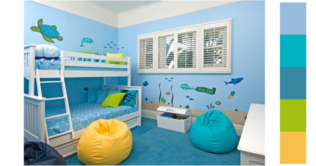
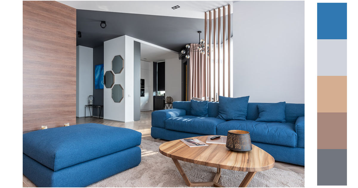
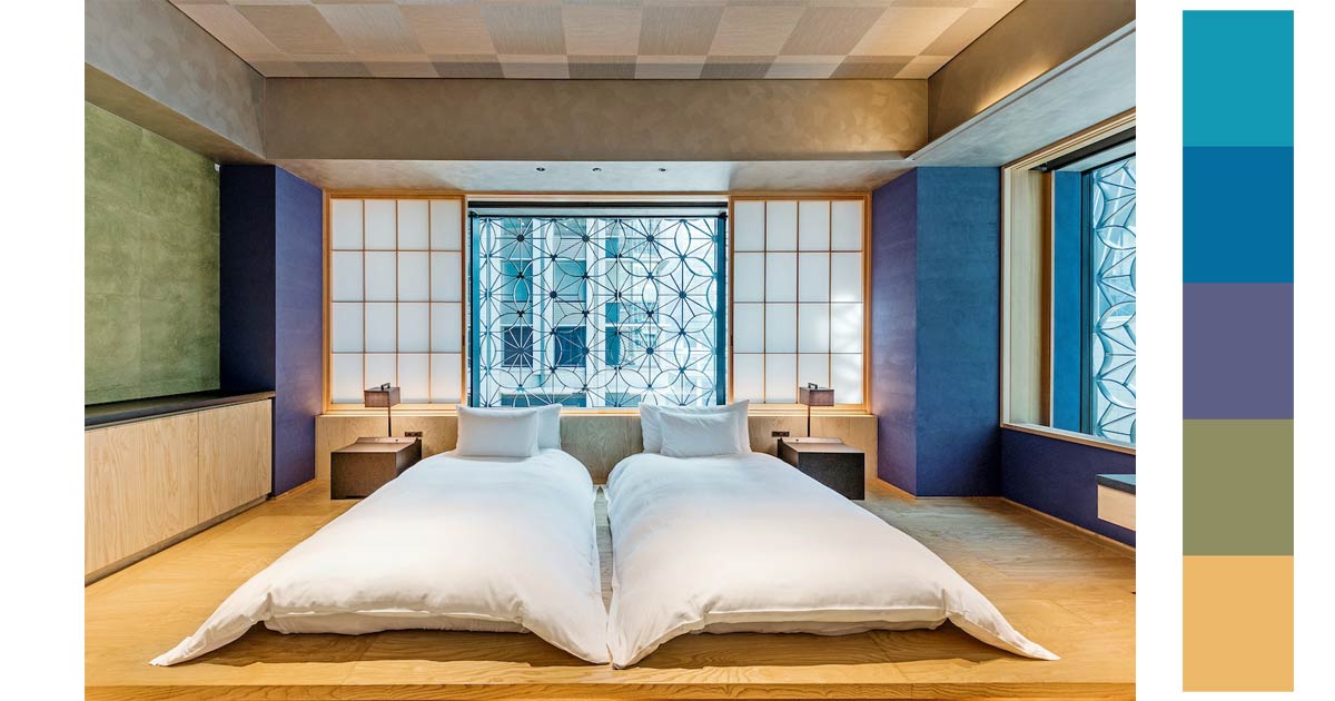
3. Interior Design
The color blue is also a favorite in interior design. Since the color represents the beautiful clear skies and the calm oceans. There is a meditative quality in this color. Designers love to use this color because with the right shades, tints and tones you could totally change the mood of the space. Lighter shades and softer tones of blues can make the room brighter and heavenly. Using darker shades as sharp contrast can make a room formal and conservative. Either combination works because any room can be transformed into a sedative, tranquil and relaxing space.
The following examples use various shades of blue in their interiors. See how the color transforms a room.
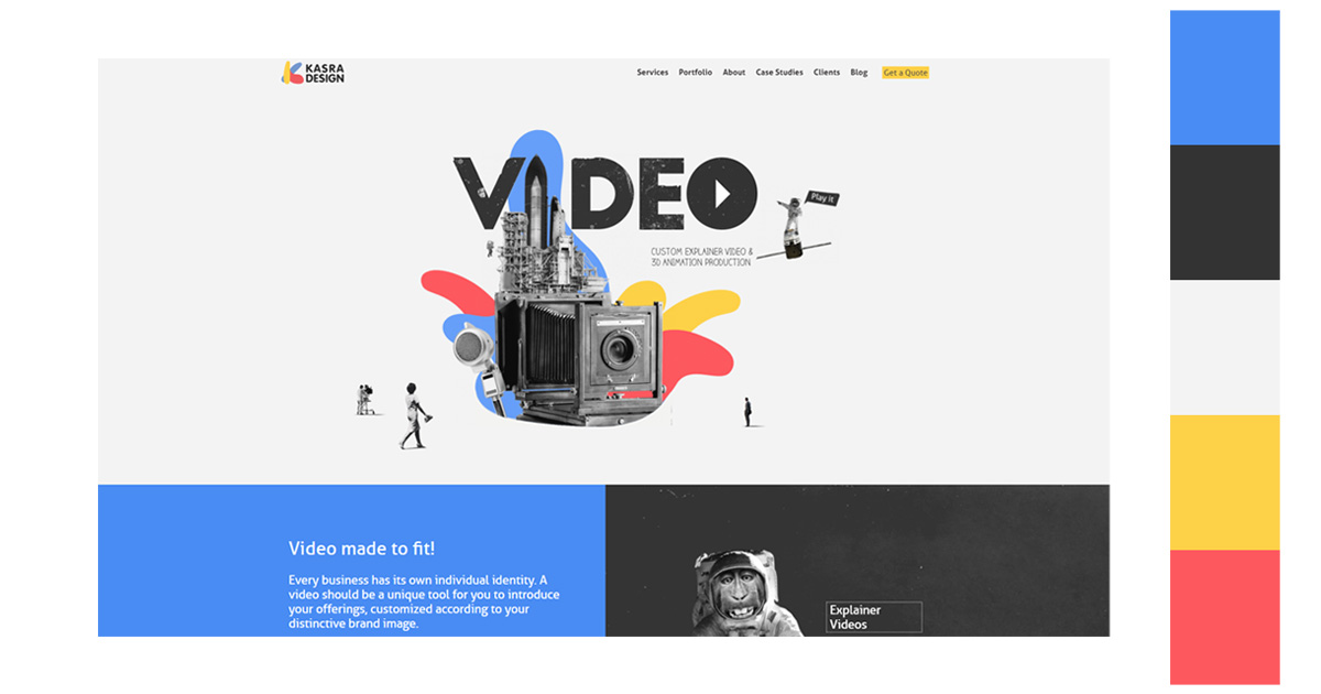
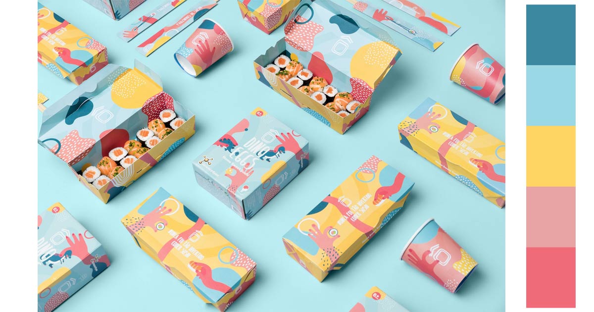
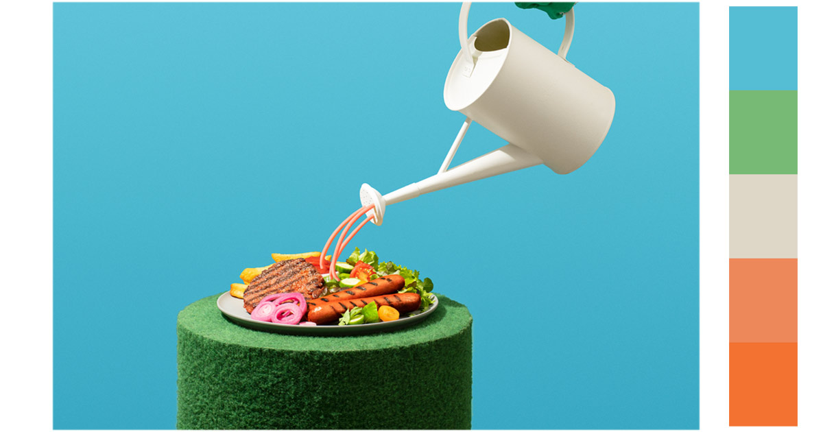
4. Graphic Design
This might sound redundant, but the color blue is everyone’s favorite. And if you want to appeal to your customers and clients, using color in your projects might be a good idea. You’d want to transfer that positive association to your project and to yourself.
Using complementary colors creates contrast. This creates a big impact in terms of branding. Use orange or yellow tones in combination with blue and see its effect.
Blue can also not be the dominant color in the design, You can use the color as an accent or a supporting color. You can use the color as a highlight to emphasize important messages.
Here are some examples.
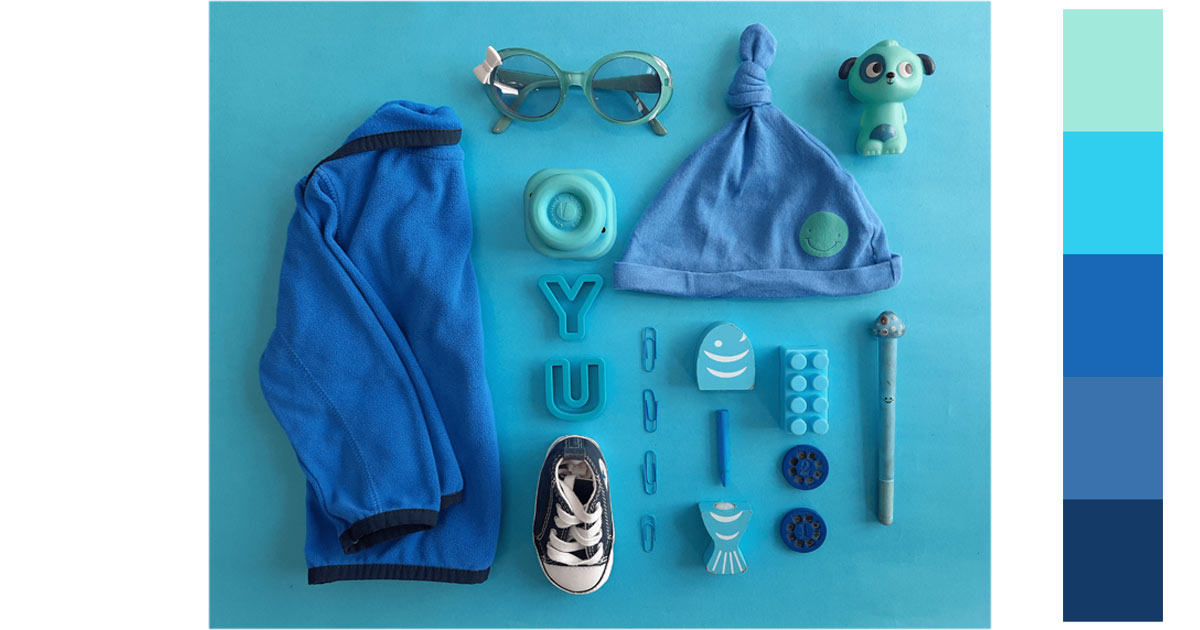
5. Photography
In photography, the color blue is also a favorite. It is not a busy color. It is calm and less flashy. The color blue is one of the most common colors in the natural world. It is the color of the sky and the ocean.
The color blue can convey a wide range of emotions. Dark blue is strong and foreboding. Light blue is softer, gentler, and far more optimistic. They are both peaceful and positive colors.
Color combinations are very important in picture composition. You need to have balance. Darker shades tend to be heavier than lighter shades. There is also a play in contrast between your foreground and your background. You need to be sure that your main subject is emphasized and not clash with your background or be swallowed by the background.
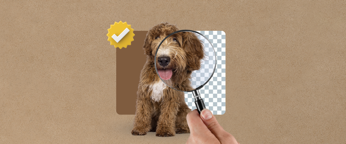
If you need to edit out your background, remove bg is a great site that is available for your use.
See the examples below to see how photographers used the color blue and what colors go with blue:
Relevant Questions:
How do different shades of blue affect the perception of size and space in interior design?
In interior design, different shades of blue can dramatically alter the perception of size and space. Lighter shades of blue tend to make spaces feel more open and airy, giving the illusion of a larger area. Conversely, darker shades of blue can create a sense of intimacy and depth, making spaces appear smaller and more enclosed. This versatility allows designers to manipulate spatial perception and create desired atmospheres within different rooms, using various shades of blue to either expand or cozy up the space. By also undertanding the basic principles of design, you can also manipulate one’s perception of art and space.
Are there any industries or sectors where the use of blue in branding is particularly advantageous or disadvantageous?
The use of blue in branding is particularly advantageous in sectors like finance, technology, healthcare, and environmental organizations, where trust, stability, cleanliness, and tranquility are important brand values. Blue’s association with these qualities can enhance consumer trust and loyalty. Conversely, it might be less advantageous in industries aiming to evoke high energy, warmth, or passion, where warmer colors like red or orange might be more effective. Here are some examples how to create a powerful branding.
What are some historical or cultural examples of blue’s significance beyond its use in art and design?
Historically, blue has been significant in various cultures, symbolizing wealth and power in ancient Egypt where it was used in tombs and temples. In the Medieval era, it represented holiness and was often used to depict the Virgin Mary. In contemporary times, blue is prominent in national flags and symbols, reflecting values of freedom, justice, and unity. These examples show blue’s enduring impact, transcending its aesthetic use to embody deep cultural and societal values.
You can get free blue background images from various websites so you can create designs that fit the cultural and historical aesthetics for you designs.
Use the Color Blue for Your Next Designs
If it isn’t clear to you yet, blue is a fantastic color to use in your designs. It has a wide range of applications. There’s a multitude of shades available. And, the color combinations are endless to say the least.
There is something reassuring about the color. Like, you can’t go wrong in choosing it for your various projects. There is optimism and happiness in the color. You can feel the boundless creativity it exudes.
It is powerful but kind. There is authority but also trust. It is a wonderful color to behold.
And, have I mentioned that the color is divine? It is quite heavenly.
Latest