Understanding the Elements of Art and Principles of Design
The beauty of art and design is in the combination of various elements and principles to come up with a visual product that translates the idea. Creativity is an important factor in design, but having the basic knowledge about the elements of art and principles of design can make a difference about how the design will come out especially for client-based projects.
What are the Elements of Art?
Knowing about design elements gives you an understanding of the tools and processes that make up the essence of art. The core elements of design include points, colors, lines, forms, shapes, spaces, textures, and values. No matter the medium, these elements can be put together to interact and complement one another in order to communicate and send a message.
1. Point
The point is one of the more important elements of art. It is defined as “a singularity in space” or “an area where two coordinates meet”. The first mark on the canvas or surface, otherwise known as a ground, is known as a point. This mark creates a “figure-ground relationship”, that is the division between the surface and any addition to the surface. Dots placed in the center of the composition creates symmetry, which is neutral and they tend to control the space surrounding it. However, dots that are not placed in the center creates asymmetry, and are more energetic and influential.

2. Line
Lines are described as the foundation of art. A line is a group of dots that are connected and they can come in different shapes, colors, and sizes. They start as two dimensional. The artist utilizes these lines to create art by either altering their size and volume or by adding more lines to convey an image. Lines can be straight, jagged, or curved, they can also convey action, guiding the eyes of the viewer.

3. Color
Color is a combination of value, chroma, intensity, and hue. Color is one of the elements that greatly affect and display emotions. The great impressionist artists like Monet and van Gogh were masters of color who could stir their audiences’ emotions as they provoked their senses with their mastery and expertise.
Color can be used as a symbol or applied to create a pattern. A deeper understanding of color theory, which is a whole different topic altogether, helps any artist gain mastery of the colors they have in their arsenal. The use of color in art is one of the most psychologically impactful and important aspects of a design, and it has a huge effect on the viewer’s experience. Color psychology and theory heavily influence some of the other elements mentioned here.

4. Shape
Shapes are defined as that which has or gives outline or boundary, despite the object being 2 or 3 dimensional. Shapes can either be organic or geometric. The shape can be geometric (known shape) or organic (free form shape). The easiest shapes to identify are geometric or “known shapes”, as they are mathematically identifiable and they have given names like triangles and squares and many others. Organic or “free form” shapes are ones that don’t seem to follow the mathematical standards.

5. Form
A form is birthed from shapes, the result of the lines in the painting after the shapes have been determined. It can also be two or three dimensional and can be limited to weight and height, or it can be free-flowing. A form is also described as the result of all the traditional elements of art.
When a shape becomes three-dimensional and has depth, a Form is created. Examples of form are pyramids, spheres, cylinders.

6. Value
Value is the application of black and white to alter the shade of different colors. It gives the impression and image of darker or lighter shades of colors, giving artists the ability to highlight certain objects in their works. The Italian term ‘chiaroscuro’ exactly illustrates what’s value in art. It means to use strong light and dark contrasts to achieve an effect on the whole design composition.

7. Space
Space is the area around the main focus of a work of art. It is sometimes the emptiness that surrounds the main focus of the work, whether space is behind, inside, or next to it.
This element of art can be altered depending on how the artist manipulates forms, colors, shapes, and lines. Space can either be positive or negative. Positive space is an area that is filled by an object or form, while negative space is an area that goes through, between, within, or around objects. Space determines the location of the focus giving birth to the ideas like background, middle ground, and foreground, granting perspective.
8. Texture
Texture works around the sense of touch and is defined as how you would feel if you could touch and feel what you’re looking at. Whether smooth or rough, it depends on how you perceive the surface. No matter the form, a texture is present, whether it’s rough, smooth, furry, soft, hard, etc.

9. Size and Scale
Proportion is what makes the relationship within a piece of artwork. If one object seems to blow out of proportion, like the head of the person you’re painting looks too big, then it would begin to look odd. Scale and proportion work hand in hand, as it can be used to appropriate something or exaggerate. Modern art uses this exaggeration to alter the image of what we perceive in the real world as normal, in a possible effort to highlight said exaggeration.

10. Direction
Direction or “movement” is an element that used to convey an action or a feeling in a work of art. It aims to guide the attention of the viewer all over the piece. This can be achieved through various means, whether it be different kinds of lines, reusing the same elements of art, the gestures of your subjects, etc.
Another ideal approach to direction is visual direction, this shows your works to have a specific or dominant direction varying on the preference of the artist.

11. Symmetry
Symmetry is the balance or proper allocation of the apparent weight in the piece, giving the viewer a sense of comfort when they look at a piece. Each visual work has what they call “visual weight”, which is not weighed using the conventional scale but is rather observed working around the turning point or axis of the piece.

The Principles of Design
What is a design?
Design refers to the plan to communicate and achieve specific objectives. It is the language of an image or an object, as words are to humans. It can be described as an organized experience that intends to convey a message and serve a purpose.
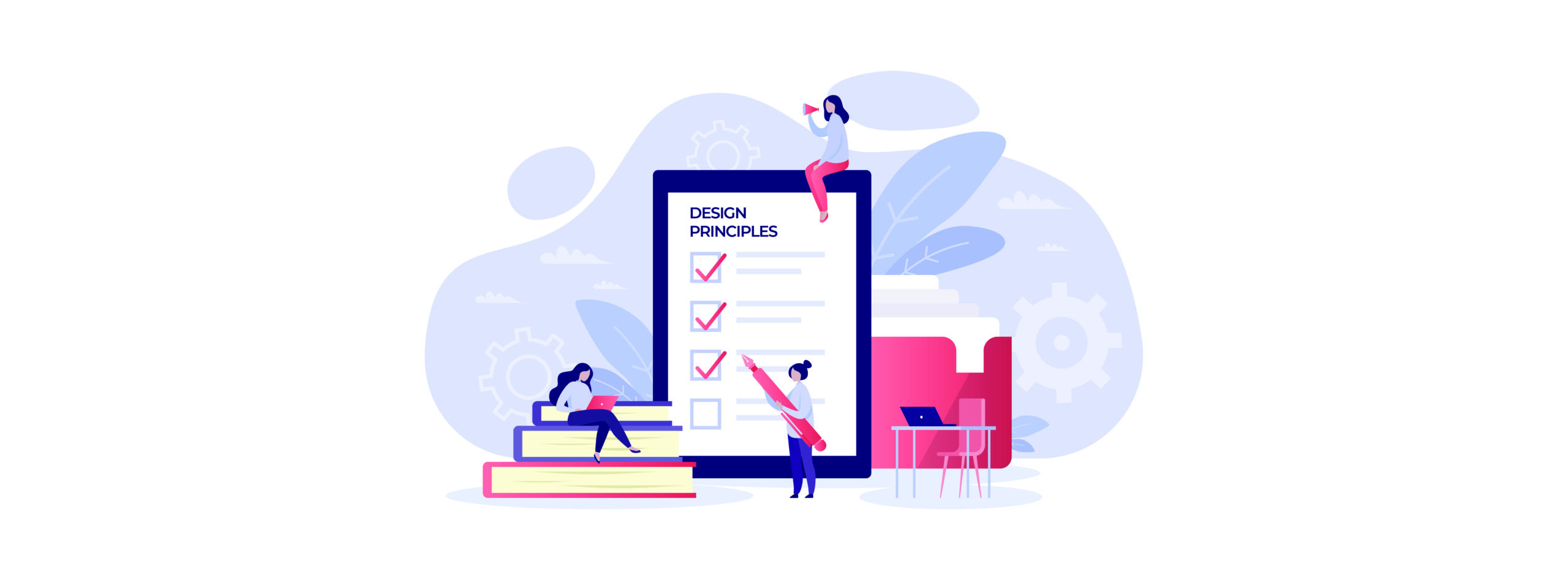
What makes a good design is that it conveys the message it’s meant to convey. It’s always good to have the following principles of design in mind when creating some things. You can better present what you need by focusing on different aspects. It would help further your goals if you understand what needs to be emphasized, understated, or, in some cases, repeated.
Here, we have 12 principles of design to help you better understand how it works:
1. Balance
Balance works by bringing two (or more) opposing concepts together harmoniously. Components of the visuals are arranged in a way that spreads the weight appropriately. It keeps the viewer’s eyes from focusing too much on one area and lets it wander around. There are two types of balance, symmetrical and asymmetrical.
Symmetrical balance is when the elements are distributed evenly around the central focus of the visuals. Some web designers incorporate a symmetrical design by putting a focus in the middle- a logo, an important button, or the name of the company. A good example of this design is the Big Hit website. It starts off clean and makes you focus on its mission statement: Music and Artist for Healing.
Asymmetrical is when the elements are not evenly spread and might possibly lean on one area more than the others. Despite the unequal distribution, balance is still achieved. A good example of this design is the SM Entertainment website. It automatically presents you with an artist they are promoting, heavy information on one side with a picture of her on the other. As you go lower, they continue this pattern.
2. Contrast
With balance, you bring elements together and create a sense of equality. However, with contrast, the differences are highlighted and made to stand out. Designs like this are often striking to the eyes and create a way to focus on a specific area- not necessarily the center. Contracts create an exciting dynamic that makes the viewer click on the site and check it out.
Wes Anderson movies are usually good visual representations of contrast in colors. Despite the clash in colors, he never makes it feel garish or ugly. In the case of the Grand Budapest Hotel, you’re automatically drawn to the movie’s color scheme of pink, moss green, red, and violet. They’re striking against each other and push a feeling of excitement.
3. Emphasis
Emphasis needs a focal point, this is where the attention of the viewer should be at. Three things are important when creating the focal point: dominance, sub-dominant, and subordinate. Dominance comes in the form of the very object you should be focusing on or otherwise known as the focal point. Sub-dominant is the secondary objects of the visuals and the subordinate are the ones with the least “weight” (usually this refers to the background).
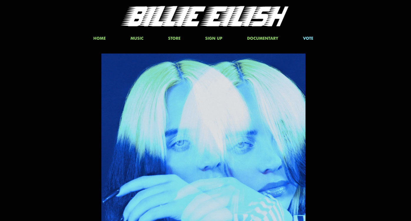
Even though simple, Billie Eilish’s website exhibits dominance, sub-dominant, and subordinate in a straightforward manner. The picture of her in the middle edited to highlight in bright neon colors draws your eyes automatically. The sub-dominant part of the site is the menu on top in basic green color while the black background is the subordinate.
4. Movement
By the name alone, the concept behind the movement is the idea that you create a “flow” in your design. Your eyes follow a direction that can lead you in any direction the artist chooses. Elements like lines, shapes, colors, or light – among other things- are used to create a sense of direction that will make the viewer go on a journey of sorts. In a way, there is a story that needs to be told and you are being silently narrated by the creator of the visuals.
5. Hierarchy
Hierarchy is, as the name implies, is the arrangement of visual information by the degree of importance. It usually comes in the form of a pyramid with the top usually reserved for key information while the bottom holds other details that may not be as urgently needed.
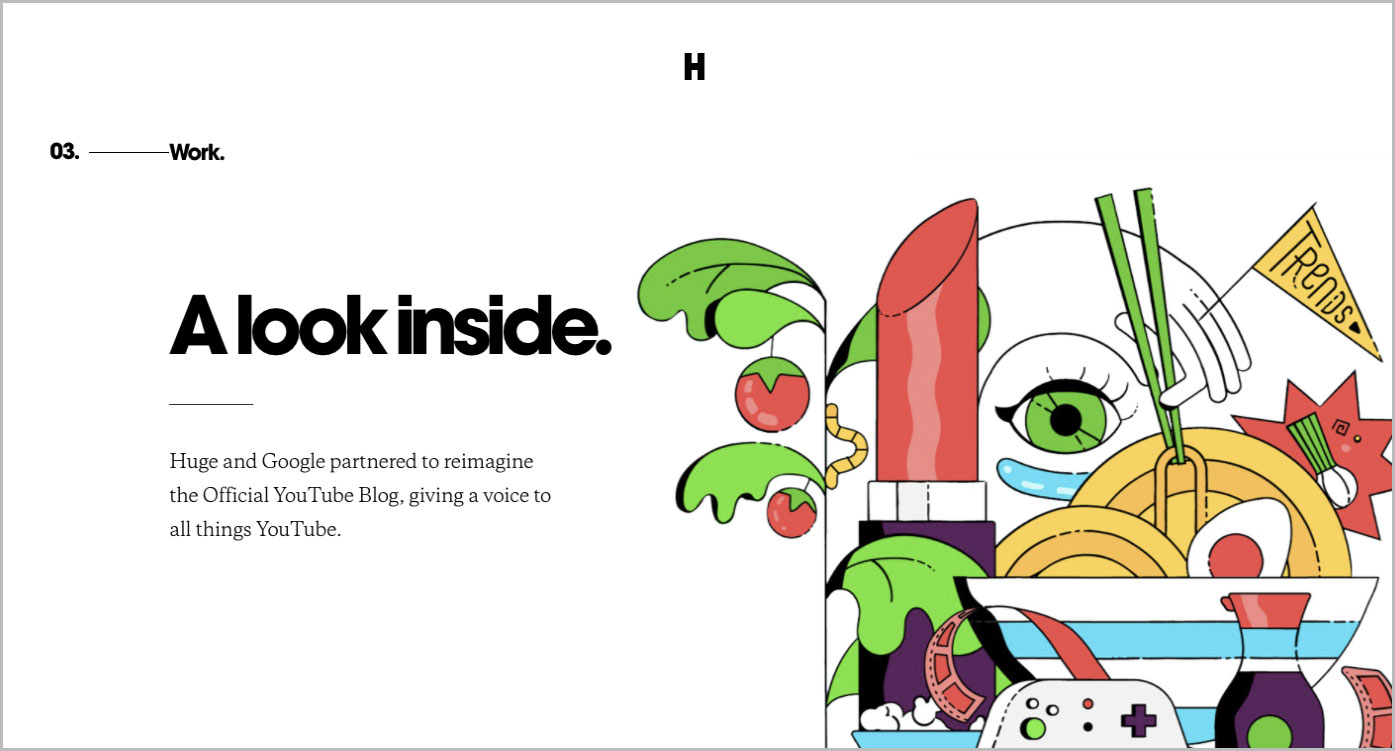
A good web design example is Huge Inc’s site. It practices good visual hierarchy, setting important information in larger font sizes so you are directed to read them first, then the other lines are in smaller font sizes so as not to get the attention and steal interests from the important information and visuals.
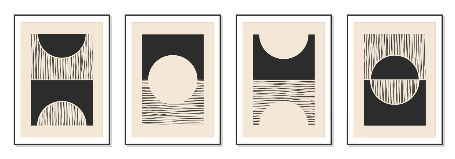
6. Pattern
Patterns are visuals arranged in a repetitive manner that results in a “whole”. The visuals can come in the form of shapes, lines, or colors just as long as they create a cohesive motif. Good examples of pattern designs are usually applied to carpets, textile, and wallpaper. They are not just simply repeating something over and over again.
7. Repetition
What is the difference between repetition and pattern? In patterns, the repeated imagery would usually result in a form of a cohesive piece however with repetition. However with repetition, you are only repeating an object over and over again, it doesn’t necessarily produce a “look” or a “piece”. It can be boring or ugly nonetheless, repetition serves an important albeit subtle function: making it unforgettable.
Certain companies apply repetition by using the logo as a background or make use of a floating menu that travels with you as you go up and down on the site. You’re constantly looking at the name of the company and eventually have it stick to your mind.
8. Proportion
Proportion is the parallel relationship among the elements in a piece or composition depending on the color size, degree, etc. Proportion serves the purpose of creating the feeling that there is an order among the elements and that it has visual constructions. It can be split into two, harmonious and unbalanced proportions. Harmonious proportion occurs when the elements are in order and in proportion. Unbalanced proportion, on the other hand, happens when disarray or disproportion is either present or forced.
9. Rhythm
As rhythm creates space between sounds in music, so does it create divisions between the elements in the design to create a pattern.
Just like in music, visual rhythm can be sharp, flowing, regular, random, progressive, and alternating. Regular rhythm as if the space between elements are even and the same. The flowing rhythm gives off the vibe that you’re moving through bends and curves. Progressive rhythm is always changing and repeating, random rhythm does not have anything that is constant and is entirely aimless, and alternating rhythm has a whole topic to itself as it utilizes a set of patterns.
10. Variety
Variety is that which makes up the amalgamation of the different elements in a complex or sophisticated relationship, using tools like lines, values, texture, hue, etc. Variety works well with unity and is often used to make certain aspects or areas within a piece interesting, using contrast and proximity to its advantage.
An artist can then position these different elements either near or far from each other, adding all kinds of shapes, geometric and organic, to create variety.
11. Unity/Proximity
Unity is what brings together the different elements of your piece to create a dynamic relationship with each other. It is important to bear in mind the outcome of the piece so you can choose the elements to work with, helping to deliver your message better.
The idea of proximity works on the distance that these unified visual elements should have between them, and/or how they are put together if they are unrelated. The closer two objects in a piece are means that they have a kind relationship and often become one unit, this helps you give organization and structure to a piece.
12. Alignment
Alignment is the allocation of visual elements so that they can align or straighten up a piece. Alignment is used in design to group and organize the elements of art so they form structure, balance relations, dishing out a clear outcome
Alignment is the unseen line that keeps the visual elements in order, as opposed to them being in disarray, achieving the look and feel of a piece the artist intended for it to convey.
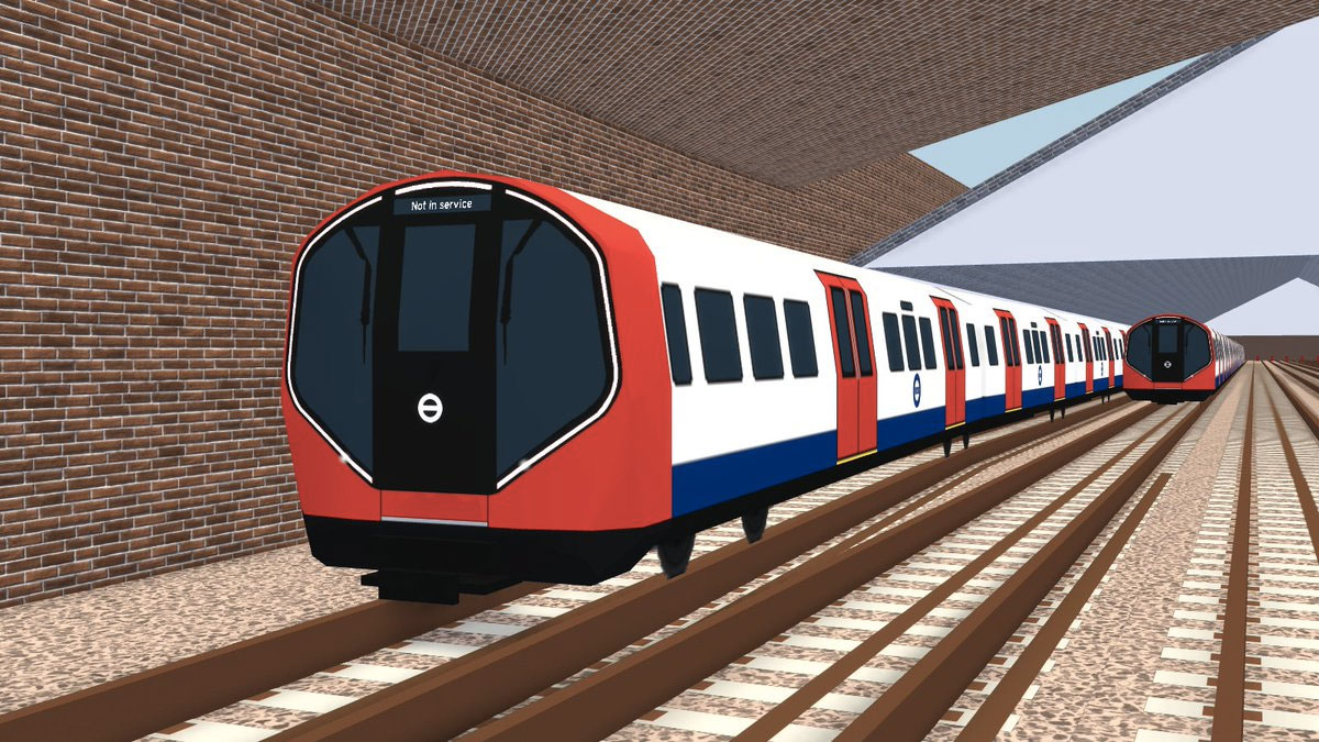
Informational websites are often like this. Take for example the website for London’s Official for their trains. The information you need is all in order and can be accessed easily. It’s upfront, linear, and in an order that doesn’t leave room for confusion.
What Other Things Make Good Design?
It is undeniable that times have changed, and with it, the timeless adapt with it. Art and design may have changed with the times, with artists coming up with something new and unique every generation. However, the elements and principles that govern them remain the same, they still remain the commandments of the field.
As timeless as those elements are, there are others that make up the alternative elements and principles of art and design in the 21st century. Dieter Rams, a German industrial engineer teaches us that design should be able to innovate and make useful products. It should be aesthetic and understandable at the same time; it should be unobtrusive, honest, and lasts long. It must be thorough and should be environmentally friendly. Most especially, it should involve as little design as possible.
Your Turn…
Now that you already have a good understanding of the elements of art and principles of design, it’s time to apply and put these visual communication principles into practice. There are many online tools that allow you to create professional-looking visual content for your marketing and social media campaigns – even if you don’t have advanced design skills. You can try one for free here.
Upload & Edit Your Image
Latest