Graphic Design: Color Gradient Guide
A bad gradient sticks out like a sore thumb from a mile away.
A gradient might look initially stunning by itself, but the moment you drop in some font combinations and icons, the whole layout suddenly becomes questionable. The next thing you know, you’re slapping on a safe, default gradient, or worse, wonder if you should just scrap the entire thing.
If the struggle seems familliar to you, then keep reading. This guide will help you answer the following questions and then walk away with tips you can use today.
- What are color gradients?
- How to make gradient-based designs effective?
- How to choose the right colors for your gradients?
- What are the best tips for applying gradients in design?
- What tools to use?
And more…
What are color gradients?
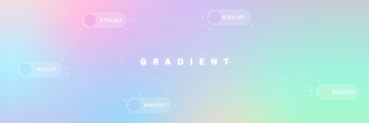
Color gradients are the gradual blending of two or more colors.
This digital technique mimics the natural shifting of light, characterized by a fluid and cohesive progression of color values, where one color fades into the next without interruption.
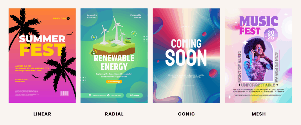
Gradient types can be:
- Linear, where colors flow in a straight line
- Radial, which creates a soft, circular glow outward from a central point
- Conic, responsible for the swirling effect around a center point
- Mesh, a free-flowing blend of colors with abstract transitions
The absence of harsh lines in gradient-based designs sends a message of harmony, leaving the viewer with no time to notice a visual disconnect. With a more nuanced emotional palette, your message is more likely to land exactly as intended.
Question: Do I need to master gradient creation?
Yes. For graphic designers, mastering gradients is essential because it lets you control mood, depth, and focus.
Having the ability to control these with precision of gradients will help you turn your visuals into a more dynamic and purposeful design. This skill not only enhances creativity but also ensures to make designs more professional, memorable, and impactful.
What makes a gradient effective?
1. When it serves a purpose
Aesthetics are important, but gradients should mainly enhance a story and must serve a purpose.
Use the various colors of the gradient to guide attention, set emotional tone, or reinforce branding. If a gradient doesn’t support hierarchy, emotion, or brand identity, it risks becoming decoration instead of design.
2. When you only use few colors
Stick to about 2–3 colors max. Too many = messy.
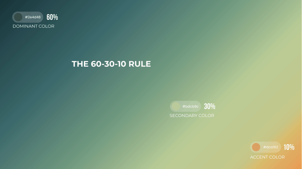
Follow the 60-30-10 rule when creating a gradient where the prominent shade occupies 60% of the colors, followed by 30% as the secondary color, and 10% as the accent color.
3. When the transition is seamless
Smooth, natural blending beats harsh, abrupt changes.
As a simple guide:
- Use linear gradients for structure (headers, buttons).
- Use radial gradients for spotlight effects.
- Use angular gradients for experimental, modern looks.
4. When combined with flat elements
Balance gradients with flat colors, clean typography, or geometric shapes. This contrast prevents the design from feeling overwhelming.
5. When it’s played with transparency and overlays
Gradients over photos or textures can unify branding. Example: a purple-to-transparent overlay on product shots can add depth without being overpowering.
6. When tested across different mediums and devices
Gradients look different on print, web, and mobile. Check accessibility (contrast ratio!) to make sure text is still readable.
Question: What’s the 60-30-10 rule in terms of gradient design?
This suggest the use of three colors to achieve a harmonious and balanced design:
- 60% dominant color which serves as the foundation,
- 30% secondary color to provide balance and contrast, and
- 10% accent color to add a pop of vibrancy
How to choose the right colors for your gradients?
Tip #1: Understand the Psychology of Gradient Colors
Design principles tell us that colors carry unique psychological meanings. While a careful transition from muted colors carries an air of tranquility and sophistication, a sudden contrast in a gradient background is often associated with a youthful, vibrant energy, most likely to attract younger audiences.
Instagram’s signature color gradient, for example, borrows hues from the warmer end of the spectrum (bold pink, orange, yellow), which subtly taps into our high-energy emotions and, in turn, makes us more inclined to engage before we miss out on something important. Purple whispers progress and reinvention, pushing a modern appeal. The smooth interplay between warm and cooler shades isn’t random; it’s a visual trademark that leaves an impression long after the first glance.
Read more from this series:
Tip #2: Design Gradients with Intent (Hue, Saturation, Lightness)
Start with your brand’s primary hue, then choose a partner that aligns with the goal: analogous for calm/consistency, complementary for energy/contrast. Keep the lightness curve smooth (LCH/OKLCH if possible) to avoid banding. For backgrounds, keep saturation ~20–40% for polish; push 60–80% only on accents or CTAs. Limit to 2–3 color stops and preserve readability—target at least 4.5:1 text contrast, or add a subtle 10–20% dark overlay under light text. Test in both light and dark modes and on low-end screens.
Tip #3: Find Visual Inspirations (Then Translate, Don’t Copy)
- From Nature
Build a swipe file from nature (sunsets, minerals, deep sea), brand systems you admire, and curated galleries. Screenshot, then annotate: emotion, temperature (warm/cool), number of stops, angle, and perceived lightness. Recreate promising references with your palette using HSL/OKLCH so the transition feels even; adjust saturation ±10–15 to fit your voice. Convert to grayscale to check value balance, preview on mobile/desktop, and A/B test hero vs. CTA usage. Inspiration is the spark—translation to your brand is the craft.
- From curated gradient palettes
You can always hunt for nice, curated color gradients before you lose all the motivation. Visit design sites like Dribbble, Behance, or even Pinterest to find inspiration for your next project.
- From Gradient Galleries
If those aren’t enough, feel free to take inspiration from a wide array of gradient galleries online.
First up is uiGradients, a handpicked selection of gradient choices available for anyone to use. It contains over 260 linear gradients, complete with CSS and hexadecimal codes, with the option to download a .JPG version. To top it all off? You can get everything for free!
Color Hunt is another quick and ready-to-use tool for people who find that manual experimentation just won’t cut it. It offers diverse options for different contexts, made easier to navigate by an intuitive interface. Just scroll, select, and apply the perfect gradient color palette to your design.
How do we take gradient inspiration from existing designs without copying them?
Study the principles behind the design, not the exact colors or patterns. Notice how gradients set mood, create depth, or guide focus, then reinterpret those ideas using your own palette, brand context, and story.
This way, inspiration becomes learning while originality ensures respect for the creator’s work.
Practical Tips for Applying Gradients in Design
Here’s how you can effectively apply color gradients in different fields:
Web & UI Design Applications
- Utilize a soft, gradient background in landing pages for a minimal yet memorable first impression.
- Incorporate high-contrast gradient buttons for intuitive navigation.
- Maximize color transitions in differentiating the sections of the website.
For better readability, avoid fonts that blend into the gradient and add semi-transparent overlays if necessary for legibility. Make sure to check responsiveness in both web and mobile. Lastly, don’t forget to use gradients in moderation.
Branding & Logo Design
- For an upgrade, reuse existing brand colors and blend them into refreshing color gradients.
- Logos lose clarity in CMYK printing. Opt for a flat two-tone alternative for print materials.
- A white background is the perfect canvas for gradients; it keeps the colors in check while enhancing their appeal.
Print & Illustration
- Bright gradients draw attention, which are ideal for highlighting key points.
- Use the natural movement of gradients for carousel posts.
- Pair a light gradient background with dark, high-contrast typography to keep the message clear and intact.
Advanced Applications
- Harness the contrasting colors of duotone overlays to grab attention without the need for clunky visuals.
- Experienced designers can do gradient mapping to achieve custom designs that would not be possible with entry-level platforms.
Combining multiple gradient layers often makes for an immersive experience. Just remove the image’s original background with Removal.AI and start tweaking each layer’s opacity.
Creative Color Gradient Examples
- Solar Flare
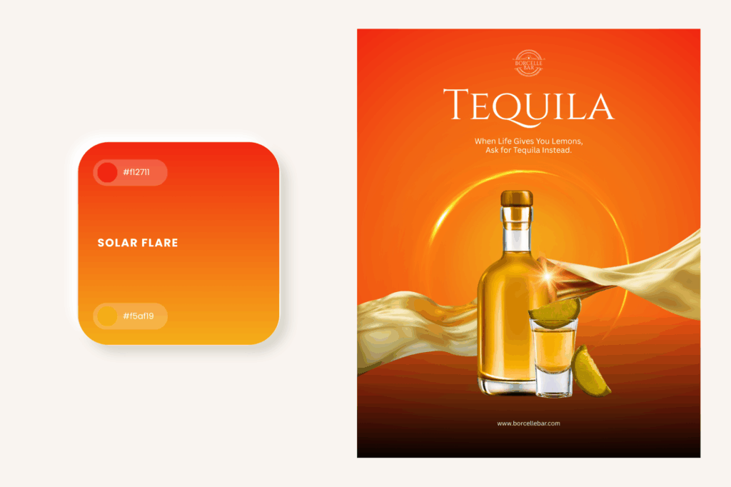
Best used in:
- Liquor and perfume branding to capture the warmth of alcohol and the passion of fragrance.
- Sports campaigns (e.g., activewear and energy drinks, to drive a fitness-first mindset.
- CTA buttons to elicit a sudden reaction.
Tips:
- Pleasing to look at with midnight blues and deep purples, like a sunset making way for the twilight sky.
- While it has its charm, it’s not a good idea to have a design drenched in warm tones alone without a cooler distraction.
- Aquatic Mirage
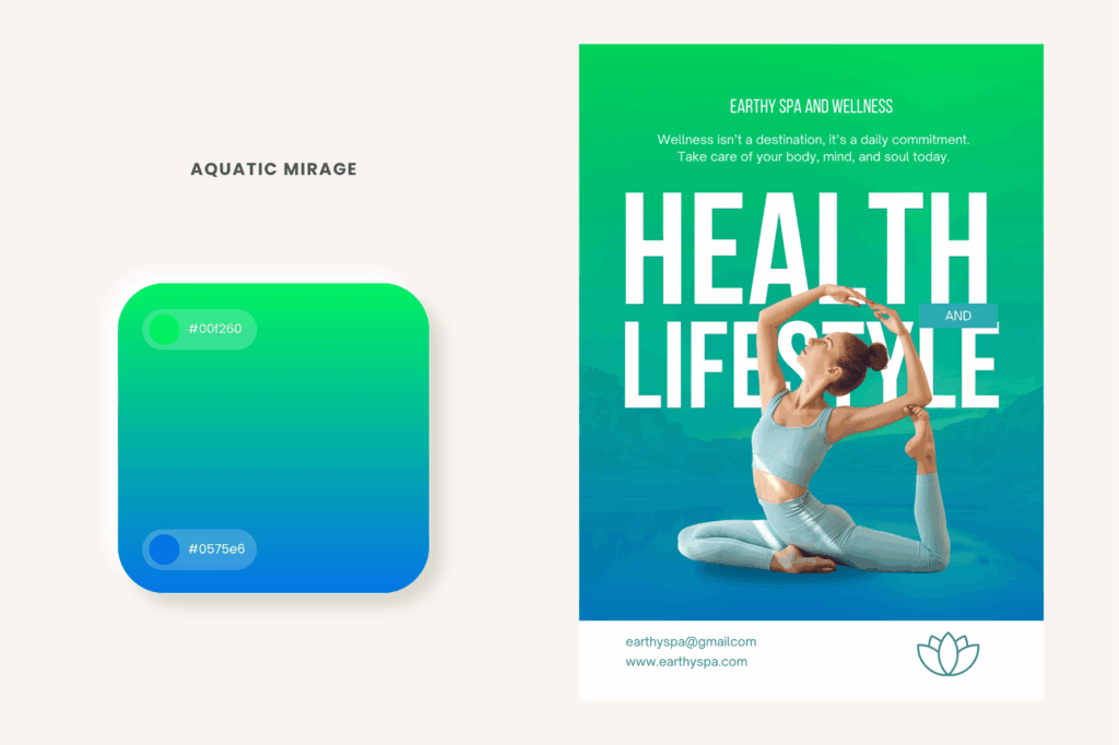
Best used in:
- Spa and wellness services associated closely with relaxation and comfort
- Luxury travel websites to mimic a luxurious experience usually out of reach
- Gaming and sci-fi design automatically imply simulated otherworldly realms
Tips:
- If your brand is on the fancy side, skip pure whites and adopt neutral supporting elements instead.
- Try Iridescent accents for water animation and other liquid elements.
- Steer clear of attention-seeking text of large sizes.
- Cosmic Dust
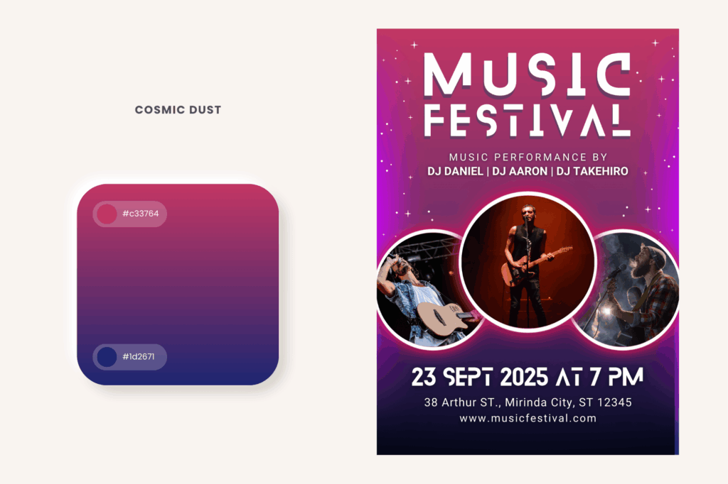
Best used in:
- Tech startups, for that cutting-edge, ahead-of-its-time vibe
- Nightclubs and festival promotions, transporting viewers to a different world
- Cosmetic packaging, an understated color combo that does the job
Tip:
- Make these colors stand out with metallics like silver and chrome. This naturally fits with VR experiences.
- Neon Pulse
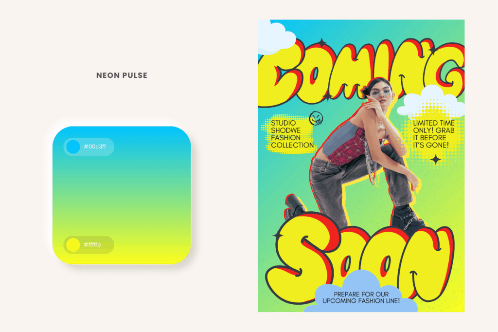
Best used in:
- E-sports branding, fueling the buzz of friendly competition
- Fashion and streetwear, see them come alive in trending running gear and footwear
- Fitness branding, painting a vision of gains and high-performance
Tip:
- These colors assert themselves best against a contrasting dark background, but be careful with conservative branding as it can be disconcerting and ineffective to look at.
- Marshmallow Whip
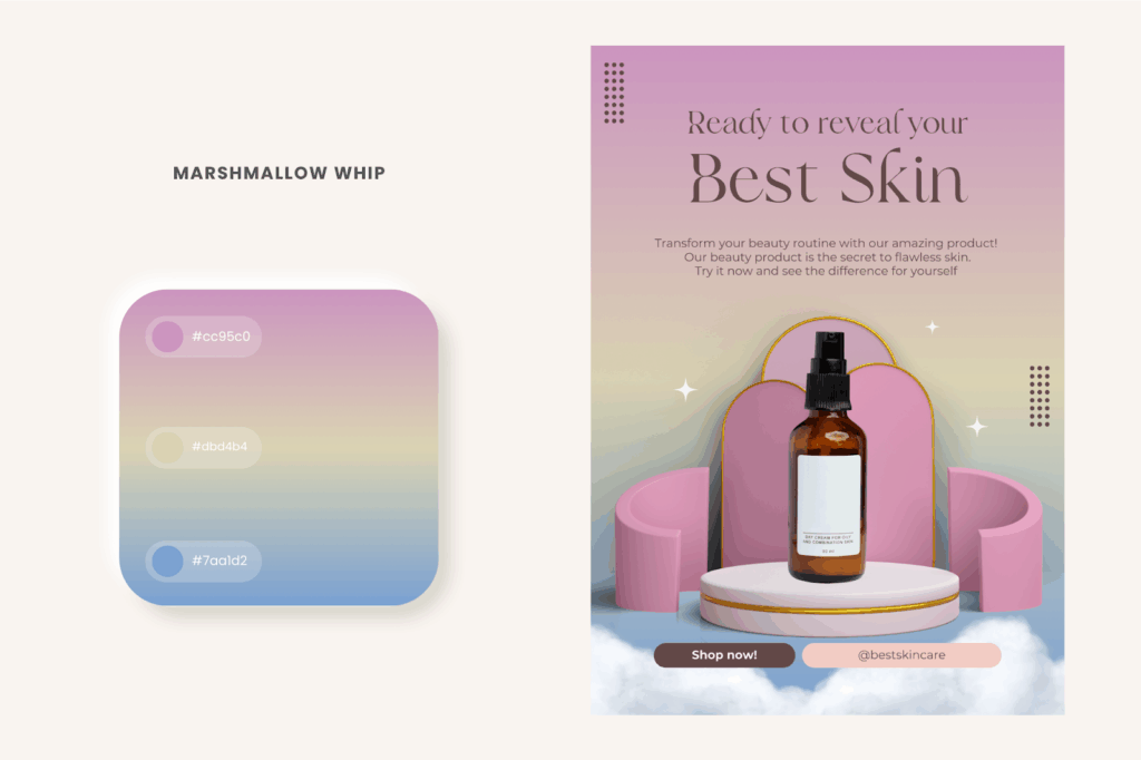
Best used in:
- Skincare and beauty communicating purity, gentleness, and self-care
- Wedding events adding a fairytale-like aesthetic for invites and backdrops
- Children’s branding nurturing a fun and whimsical aspect to book covers and toys
Tips:
- To preserve the airy atmosphere, avoid pairing with bold colors.
- Soft colors call for delicate handwriting – keep them open, light, and pleasant.
- Smoke & Mirrors
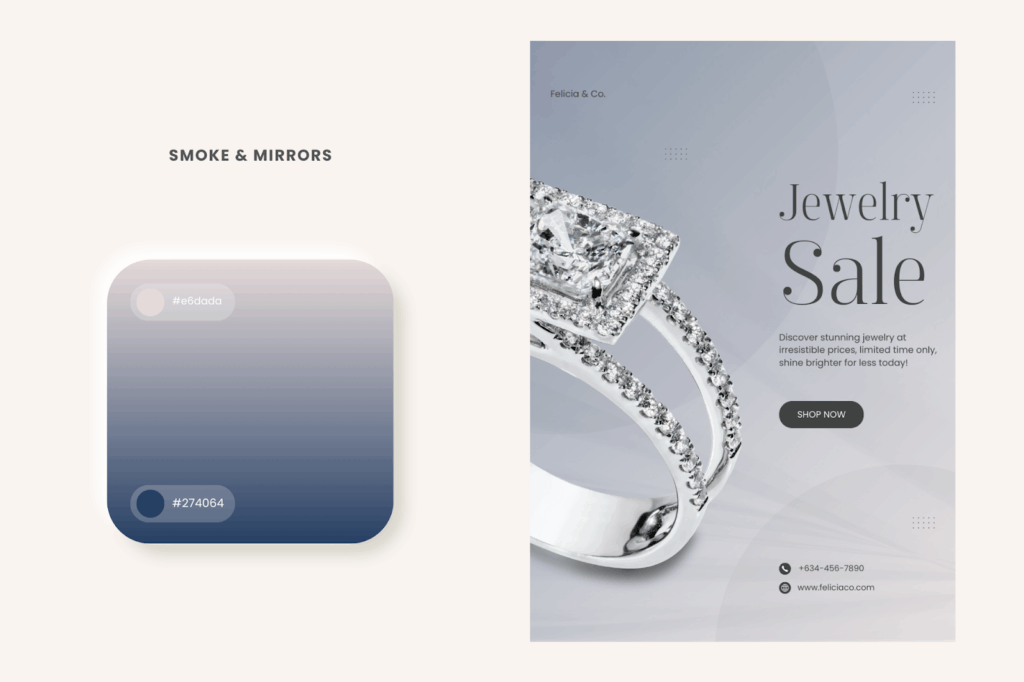
Best used in:
- Luxury branding where simplicity becomes chic without trying
- High-end photography monochromatic magic, in all its light and dark glory
- Corporate websites not a daring move, but definitely the right one
Tips:
- Professional layouts call for exquisite, intentional fonts. Choose slim classics.
- Keep the contrast between light and dark distinct to prevent dullness.
- Stick to two color layers at most.
- Sonic Glow
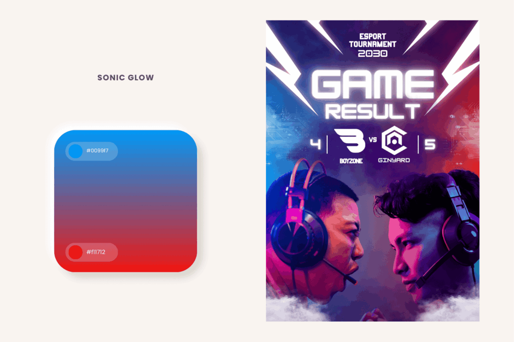
Best used in:
- Music and pop culture branding hit differently with culturally-attuned younger generations
- Tech startups and app UI when you want to project expertise without looking outdated
- Gaming and e-sports branding make teams look as sharp as they play
Tips:
- Avoid backgrounds (e.g., orange) on the warmer end, as this may dilute the energy in your branding
- Try it with motion graphics – there’s a reason why performers use red and blue in their stage lights!
- Angular, bold typography with metallic textures is recommended.
- Muted Meadow
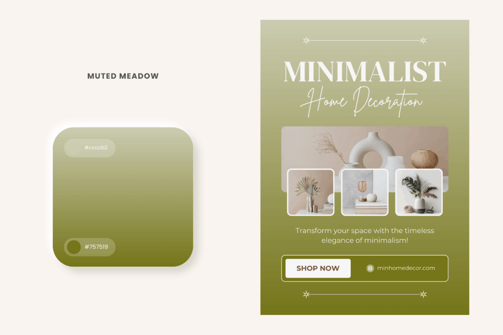
Best used in:
- Eco-friendly branding where nothing screams “I love the environment” more than earthy colors
- Interior design and home decor to wrap your space with neutral hues (e.g., Scandinavian furniture)
- Yoga and meditation apps which use grounded colors that allow you to slow down and step away from overstimulation
Tips:
- Stay true to your branding with textures lifted from nature and typography inspired by organic living.
- Images embracing natural light best complement this gradient’s organic appeal.
- Luminous Typography
Best Used In:
- Gaming and tech, ideal for product launches with a futuristic edge
- Movie posters, enhancing the impact of sci-fi and action films
- Streetwear fashion, nurturing a fun and whimsical aspect to book covers and toys
Tips:
- Make text stand out with a dark canvas. It’s best to remove the background from the elements first to stay clear of distractions.
- Keep the layout minimal and text size large – stick to one color gradient per word or line.
- Use in animated text effects for visually engaging social media posts and video thumbnails.
- Prismatic Swirl
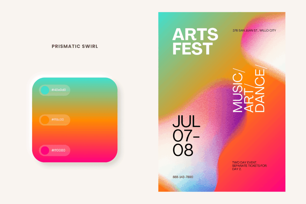
Best Used In:
- Design agencies and art collectives, transcending boundaries and uniting in artistic expression, no matter who you are
- Festival promotions, sensory overload in the best way possible
- LGBTQ+ branding, a statement color for advocacies of inclusivity (e.g., Pride Month campaigns)
Tips:
- Replicate the surreal dream-like quality with mesh effects.
- Sharp text overlays are discouraged so as not to take away the spotlight from the gradient.
- If backgrounds are necessary, inject a secondary neutral color.
Pro tip before diving into these gradient styles: use Removal.AI background remover to strip away the image background and see how each gradient truly interacts with your subject.
Why it works: It primes designers to preview gradients in isolation, aiding decision-making.
Tools & Resources for Creating Gradients
Online Gradient Generators
CSSGradient.io is a free gradient generator that allows you to create your own website backgrounds with a provided CSS code. From there, you can input your desired hex codes, adjust RGB values manually or with a slider, and choose between linear and radial layouts.
It also performs similarly with the Coolors Gradient Maker, but without the option to randomize designs.
Design Software & Plugins
The advanced customization techniques of Photoshop’s Gradient Map let you tweak midpoints, blend modes, and opacity stops freely, while Illustrator’s Gradient Mesh Tool aids with complex multi-point blending to truly make a design your own. Another is Figma’s Angular Gradient tool, helping you simulate lighting effects for dynamic, 3D-like transitions.
CSS Implementation
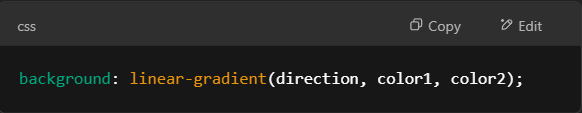
A linear gradient creates a progressive transition of two colors in a straight line (top-to-bottom, left-to-right, or at an angle).
Here’s the basic syntax:
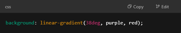
And here’s what a purple to red gradient tilted at 38 degrees will look like in code:
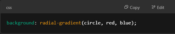
Meanwhile, a radial gradient expands from the center and follows a centered circle structure by default:
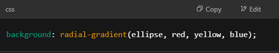
For an elliptical shape, it will look like this:
Additional Resources
These resources provide easy access to the best color gradients for your designs. Here’s some more curated libraries and generators to explore for inspiration:
Advanced Techniques & Future Trends
CSS Advanced Techniques
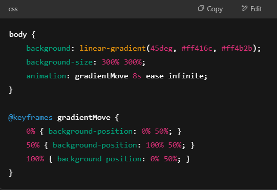
- Animation
- Experiment with shifting colors and moving backgrounds. Use background-size: <size percentage> to make the gradient larger than the viewport, and @keyframes to produce a looping sequence.
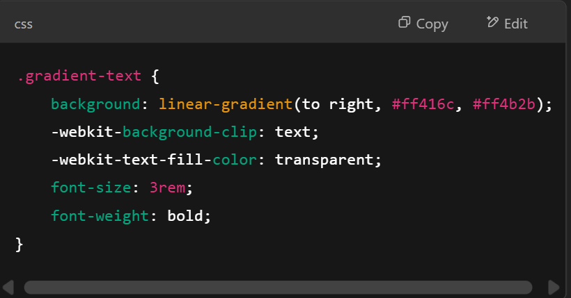
- Gradient text effect
- Use background-clip: text to turn the text into a mask and text-fill-color: transparent to hide the original text color and allow the gradient to appear.
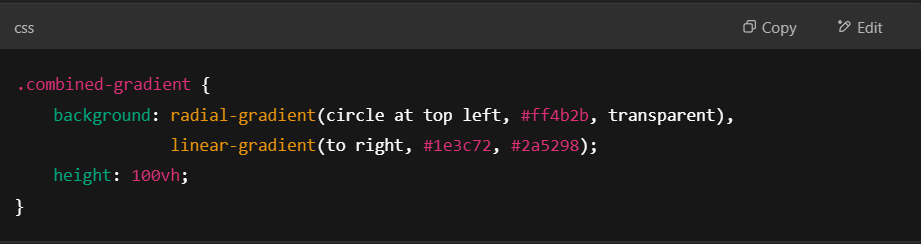
- Multiple layers
- Use commas to stack gradients for more complex designs (e.g., combining both linear and radial gradients)
Emerging Trends
The rise of organic and abstract design became apparent with the growing influence of AI-generated art. Outside conventional patterns, people are turning to complex fluid and abstract mesh designs for their unrestrained nature. Nice color gradients are adaptable, and developers are finding ways to create designs that feel more immersive.
While experts recognize the appeal of using color gradients for branding, it will ultimately depend on the context in which it will be viewed. Focal points draw attention and enhance the user experience. In this process, a gradient generator becomes an essential tool as more designers adapt with the times.
Conclusion
Color gradients hold attention longer because they communicate a sense of depth, energy, and movement pleasing to the eye that solid colors simply cannot match.
While design principles are universal, not all palettes are created equal. The best color gradients require more than just picking attractive shades, and oftentimes, a one-size-fits-all approach might not be a good idea when different contexts are involved.
Think of a gradient color palette as the GPS of your design. You might not realize it yet, but it starts telling your story the moment a viewer lays eyes on it. This silent yet powerful element is key to a brand that turns heads, not pages.
At the end of the day, it’s all about exploration. If you’ve tested out new color gradients, let us know what worked (or didn’t!). Drop a screenshot – we’d love to see your work.
Disclaimer: We do not own some of the images, videos, and content being shared on this page. Please note that some of the images, and videos we used have copyrights belonging to their original owners. No copyright infringement intended. If you originally owned the images, videos, and content we shared and distributed on our website, and do not wish to have your work published or distributed should make your wishes known to us. You can email us at hello@removal.ai. We will take your content down and never publish it on any of our pages.
Latest