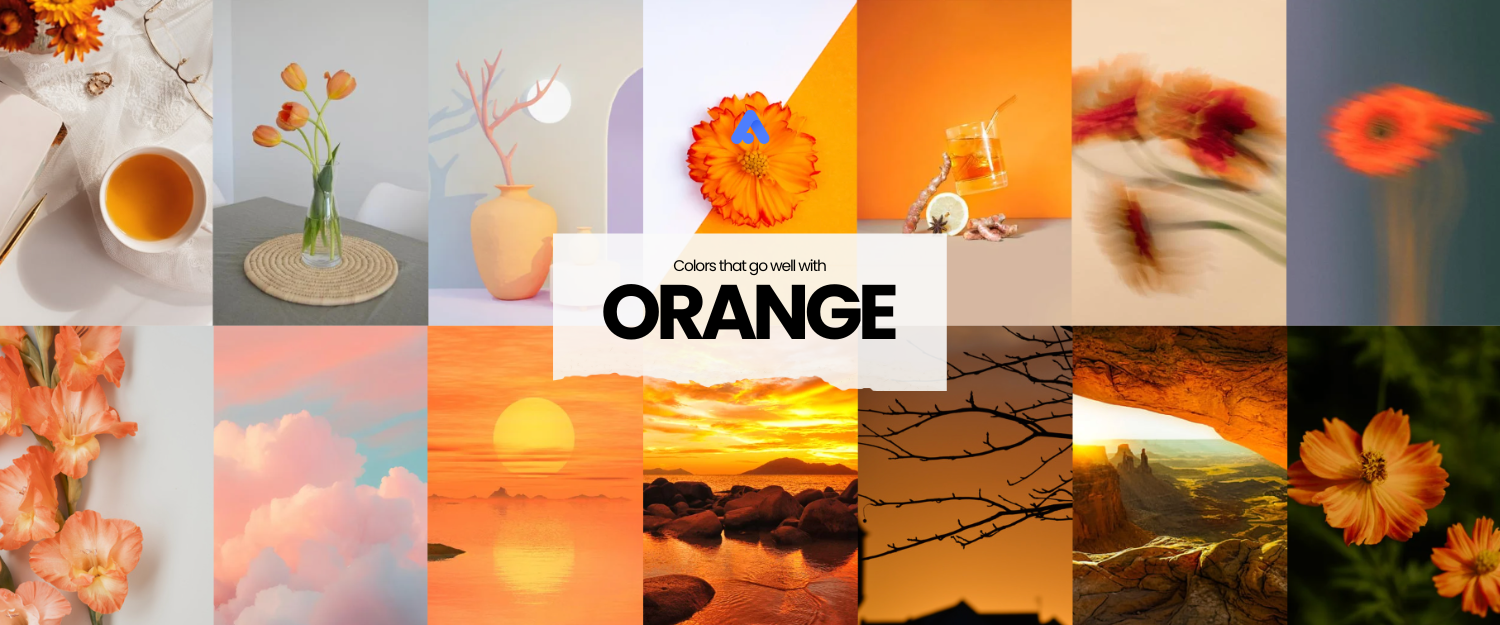
Design Inspiration: What Colors Go Well With Orange?
What would go well with the orange color to fit your next design?
Orange is a vibrant and dynamic color that is so powerful that it can significantly influence your design and branding. This color is stimulating and is effective in evoking feelings of energy, creativity, and warmth. When paired with other colors, it can bring life to designs and create environments with a strong psychological impact.
The Orange Color
The color orange was named after the fruit, which originated in Asia. It lies between red and yellow on the color spectrum. In digital design, it’s created by blending appropriate amounts of red and green light.
Properties of Orange
- Wavelength: Between 590 and 620 nanometers.
- Complementary Color: Blue.
- Psychological Effect: It represents optimism, enthusiasm, and attention.
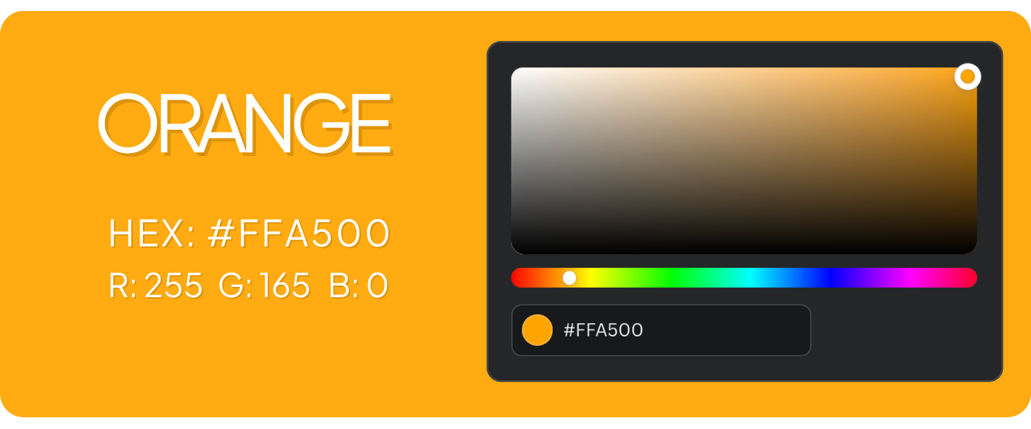
- RGB Notation: RGB(255, 165, 0)
- Orange Hex Code: #FFA500
Other Shades of Orange
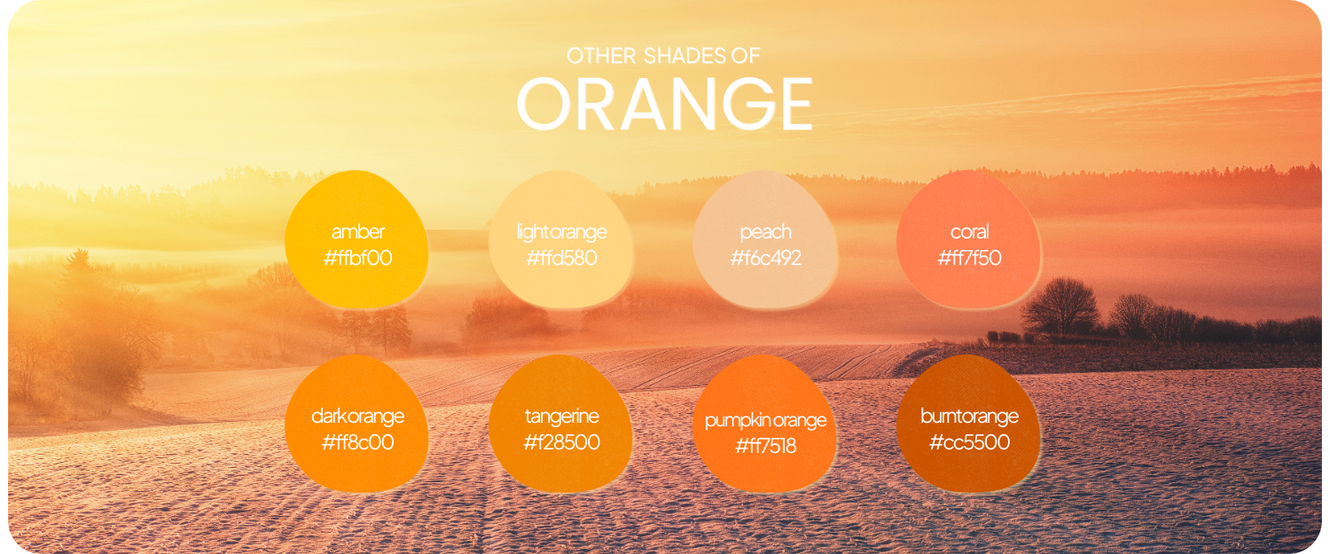
- Light Orange (#FFD580): A mix of orange and white, lightening the intensity to create a softer, pastel-like orange.
- Dark Orange (#FF8C00): A combination of orange with a touch of red or brown to deepen the shade, giving it a richer, more intense tone.
- Burnt Orange (#CC5500): Made by blending orange with brown or a small amount of black, resulting in an earthy, warm tone
- Peach (#F6C492): A soft shade produced by mixing orange with pink or white, creating a more muted, delicate tone.
- Amber (#FFBF00): A blend of orange and yellow, giving it a bright, golden appearance with a slight warmth.
- Tangerine (#F28500): Made by combining orange with a hint of red, giving it a slightly deeper, more vibrant appearance than standard orange.
- Coral (#FF7F50): Created with a mix of orange and pink, softening the intensity and adding a warm, slightly pinkish undertone.
- Pumpkin Orange (#FF7518): Produced by mixing orange with a touch of brown and red, giving it a warm, deep, earthy feel, perfect for autumn themes.
These variations of orange can be adjusted by altering the saturation, brightness, or adding other colors like white (to create a lighter shade) or black (for a darker tone).
What Colors Go Well with Orange?
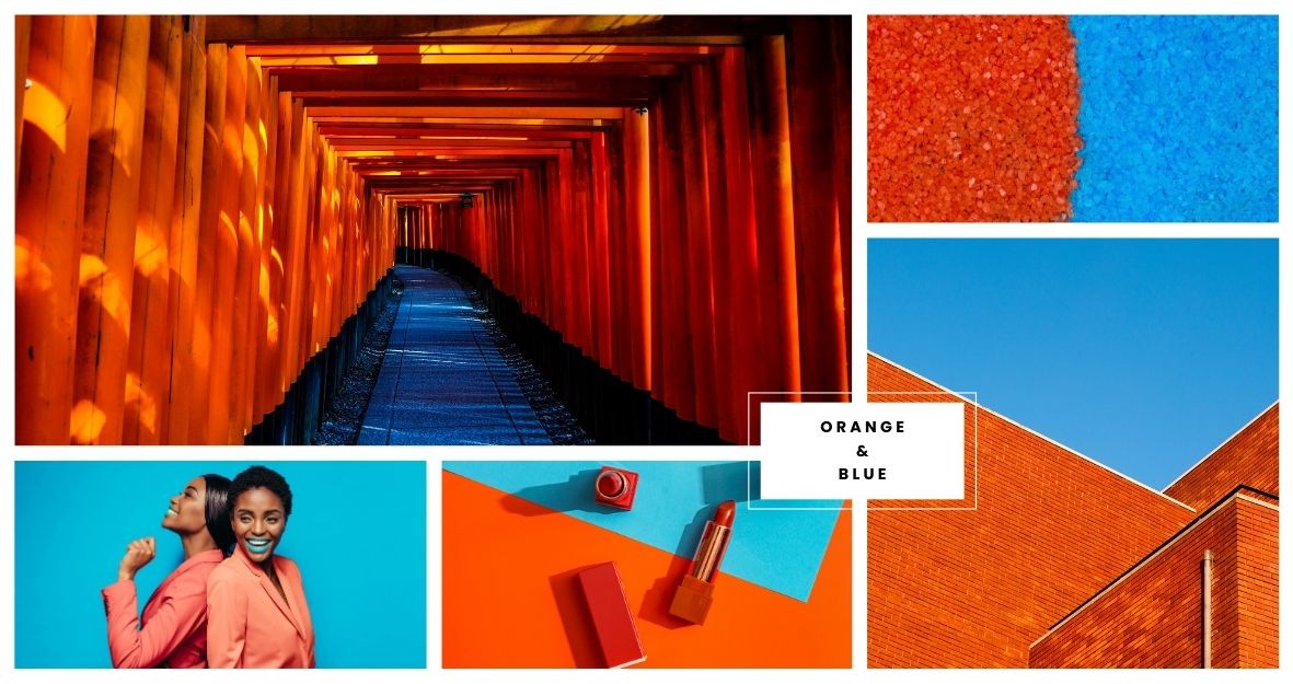
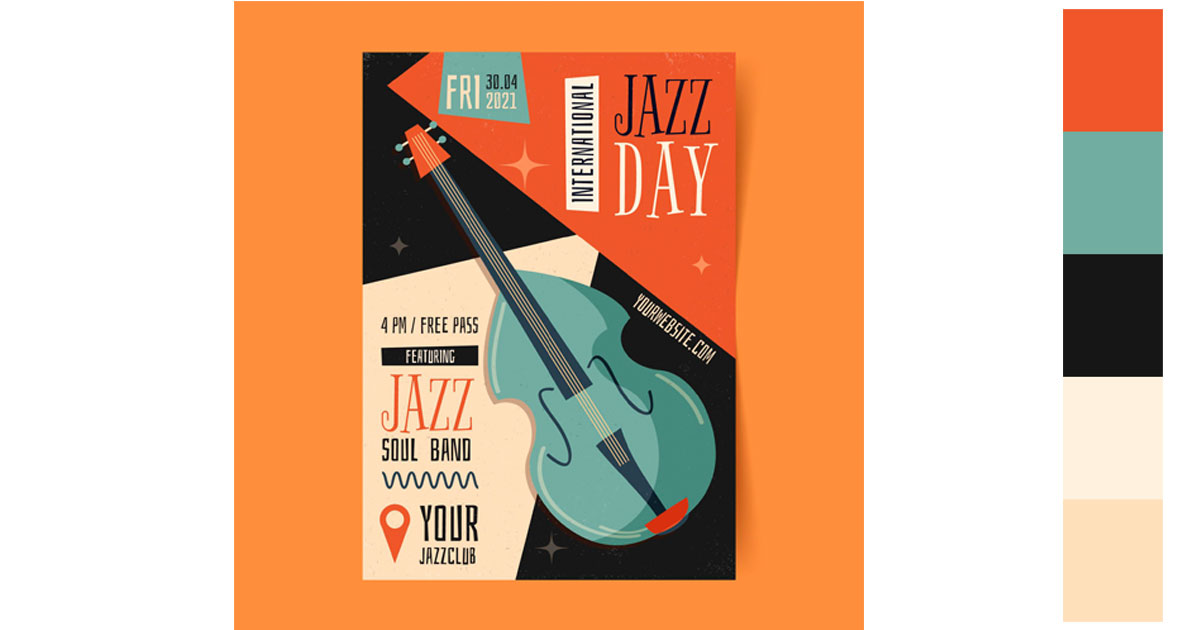
- Blue (stability and excitement): The complementary contrast creates a balanced, energetic vibe.
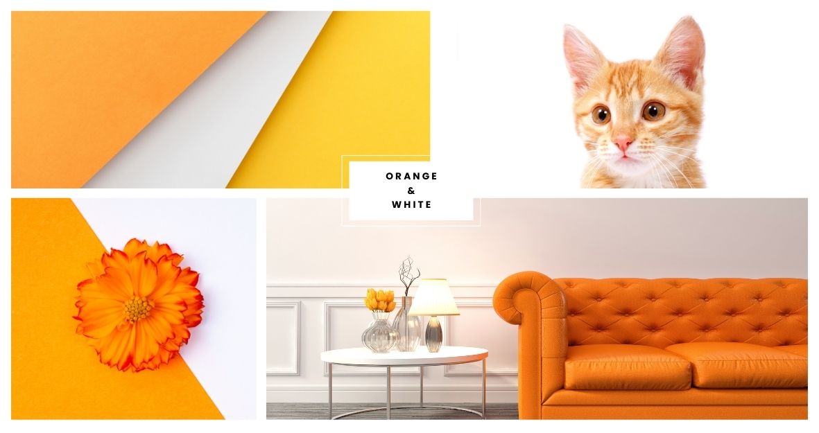
- White (freshness): Clean and crisp, it allows orange to stand out while feeling light and uplifting.
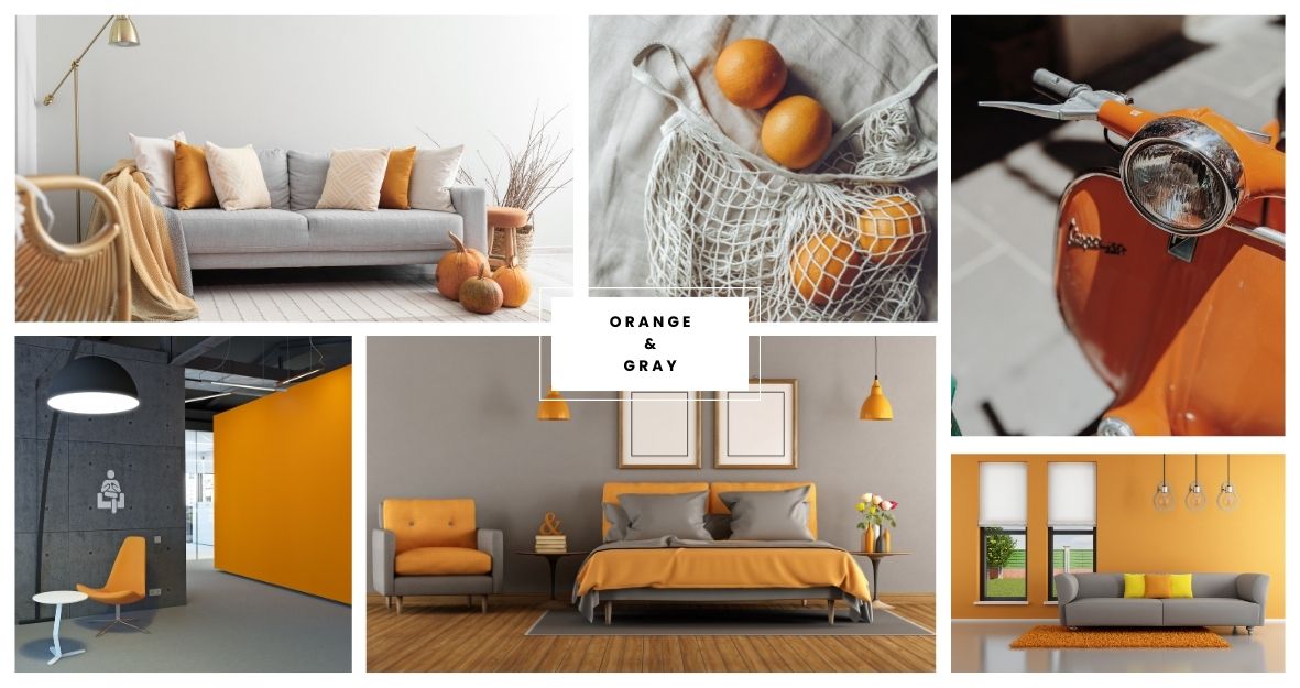
- Gray (sophistication): A sleek, modern pairing that adds calmness and refinement.
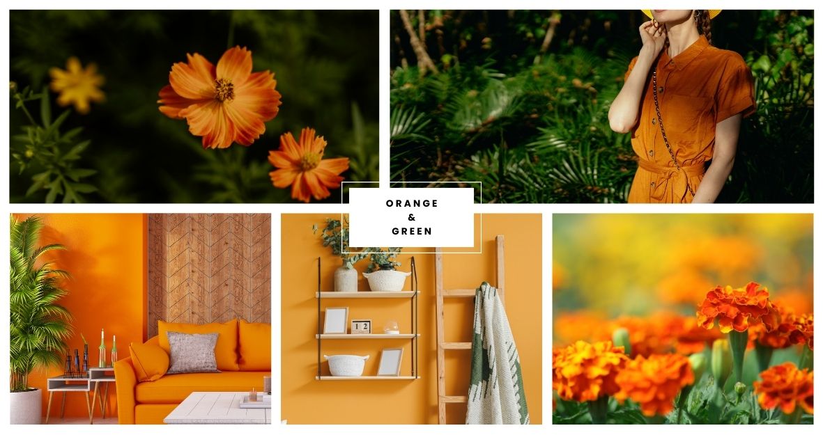
- Green (harmony and relaxation): Earthy and natural, it brings balance and a soothing effect.
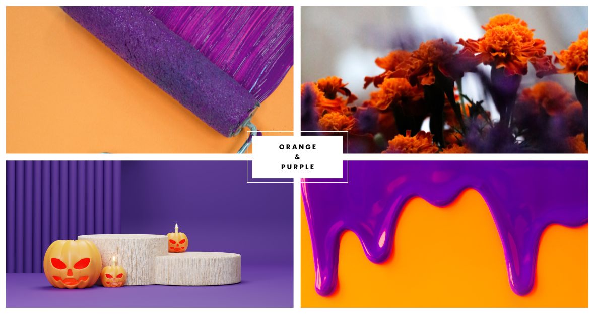
- Purple (creativity and confidence): Bold and vibrant, it evokes an artistic and confident mood.
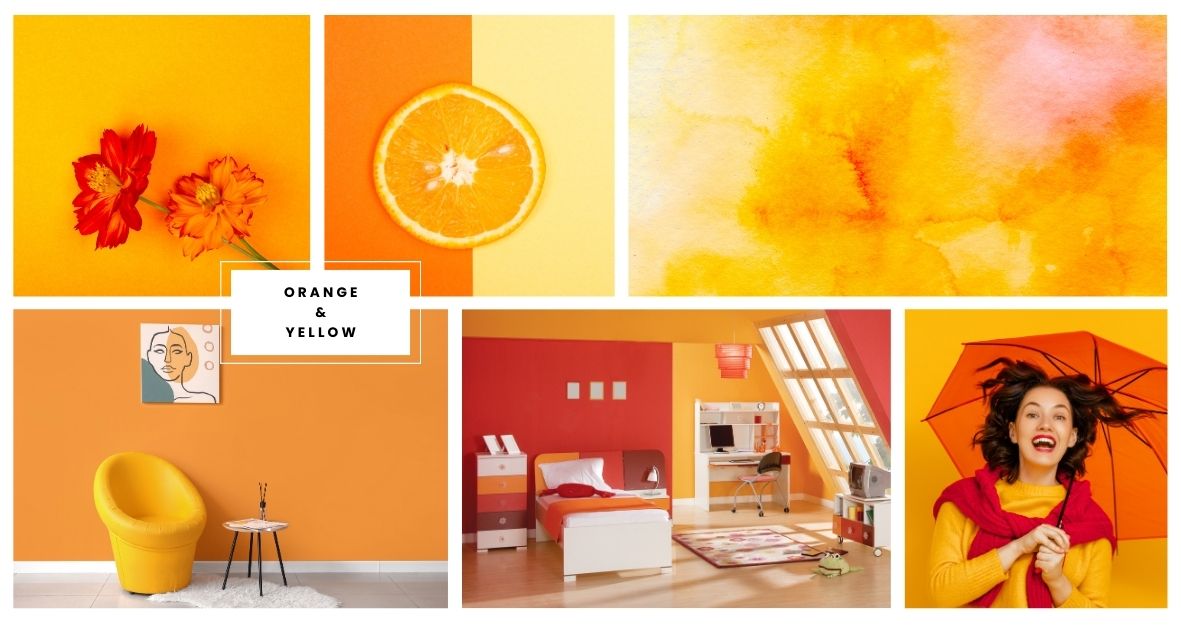
- Yellow (vibrancy and optimism): Enhances warmth and cheerfulness, making spaces feel lively.
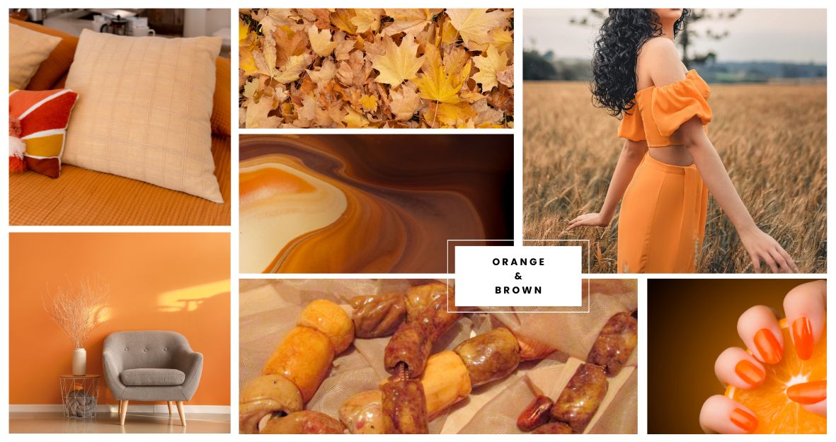
- Brown (coziness): An earthy combination that feels grounded and welcoming, ideal for comfort.
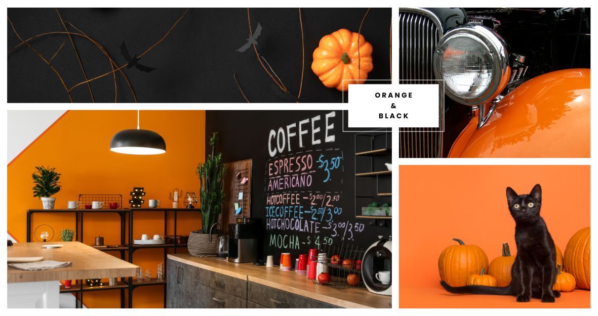
- Black (boldness and power): The strong contrast creates a dramatic, authoritative look.
How to Effectively Use Orange Color Combinations?
Once you have perfected the use of various orange color combinations, you can easily apply them to your projects.
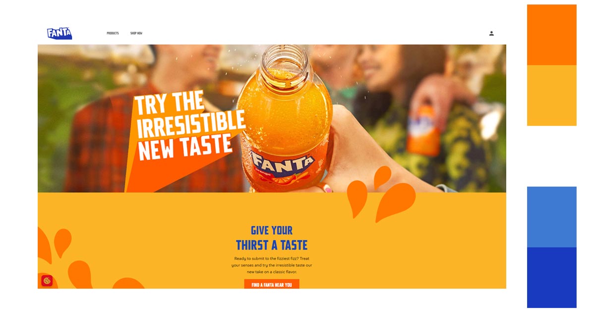
Website Design
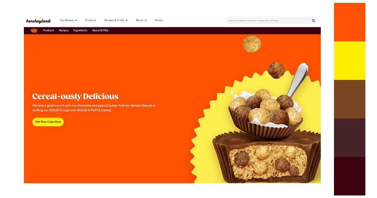
In web design, orange is a natural fit for brands in food, hospitality, and lifestyle because it radiates warmth and approachability. Pairing it with gray, brown, or yellow works well—but if you want your website to truly stand out, consider going beyond flat colors.
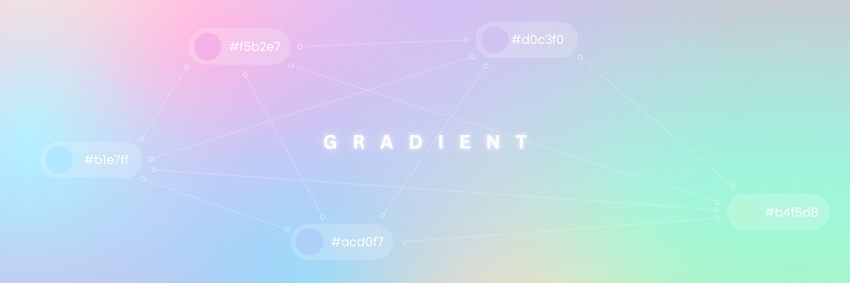
This is where gradients come in. Using gradients with orange gives your design a modern, dynamic edge that flat colors alone can’t achieve. They add movement, depth, and sophistication, making the user experience more engaging. Gradients also help highlight key sections of a page—like headers, backgrounds, or call-to-action buttons—without overwhelming the design. In a competitive digital space, choosing orange gradients allows your brand to appear fresh, contemporary, and visually memorable.
Photography
In photography, orange is excellent for creating vibrant images, especially when shooting outdoor scenes at sunrise or sunset, where it contrasts beautifully with blue skies. For portraiture, combining orange and brown tones warms skin tones, giving a natural, inviting look. Nature photography benefits from orange-green pairings to enhance the lushness of greenery, while urban photography pops with orange-black for bold, edgy images, ideal for nighttime shots or modern cityscapes.
Graphic Design
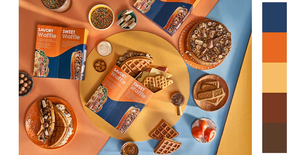
In graphic design, orange can effectively highlight key elements like buttons, icons, or text headers, especially on websites or social media graphics for brands targeting younger audiences. For designs with an eco-conscious or wellness theme, pairing orange with green reinforces a natural, vibrant feel. Seasonal promotions benefit from orange-brown tones for a cozy vibe, while orange with purple can create a bold, unique aesthetic, appealing to creative or fashion-forward brands.
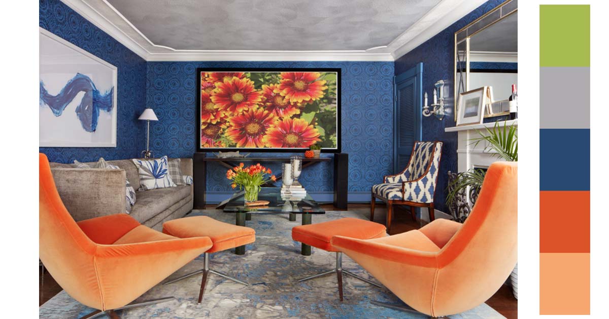
Interior Design
In interior design, orange brings warmth and energy to communal spaces like living rooms or kitchens. When paired with beige, it softens into a cozy, inviting palette perfect for relaxing areas. Orange and gray combinations are ideal for modern interiors, offering both vibrancy and sophistication, while pairing with green creates an energizing, fresh atmosphere for home offices or dining areas. Orange with black makes a dramatic impact, often used in accent pieces or statement walls for a striking visual effect.
Fashion Design
In fashion design, orange is popular for statement pieces that add vibrancy and confidence to an outfit. Paired with blue, it creates a bold, high-contrast look, ideal for standout items like outerwear or accessories. Orange and beige combinations bring a softer, casual feel, great for everyday wear. For fall collections, pairing orange with brown and yellow captures an earthy, seasonal aesthetic, while green-orange combinations convey an eco-friendly, natural vibe. Black and orange is a bold combination often used in streetwear, adding intensity and flair to edgy styles.
Each application of orange across these design fields enhances mood, draws focus, and reinforces brand personality, creating an impactful, memorable impression.
Tips when Using Orange Color Combinations in Design
What colors work well with orange to create balance or contrast?
Orange pairs well with blue for a striking contrast, gray for a modern, sleek feel, or green for a natural, earthy vibe. The right combination depends on the mood and style you’re aiming for.
How can I use orange to highlight key elements without overwhelming the design?
Use orange sparingly for CTAs, icons, or accent pieces to draw attention. Too much orange can overwhelm you, so balance it with neutral or cooler tones to keep the design focused and readable.
What colors pair best with orange for a balanced design?
Orange works well with blue for high contrast, gray for a modern and sleek look, and green for a natural and fresh feel. Each combination creates a different mood and effect.
What orange color combinations should I use for a warm and inviting atmosphere?
Pair orange with brown, yellow, or beige to evoke warmth and comfort. This is great for interiors or seasonal designs like fall-themed campaigns.
Is orange and gray a good combination for professional designs?
Yes, pairing orange with gray can create a balance between vibrancy and professionalism. This combination is perfect for modern websites or business designs that want to appear friendly yet polished.
How can I use orange with black for a bold, dramatic effect?
Orange and black create a strong, high-contrast design. This pairing works well for urban themes, bold branding, or nighttime photography where you want to make a striking visual impact.
What are the best color combinations with orange for fashion design?
For fashion, orange pairs well with blue for a bold, standout look, while orange with beige offers a more relaxed, everyday appeal. For fall collections, pairing orange with brown and yellow creates an earthy, seasonal vibe.
How does using orange with purple impact a design?
Orange and purple together create a vibrant, creative look. This bold combination is ideal for designs targeting younger or more artistic audiences, adding a fun, dynamic edge.
Use the Color Orange for Your Next Designs
Color is a very important aspect of our everyday life. It helps us communicate our ideas and emotions. It gives meaning to certain concepts and designs that make them more significant and powerful.
Do not be afraid to use color in your designs or in your projects. It could be a little bit overwhelming if you think about it. There are almost an infinite number of colors. How would you know which ones to use?
Try to remember, color communicates on an emotional level. We feel colors. We give meaning to colors. It would not be a bad decision to factor in how you feel when it comes to deciding which colors to use.
Orange could be a color you could start with. It is always nice to start your design with a dash of enthusiasm and joy. It also represents creativity and optimism. And, these two are the two things designers and creators need to carry throughout every project.
You might want to read more from this series:
- Design Inspiration: What Colors Go Best With Yellow?
- Design Inspiration: What Colors Go With Red?
- Design Inspiration: What Colors Go With Blue?
- Design Inspiration: What Colors Go With Black?
- Design Inspiration: What Colors Go Best With Green?
Disclaimer: We do not own some of the images, videos, and content being shared on this page. No copyright infringement intended. If you originally own the images, videos, and content we shared and distributed on our website, and do not wish to have your work published or distributed should make your wishes known to us. You can email us at hello@removal.ai. We will take your content down and never publish it on any of our pages.
Latest