What Colors Go With Green?
If you want people to feel refreshed and relaxed, then using the color green in your design is key.
Green is a grounding color. It instantly connects you to nature, balance, and growth. Every designer uses it to aim for freshness, renewal, or calm, but at the same time, gives out variance and energy when paired with the right colors.
The Green Color
The word “green” comes from the Old English word grēne, which is related to the German grün and Dutch groen. All of these trace back to the Proto-Germanic root grōni which means “to grow”.
It’s tied to the idea of grass, plants, and things sprouting—basically anything fresh and alive. So the name itself has always been linked to nature and growth.
In a technical sense, green is a secondary color created by mixing blue and yellow in additive or subtractive color models.
- RGB (light, digital screens): Green is one of the three primary colors, represented as (0, 255, 0).
- CMYK (print): It’s made by combining cyan and yellow inks.
- Wavelength: Green light sits around 495–570 nanometers in the visible spectrum.
It’s the color the human eye is most sensitive to, which is why it often feels clear and balanced.
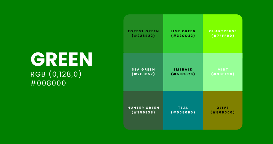
What are the different shades of green?
There are many shades of green, each carrying different vibes and technical codes. Here are some of them:
- Lime Green (#32CD32): Bright, energetic, often used for freshness and vitality.
- Olive (#808000): Earthy, muted, linked with peace and nature.
- Emerald (#50C878): Rich and luxurious, associated with elegance and gemstones.
- Mint (#98FF98): Soft, calming, with a fresh and clean feel.
- Forest Green (#228B22): Deep, natural, tied to stability and the outdoors.
- Sea Green (#2E8B57): A bluish-green, soothing and coastal.
- Teal (#008080): Balanced between blue and green, modern and versatile.
- Chartreuse (#7FFF00): Yellow-green, bold and attention-grabbing.
- Hunter Green (#355E3B): Dark and traditional, often used in uniforms or heritage branding.
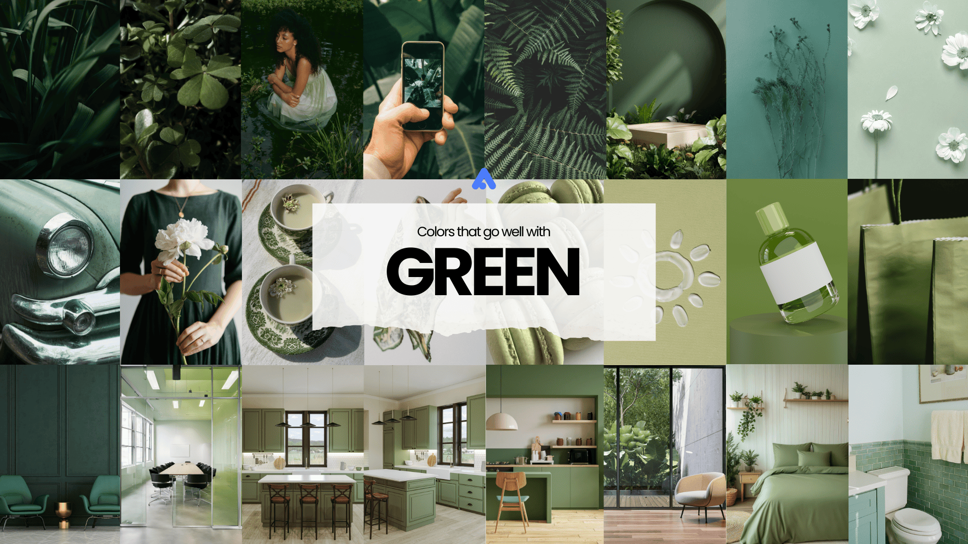
Colors That Go Well With Green
- Green and White: Clean, crisp, and refreshing. This combination creates a minimalist and modern look that is both serene and sophisticated. Ideal for creating a fresh and airy atmosphere in designs.
- Green and Brown: Earthy, natural, and grounding. The brown tones complement green’s natural feel, making this combination perfect for designs inspired by nature and organic materials.
- Green and Yellow: Vibrant, cheerful, and energetic. This pair brings out a lively and optimistic feel, reminding us of spring and growth. Great for creating a bright and uplifting ambiance.
- Green and Blue: Calming, trustworthy, and balanced. These adjacent colors on the color wheel evoke a sense of tranquility and harmony. Ideal for serene and peaceful designs.
- Green and Pink: Playful, romantic, and lively. The contrast between green and pink adds a touch of whimsy and charm, making this combination great for fun and engaging designs.
Application: The Effective Uses of Green Color Combinations
E-Commerce
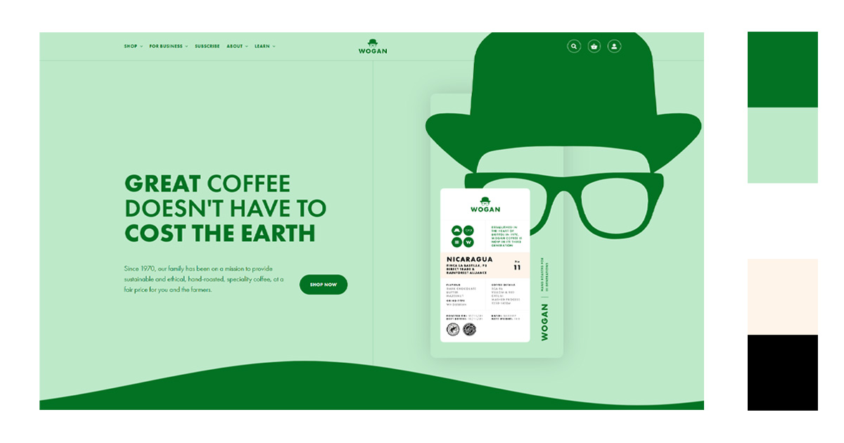
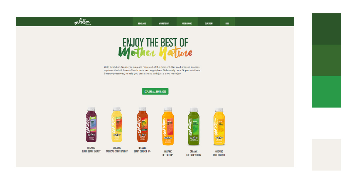
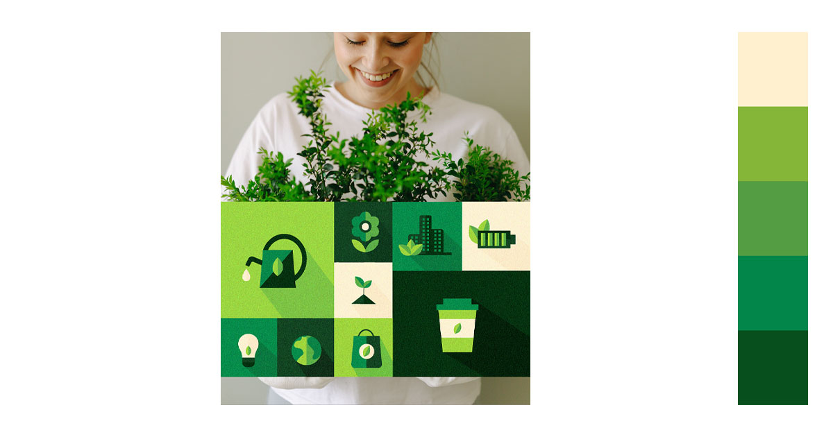
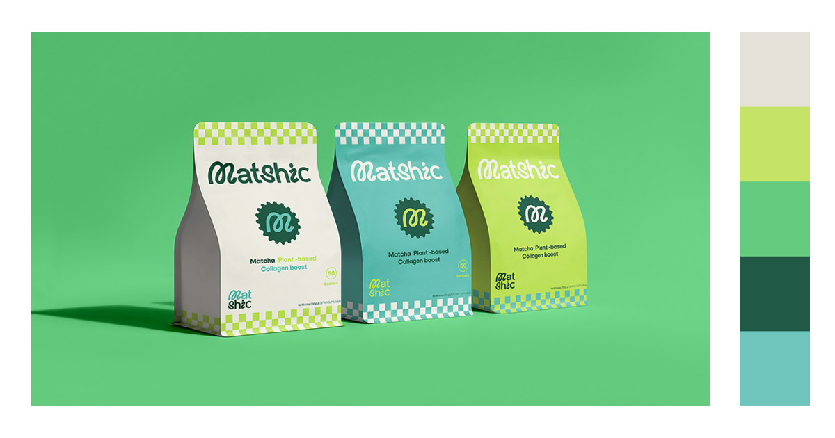
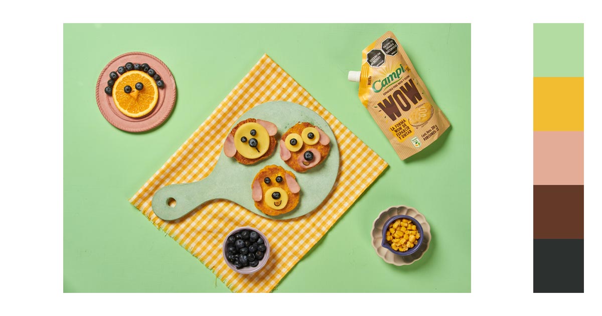
Green is universally linked to nature, health, and eco-friendliness. E-commerce stores selling organic, sustainable, or health-related products can leverage green to highlight their commitment to the environment and healthy living, resonating with eco-conscious consumers.Green’s calming effect can improve the overall user experience by making the website feel welcoming and less stressful. This is particularly effective in minimizing bounce rates and encouraging longer browsing sessions.

Website Design
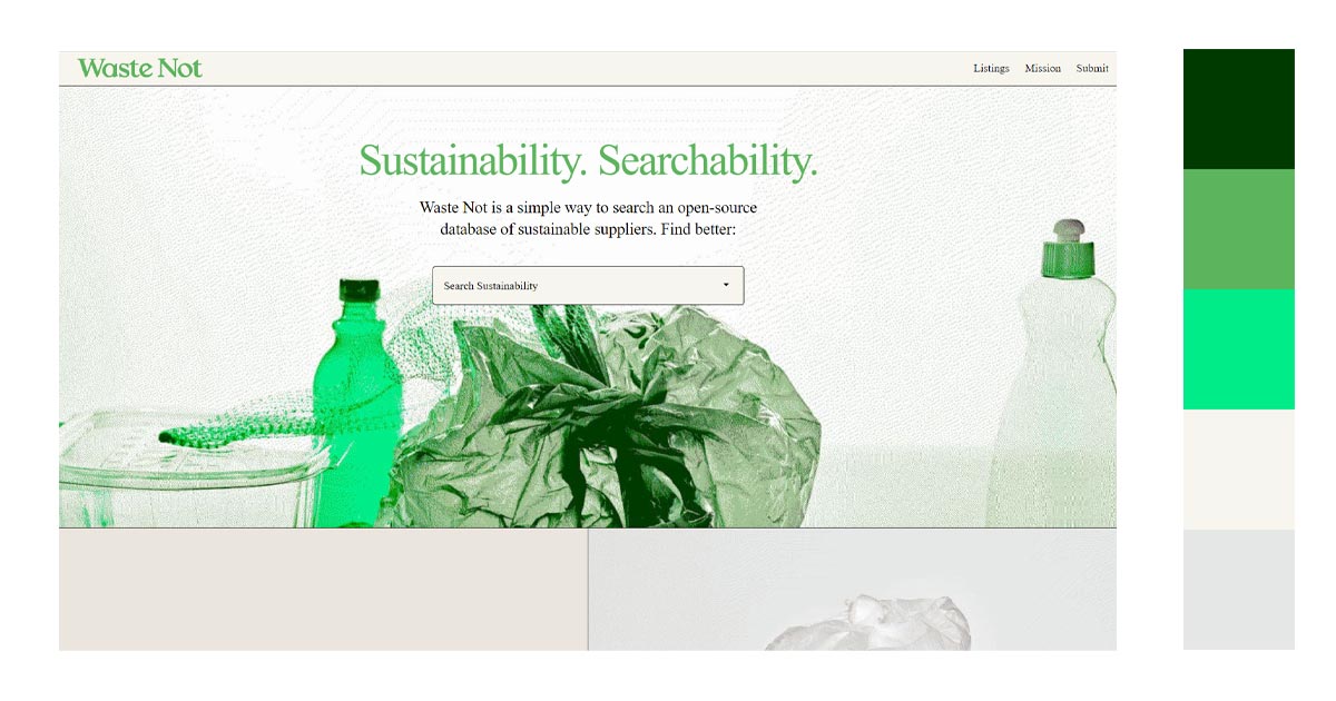
Try to remove bg from your images and create collages for your website banners:
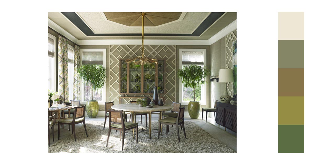
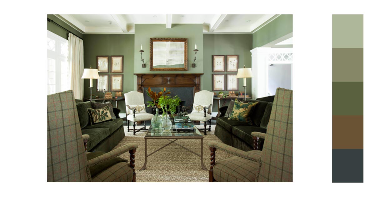
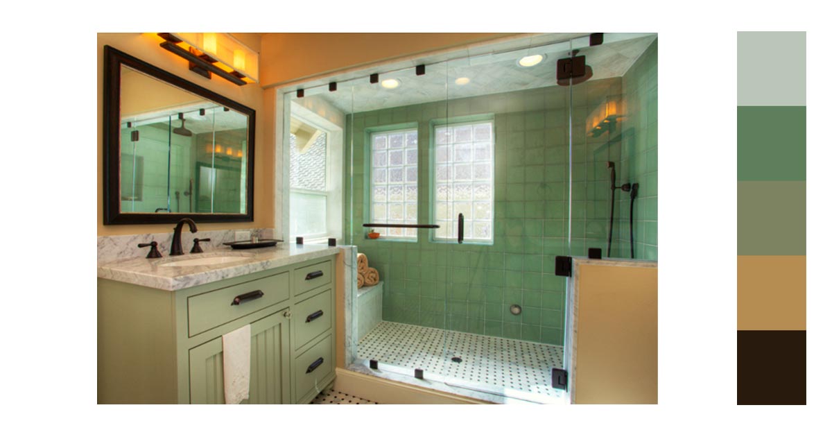
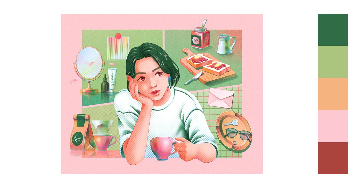
Interior Design
Green is known for its calming and refreshing qualities, making it ideal for spaces meant for relaxation, such as living rooms, bedrooms, and bathrooms. Light greens can evoke tranquility, while deeper greens can add a touch of sophistication.
Use green as an accent color to draw attention to architectural features such as moldings, built-in shelves, and fireplaces. Pairing green with neutrals like white or gray can create a clean and elegant look.
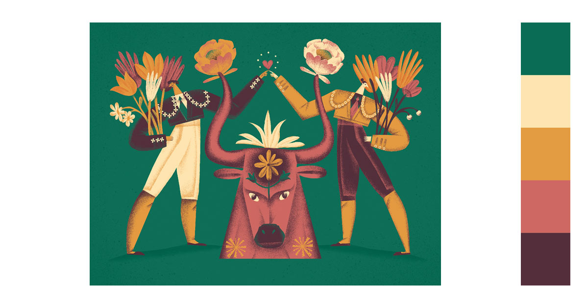
- Graphic Design
Green, particularly darker shades, can provide a strong contrast against lighter backgrounds, enhancing readability and drawing attention to key elements such as headlines, buttons, and calls to action.
For brands that emphasize eco-friendliness, health, or growth, green is a perfect choice for establishing a strong and recognizable brand identity. Incorporating green in logos, marketing materials, and digital assets can reinforce these brand values and create a cohesive visual identity.

大 灰兰 | Behance
Andrey Prokopenko | Dribbble
Anurekha | Dribbble
tubik.arts | Dribbble
YOP YOP | Behance
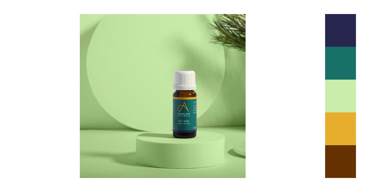
Photography
Green can be a flattering background color for portraits, especially when combined with natural light. It can provide a calm and balanced backdrop that enhances the subject’s features without overwhelming the composition.
Incorporating green elements into photographs can convey these themes, making it ideal for projects focused on nature, health, and sustainability.
Titus John | Behance
Brolly Creative | Behance
Isabella Rivera Gallego | Behance
Conclusion
Green’s ability to evoke a range of emotions, from tranquility and trust to vibrancy and energy, makes it an invaluable tool for designers aiming to create visually appealing and emotionally resonant experiences. By understanding and leveraging the unique qualities of green and its complementary colors, designers can enhance aesthetics, convey powerful messages, and engage audiences effectively, ensuring their projects stand out and leave a lasting impression.
You might want to read more from this series:
Latest