How To Create Product Images That Drive Traffic and Sales?
An adage said: “A picture is worth a thousand words.” Since content becomes more global, visuals have become a universal language that can convey your message fully and effectively.
The technology revolution has changed the way humans consume information. So do the shopping behaviors of modern consumers.
For eCommerce businesses, visuals even show the indispensable role in sales and marketing. This post will dig deeper into the power behind visuals, more specific tips for stunning product images that boost traffic and sales.
Let’s get started!
Why does your eCommerce website need a convincing product presentation?
Till now, content has always been the soul of any marketing strategy. In the increasing development of online shopping, the most potent weapon of eCommerce businesses to spread their speech is, apparently, visual content.
Some surveyed figures show:
- 49% of marketers consider visual marketing as “Very Important,” and 22% believe it’s “Important” (Venngage)
- 74% of marketers admit that more than 70% of their content has visual factors (Social Media Today)
- A breakdown of brain rule found that readers can retain up to 65% of the info with relevant images than one with no photo (Brand Rules)
- Around 50% of online buyers take product videos as the deciding factor to make the purchase (Serpwatch.io)
To understand the increasing trend of visual content, let’s look at its definition for a moment. Visual content is exactly what it sounds like – content that contains sort of visual elements such as pictures, infographics, online videos, and so forth.
So what’s special about this image-based content?
The power of visual content comes from how it can capture people’s attention and transfer messages in a blink of an eye.
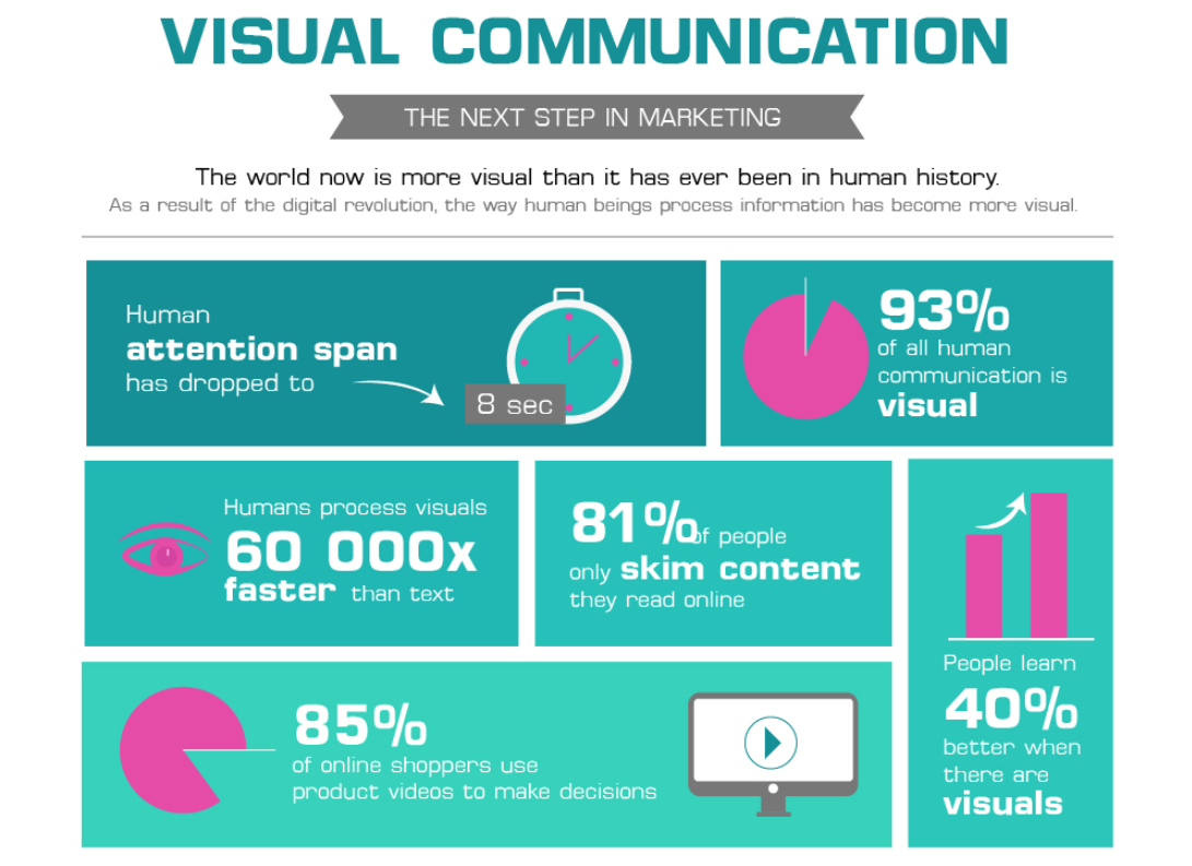
Source: Creately
According to Creately:
- People’s attention span has decreased to 8 seconds
- Humans process visual info 60.000X faster than text
- 81% of people skim the content they see online instead of reading the whole text
- People can learn 40% better when there are visuals
For eCommerce businesses, attractive product presentation indeed comes with incredible opportunities to promote their products to the target audience compellingly.
Compared to text, visuals are the most used content type for e-retailers to create the same value and experience as in a physical store, hence convincing online shoppers to click on the Check Out button. Amongst visual content, photos and videos are the 2 most commonly used.
Once your content is optimized for the user shopping experience online, it comes as no surprise when your e-store gets higher conversions or better click rates, etc.
How to make your product photography stand out?
In this post’s scope, we will focus on one common type of visual content that’s indispensable for any eCommerce business’s growth. They are product images.
Online shoppers typically judge a brand’s trustworthiness along with products’ perceived value based on its quality of the visual presentation. So it comes as no surprise when visitors on an eCommerce site make their purchases via image searching.
Still, not any e-retailer knows how to get the full potential of product images on their sites. Things you need for having stunning product photography:
- Get necessary equipment for beautiful photos: A tripod and a camera
- A white or black background: Can be brought on Amazon
- A suitable position: Consider choosing a room with windows next to a wall so you can get the natural light for your product photos
- Other things: Table, tape (prefer 24-27 inch wide), white or black bounce cards based on the products’ appearance that is about to photograph and your background, decor stuff, etc.
When all equipment is prepared completely, make your product images something amazing by:
- Get inspiration from other photographers as well as how famous brands take pictures of their products
- Choose for your product the suitable aperture. However, if you’re a newbie to this field, solid wall studio is more optimal
- Use standard lenses (typically, lenses with 50mm focal length) for your images so that you won’t distort the products
- Consider using a Diffuser with artificial light
- Keep an eye on the colors of your photos. Make sure the lighting is not tinted or the white balance, etc. Apply color theory to your photographs
- Finally, retouch your images with Photoshop or other photo retouch tools
Related Post: Background Color & Ideas: Which Is Perfect For Ecommerce Product Photography
Some tips & tricks to create images that drive traffic to your store
Show multiple use cases of your products
When it comes to shopping online, customers make purchase decisions based on information collected from several sources; mostly there are 2 types:
- Internet: mainly gaining product information via its intro on the brand’s website (text, image, and videos) as well as other review posts
- Ask for suggestions from friends and family
Thus, optimizing your product presentation’s visual content is one of the most effective ways to affect customers’ shopping decisions.
So how to convince customers that yours is their best option?
One common tactic is to introduce the function of your product to customers using several different product images. This tactic is handy when your product’s multi-functional.
Even when your products are not, you can still apply this tactic since it brings no harm to your business. In contrast, you deliver a better product display so online shoppers can visualize your offerings more detailedly as well as its advantages versus your competitors.
For instance, see how this Amazon retailer showcases their cardigan sweater worn in several different styles:
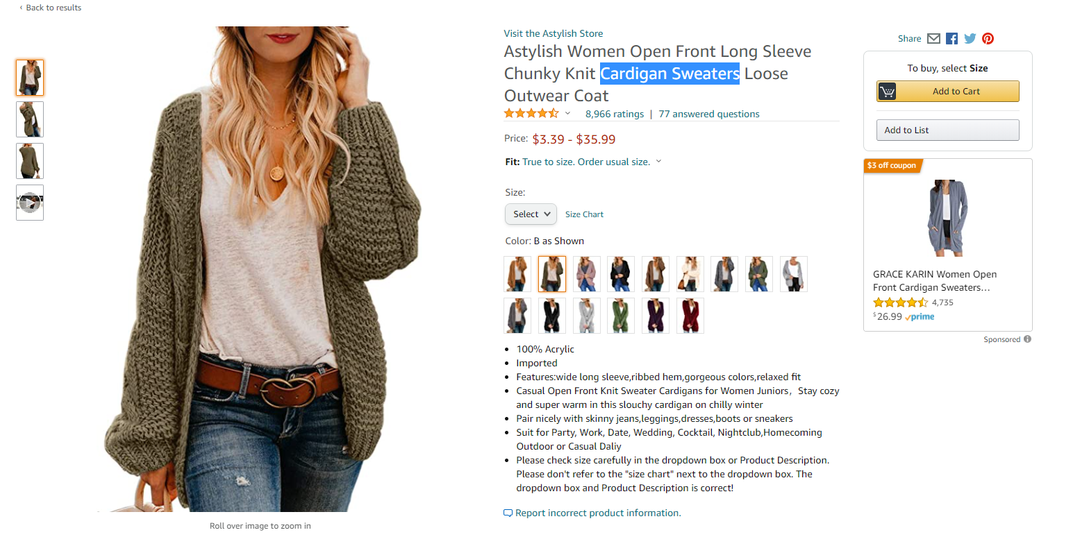
They even come with a video for each variation (when a human model wears the sweater) to make the offering more convincing and attractive. There are high chances shoppers will make a purchase.
Add graphics that help your customers make a purchase decision
Another tip for merchants to improve their product presentation comes from the application of graphics.
You can see this visual content type in the form of comparison charts or sizing charts. Let’s look at this product presentation of the iPhone 12 on Amazon as an example.
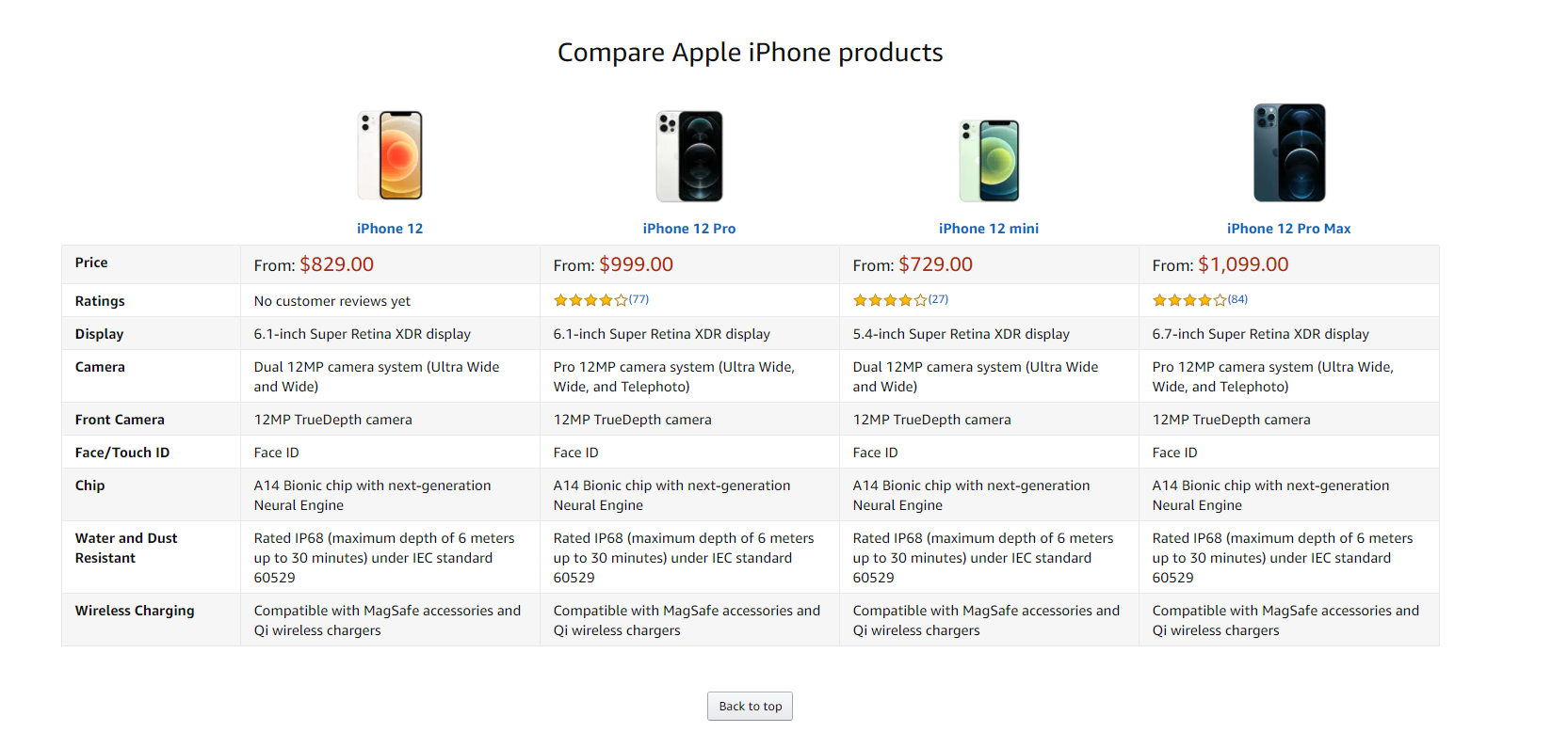
After a lengthy introduction of the phone’s full features, the webpage showcases a detailed comparison of all iPhone 12 series from Pro to Pro Max.
This comparison method is straightforward and clarified, hence supporting shoppers to find the product that fits their needs the most. At the same time, enhance their shopping experience and satisfaction.
Include human using your products
A product image becomes a must when selling products online. By adding lifestyle shots of the product usage (with human models in it), merchants can
- Create a better connection between potential buyers and products
- Give the prospects a frame of reference for more informed decisions when shopping online
- Allow online buyers to estimate the product’s size as well as its usage in practice
Not only contributing to increasing the persuasive power of the product page, but you can also purposely promote a product to its target audience by featuring ones fitting your ideal customers’ profile.
For instance, if you’re selling slim-fit jeans for men, and your target customers usually are teens or young boys, then using an energetic young model for your product picture like this one of Uniqlo:

You might be surprised with how carefully and subtly customers (especially female shoppers) notice these visual cues and their influence on their purchase decisions.
Include lifestyle shots
Though plain product images with white backgrounds avoid unnecessary distractions for buyers when shopping, they lack the emotional connection to buyers as in lifestyle shots.
These “simple photos” create difficulties for shoppers to evaluate the practical application of the product at a certain level.
The solution for this problem is to use lifestyle shots with plain product images. This way, you can:
- Help your prospective buyers picture themselves using products
- Make your product presentation more visually attractive and more aesthetically pleasing
- Deliver more practical product info to “still considering” shoppers
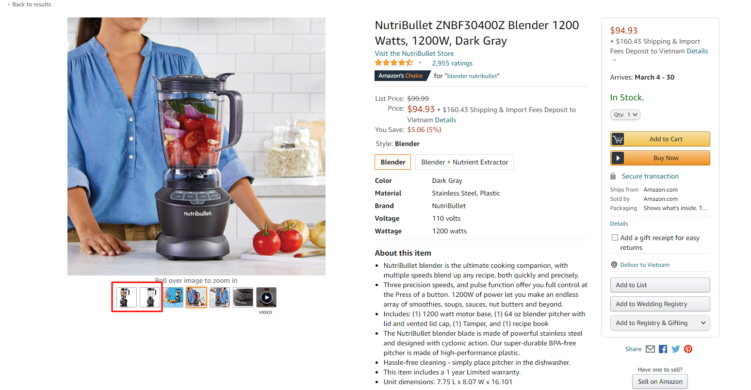
Again, we can still always learn from Amazon. Take the product presentation of this NutriBullet ZNBF30400Z blender, for example. We can see that the seller uses :
- 2 first spots for plan product photos (with white background)
- 3 next images are lifestyle shots (with a human model in a use case of the blender)
- Finish with a video introducing the blender’s usage
Related Post: Product Image Requirements For Ecommerce – Ebay, Shopify And Amazon
Provide a 360 view of your products
The most considerable inconvenience and worry of online shoppers are that they can’t have products on hand to experience before purchasing. Hence, the more persuasive your product images are, the more chance you can close the sales.
A 360° video is a fantastic way to give online shoppers that comfort and trust as they would be when shopping in person at a brick-and-mortar store.
This tactic is regularly seen in the luxury industry like jewelry and watches since it allows buyers to see the luster and whole design of the product from every angle.
Let’s move to a great example by Brilliant Earth – one of the jewelry industry’s leading companies. They allow buyers to interact directly with the image. You can drag and move the ring in the image to view its whole design.
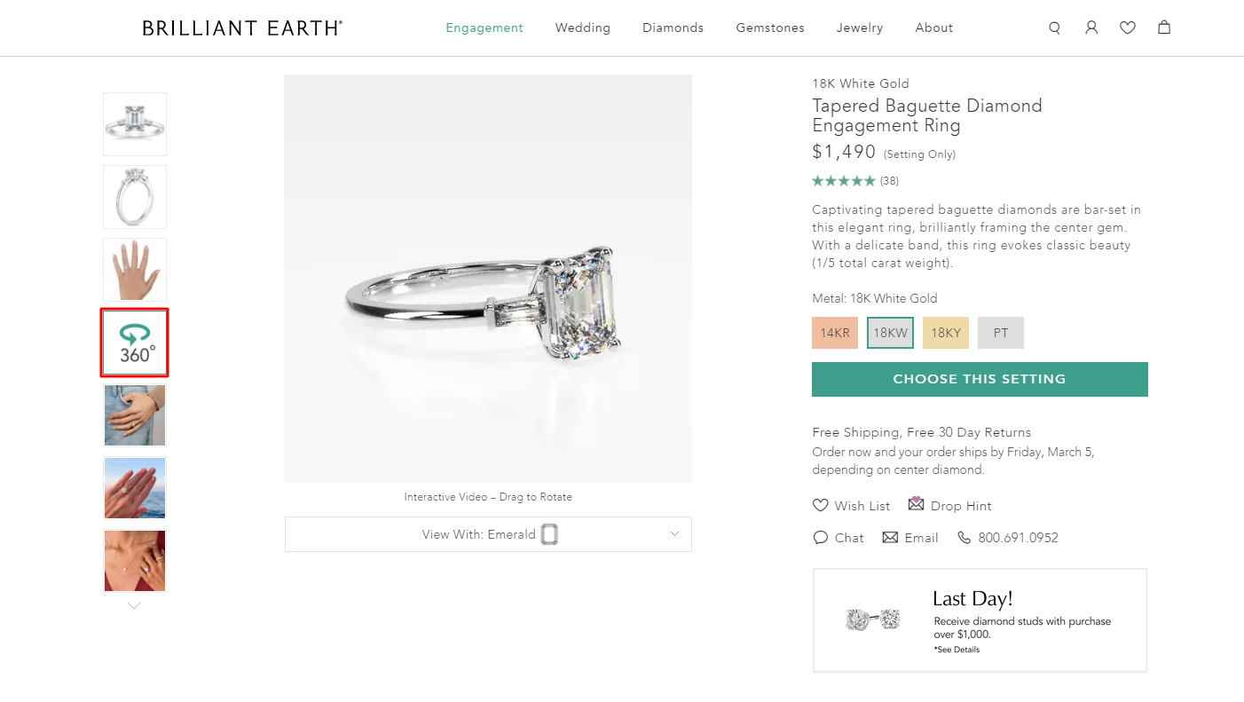
360° videos are indeed a clever method for eCommerce businesses that want to give their customers a three-dimensional shopping experience.
Optimize images for page speed
Modern users expect speed. And it’s not exaggerating to say that slow load speed can break a website. The longer a webpage takes to load, the higher its bounce rate will seriously affect Google rankings and the business’s conversion rates.
A survey estimates the average bounce rate for pages loading within 2 seconds to be 9%. This figure’s up to 38% right after the page load time surpasses over 3 seconds.
Large-sized, high-resolution, or uncompressed images can be the main reason that drastically reduces a web page load speed.
So, how do you fix this?
- Choose an optimal width and height for your image display on various devices, from desktops to smartphones and tablets. This way can boost your web load time on mobile devices as well as other devices
- Set the proper resolution for your images. 72 PPI (Pixels per inch) is the optimal standard resolution for image display on web pages. The resolution for full-width images will typically range from 72 – 100 PPI
- Consider using image manipulation techniques to reduce the size of the image without affecting its visual details
- Choose and upload your images to an Image Optimization Tool for image compression
Related Post: 10 Tips To Optimize Your Product Photos For Ecommerce
Keep your images simple
Have you ever wondered why Amazon always uses the white background for all product images?
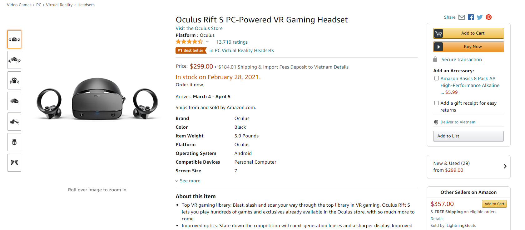
It’s not just about consistency; Amazon shows a great move on making all their product images as simple as possible. In this way, they can better prevent customers from being distracted by unnecessary details. Hence, horn their attention in the product only.
As mentioned above, a white sweep is all you need to get this effect, which can be easily found on Amazon with multiple types and costs to choose from. You can even get portable table-top photography studios for small items!
Moreover, by keeping all your images to one consistent and straightforward style, merchants at the same time enhance their brand’s profession and consistency in shoppers’ eyes.
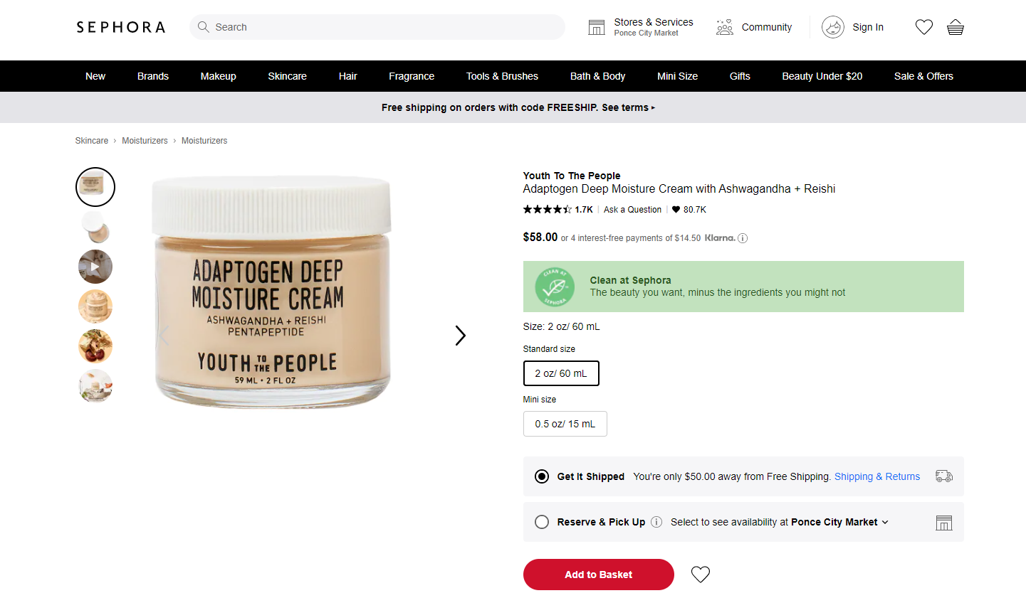
Apart from Amazon, Sephora is also a perfect example of simplification and consistency in product images using a white background for all product photos.
Conclusion
The power of visuals in content marketing has increased under the influence of the rapid growth of image-centric social networks. Having images within your content makes it less-boring and will give your readers time to take a breath and help them explore more about your products. Visuals are always a great way to capture the attention of shoppers and they help feature your products effectively.
Get professional image editing services for your e-commerce business. Our team of professional editors will meet your challenging image editing needs.


