10 Graphic Design Tips for Non-Designers
“I’m not a professional graphic designer. Can I still create good designs?”
This is the question oftentimes asked by non-designers when faced with the challenge of creating a design for a specific purpose. Although you have enough desire to create a good design, sometimes you hesitate to start because you believe you lack the skills or creativity to do it.
The good news is: you can still create good designs and not have to abandon your job aspiration just because you are not the next da Vinci.
Even if you are not a designer or lack a design degree, you may operate as an effective graphic designer if only you would pay attention to a few principles and use some tools for graphic designers.
Let’s explore some graphic design tips, ideas, and tactics for your next graphic design attempt:
Read More About: The Elements of Art and Principles of Design
10 Graphic Design Tips for Non-Designers
1. Learn Different Graphic Design Styles
Graphic designs come in many forms and styles. Knowing them and when to use them will help you communicate your message more effectively.
While they sometimes overlap, each graphic design style demands a unique set of talents and techniques. And whether it is punk, psychedelic, modern minimalist, or abstract, every type of graphic design solves issues and expresses ideas using typography, pictures, color, and form.
Numerous designers specialize in a single type, while others focus on a collection of related, equivalent types. Yet, since the industry is always expanding, designers should be adaptable and lifelong learners in order to switch careers or add skills.
Whether you are an aspiring designer or a business in need of design services, understanding the many types of graphic design styles and checking out the latest graphic design trends will aid you in choosing the most qualified individuals for the job.
2. Look for Graphic Design Templates and Inspirations
You may believe that graphic designers do not utilize templates – however, templates can significantly speed up day-to-day design activities, providing flexibility and agility when it comes to taking on new mandates and launching new projects.
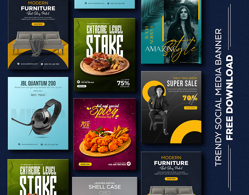
A well-stocked arsenal of templates may make all the difference in terms of saving time and money on your design expenditure without compromising your ideas at the pitch stage. Perhaps it’s time to update your designs in 2022 by including some of the hottest branding trends or adopting offbeat illustration trends. With templates, you can quickly discover what works, changing and altering with a few clicks to make each design uniquely yours and hit the target every time.
Looking for inspiration from graphic design websites like Dribbble, Behance, or design agencies like DesignBro or InkBot is also effective. Besides, observing how experts and professionals do it is the best way to learn graphic design.
3. Choose Your Color Palette
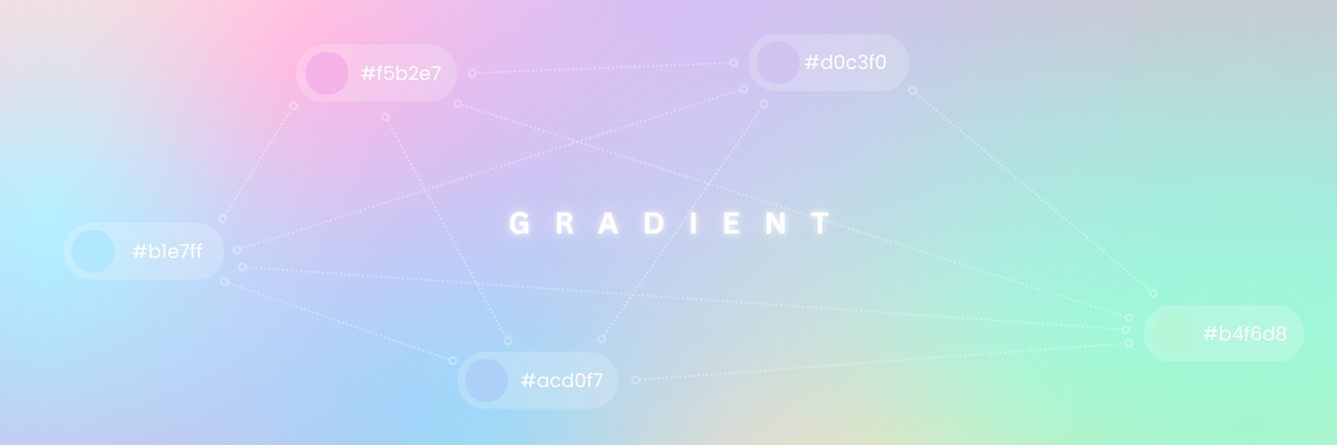
One of the most effective graphic design tips to consider is the colors you want to integrate. Generally, it is better to stick to a limited color palette that is consistent with the rest of your designs. You may start with the main color and then add a few secondary colors that contrast and complement one another.
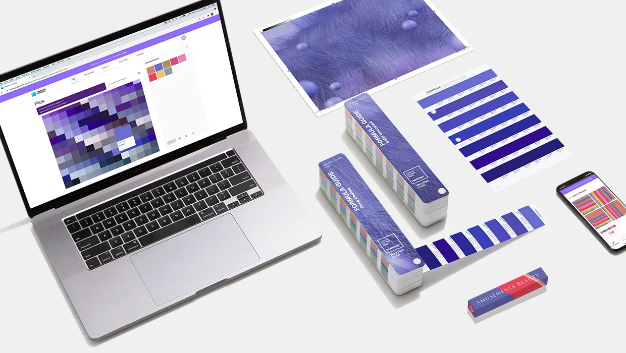
Certain graphic design tips and tools make it simple to create color palettes by mixing complementary hues. Whatever method you choose to select your color palette, you want to ensure that it is coherent. Additionally, you want to ensure that the colors you chose correspond to the message you are attempting to convey!
If you want some references for color combinations and palettes, you can check out these following blog posts:
- Colors that go with green
- Colors that go with yellow
- Colors that go with black
- Colors that go with red
- Colors that go with blue and
- Colors that go with orange
Read More About: The Best Tools for Graphic Designers
5. Learn the Psychology Behind Colors
Color perceptions can be a little different from person to person, but there are some effects of color that everyone can agree on.
Of course, the colors we choose are often influenced by things like how much they cost, how many there are, and other practical issues. Not only that, but your favorite colors can change over time.
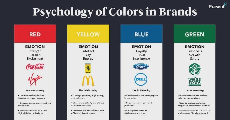
In the beginning, people might like bright, attention-getting colors. They might be drawn to the more traditional colors as they get older. Many things can affect how a buyer chooses a color, such as how much it costs and how quickly it can be found.
For example, buying a white car might seem less regarding wishing people thinking users are fresh and innovative and more regarding climate where you live. People who live in hot places usually prefer light-colored cars to dark ones. People need to pay attention to color psychology because it can make a big difference.
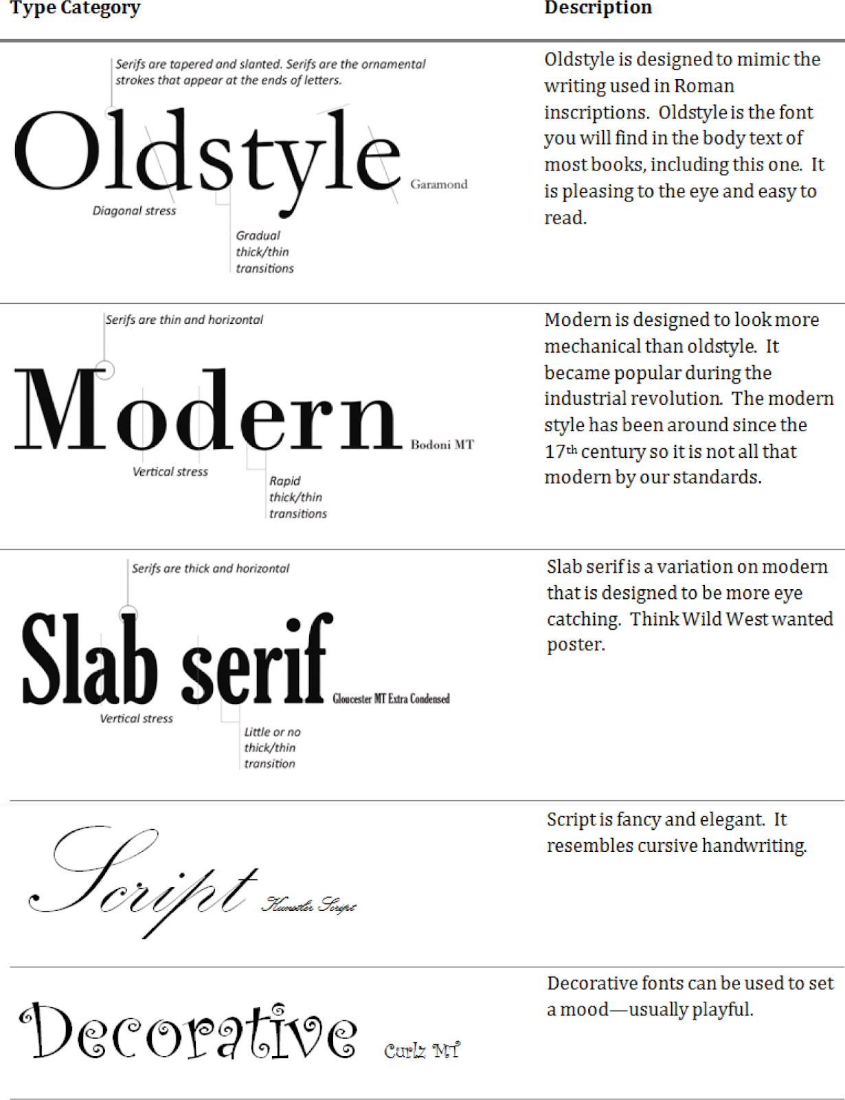
6. Only Use 1-2 Fonts
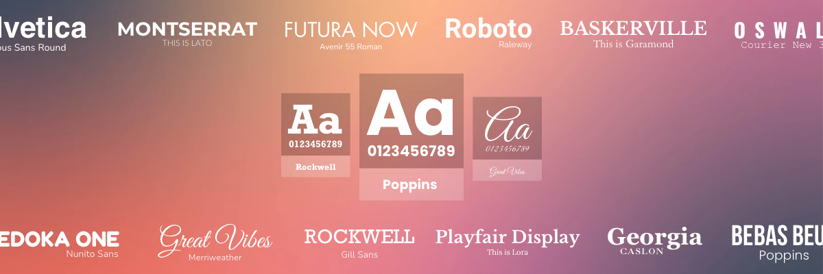
People utilize an excessive number of typefaces. Use no more than 1-2 typefaces, with a maximum of three fonts, for whatever you develop for your company. Because you are creating a quotation for one piece of content and a blog promotion for another, it does not follow that the typefaces used for each piece of material should be distinct. Choose a font combination and utilize them consistently across your content and website. Not to mention that if you are continuously changing typefaces, you are losing out on all of the notoriety you may have gained for your material.
7. Keep Your Objects/Elements Aligned
Whenever it comes to producing harmonious pieces, proper alignment is among the most essential tools at one’s disposal. You’ll discover blank spaces in the borders, among forms, paragraphs, lines, phrases, and even between letters in certain documents. As previously said, space is mostly comprised of white space. The difference is that in this instance, it serves, as a rule, to assist you in aligning components, keeping them balanced, and complementing one another.
For example, grids provide a foundation for any design by using particular spacing measurements. More information about grids and spacing may be found in the article linked below.
8. Use Contrasting Colors
For graphic designers, contrast is the bread and butter of their work. Take away all of the contrast from artwork, leaving you with a boring blank canvas to work with. Visual contrast sharpens the picture and effectively catches the viewer’s attention. You can use a high or low degree of contrast, although the latter is required to make a statement.
Colors, typefaces, forms, size, opacity, alignment, and other design elements may all be used to create contrast. Create layers in a picture and recreate a 3D scene by using contrasting colors or textures to differentiate between the background and foreground of the image.
9. Use Relevant Images
Images in web design should only be used if they are related to the content being shown. This is mostly due to the fact that photos may be used to improve your website’s aesthetic attractiveness. As a result, the picture on the page should be relevant. If your website is about how to make apple juice, don’t put a picture of a mango.
To put it another way, the images you utilize in your site design should have some kind of context. The images you use should be ones to which your target audience may connect. For a fashion firm, visitors want to see photographs of designer clothing, shoes, and jewelry, among other things, while developing a website. These images serve to highlight the theme of the website. By giving an outstanding visual representation of the website, photographs are supposed to enhance the user experience. You can also remove background from images to give them a nice, clean, professional look!
10. Make Use of White Space
White space isn’t really “white,” though. It means there is no text or other things on the space. It’s the part of the design where it “breathes,” so to speak. This is one of the hardest things to get good at in design.
A good way to learn about how to use white space is to look at minimalist designs, like this one. This is a movement that thinks that “less is more” and that you only need the basics on a picture to make it look good. One more way to use white space is to make it negative space, which is what it sounds like This is a way to make empty space tell more of a story than if it was in the background or between other things.
Remove background with AI
11. Keep It Simple
A good graphic designer knows that keeping things simple is the key to success. If you look closely, you will see that the finest graphic designs are basic, with fewer photos and less text. Elegant graphic designs are characterized by the maxim ‘Less is more.’ Rather than using a significant amount of text or too many images in your design, strive for smaller, higher-quality material that conveys more information in fewer words. Also, make certain that there aren’t too many words on the same line of the text. The ability to keep things simple is a key characteristic of any effective design.
Start Your Design With Removal.AI
It’s a process that gets better with practice. No need to do all of the tips at once. You don’t even have to follow them all.
Graphic design is a field that deals with a lot of different things. You can choose which of these 10 graphic design tips you want to work on and improve. The rest of them should be kept in mind as you work on them. This is how you should do it. That your designs are a unique representation of you and a way to connect with your audience, a way to understand how people think, and something that you can make look good.
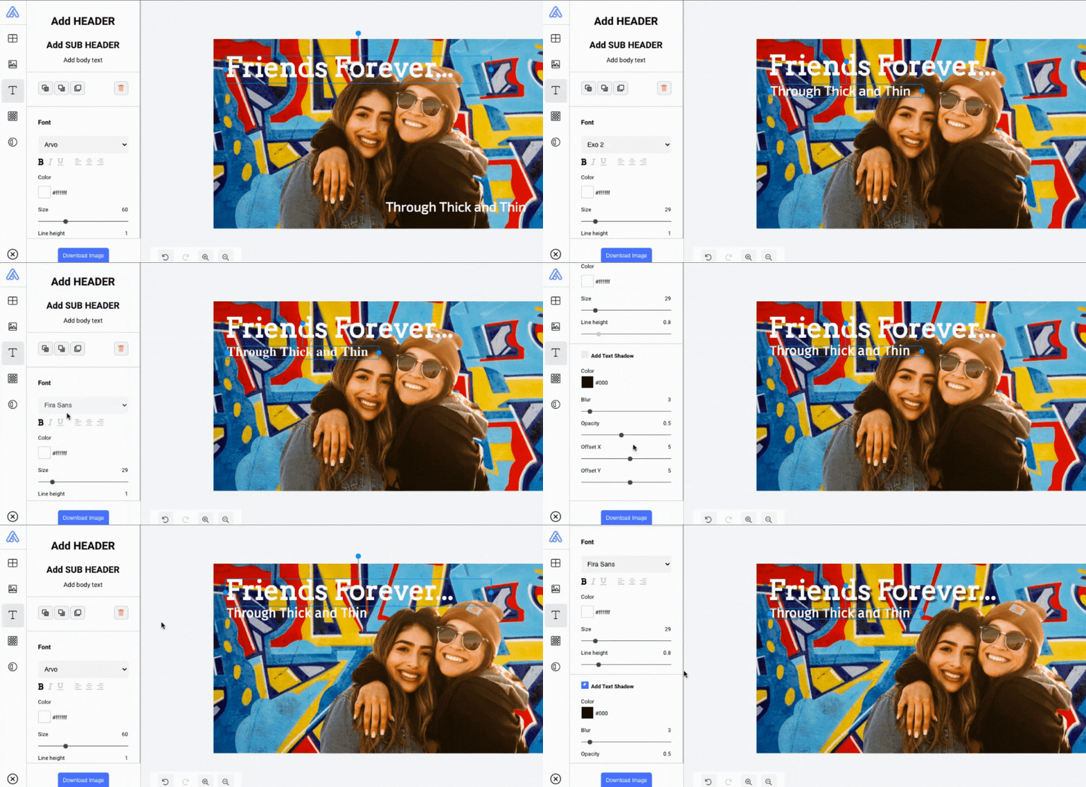
In terms of the hacks themselves, we simply wanted to give you a little shove out the door to get started on your projects using these tips. We really hope that we were able to assist you in comprehending all of the points without difficulty.
If you have any more questions on this subject, we would be delighted to speak with you! In addition to eliminating picture backgrounds, we created Removal.AI to assist our clients in realizing their visions, allowing them to maximize their creative potential and maximize their business potential. If you want assistance, we would be delighted to assist you!
Simply upload and edit your images to make an awesome graphic design
Try it now!
