Design Inspiration: What Colors Go With Black?
Touted as the color for infinite coolness and glamor, the color black has cemented its rank in prestige. This color has become a favorite of almost everyone. It is prevalent in use by numerous artists and designers. Even in religion, the color is in use. So what colors go with black?
The History and Cultural Contexts of the Black Color
History
The color black dates back as far as 30,000 years ago.
Prehistoric man has made use of charcoal to draw cave paintings as seen in southwest France. They often portray the hunting of different animals and religious services offered to the gods.
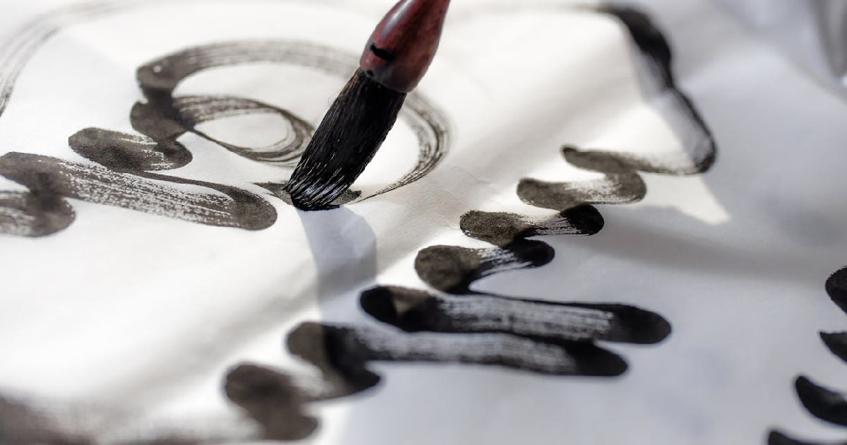
In the 23rd century BC China, the use of black ink became prolific. They used charcoal mixed with water to produce the ink. It depends on the material and ingredients but different shades and tones can be produced.
Artists in the Renaissance Period would often use lamp black in their paintings, which they got by gathering soot from oil lamps. Some materials can be sourced from animals like bones, horns and other organic products. Charred ivory is made from elephant tusks. But, it is a luxurious item because of the high cost of obtaining one. Bone black became popular as an alternative since it uses various animal bones.
Black ink became very important when the printing press became widespread. Johannes Gutenberg invented the movable-type printing press that made “printing” faster and more efficient.
In recent times with the help of advancements in technology, synthetic inks were invented. This made the ink more accessible and easy to procure. We can now have different tones and shades of black.

Cultural Significance
It is undeniable that there is power that exudes from the color black. Black is, after all, the color of darkness and shadows. It is intimidating and mysterious. And, for most of us, there is always that allure of the unknown
There is duality and contrast within the color. The color can represent two contradicting ideas, for example– sin and holiness.
Historically, black is often the color of damnation and hell. The color is frequently associated with evil. But in medieval times or as early as the 5th century, the clergy started wearing black cassocks. Black now becomes the color of mourning and penance. It is a reminder to the clergy to always value humility and selflessness.
When the Church grew in power, the color became synonymous with prestige and authority. The courtiers and royalty soon began wearing black, earning the color its luxurious hallmark.
The color’s contrasting ideology is also seen in this century. Black is dignified, sophisticated, and formal. That is why it is the chosen color for formal events. People wanted to be perceived as wealthy and upscale.
But, with the Punk Movement of the ’70s, the color became that of rebellion. Black now stands for non-conformity and anti-authoritarianism. They wear black leather jackets, shredded clothes, multiple patches and pins, and a whole lot of attitude. They resent societal pressure to conform by wearing a variety of hairstyles and having tattoos and piercings. And, the spirit lives on even today
Symbolism and Cultural Meanings
1. Black in mourning and grief
Most of the Western cultures associate black with mourning and grief. This could be seen as far as the time of the Roman Empire. The color is used to show that you are grieving for the loss of the soul and showing sadness. It is also a symbol of giving respect to the person who passed away.
Wearing black for mourning became common, though, when Queen Victoria of England wore the color for 40 years after the passing of her husband Prince Albert in 1861.
2. Black in authority and power
The color at first was for the clergy to be reminded of their penance. Since it is a color of mourning, they are to live a life of humility and service to the people. But with the Church’s dominance, the clergy who wore the color gained power. The royals and the nobility soon followed in wearing black to present themselves as powerful and authoritative.
3. Black in fashion and elegance
Popularized by Audrey Hepburn in the film Breakfast at Tiffany’s, the ‘little black dress’ became a must-have item in every wardrobe. The dress is simple but sophisticated. It shows a just amount of skin for it to be sexy but not enough to be seen as vulgar. And, since the black color does have a slimming effect on the body, it compliments perfectly for any body type.
Black is a staple color in the fashion industry. Study shows that 33% of consumers prefer black-colored clothes. This is because it is rich and glamorous without needing too many bells and whistles. It is a neutral color so there are a lot of colors that go well with black. Coordinating outfits is easier. You will not become limited by what colors go with black.
Evolution of the Black Color’s Perception Over Time
As in all things, change is always constant. Human perception will evolve as time passes by.
The black color started as the color of evil and darkness. Everything bad is allocated for this color. Grief and mourning are also associated with this color. It seems that there is always a negative connotation when it comes to the color.
When the clergy and the nobility started wearing them, they became a symbol of power and prestige. The 70’s and 80’s youth movements made black the color for rebellion and non-conformity. Later on, the color became synonymous with glamour and luxury.
Nowadays, the color enjoys a multitude of meanings and symbolism. It will keep on evolving as more people find new ways to use the color black.
Psychology

After understanding its history and cultural significance, let’s understand the psychology behind the color black.
Our perception of color is closely tied up with our emotions. To influence our choices and actions, color psychology targets colors that can have an incredible impact on our emotions. Here are some of the black effects on humans;
Be careful in using the color black, since its application can be adverse to what you have intended it to be. You need to know what colors go with black to further enhance your visual project.
What Colors Go With Black?
As a graphic artist, you need to have a good grasp of what colors go with black. It is not as simple as just having a black color scheme to tie all elements together. You need to find colors that go well with black.
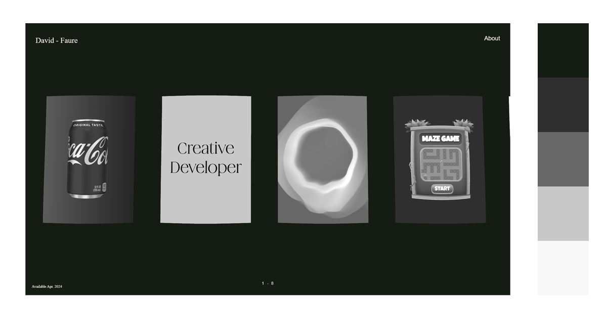
1. Monochromatic/Tint
Here is a color palette that uses a single color tint, black. This color palette is simple and uncomplicated. It is a black color scheme that is easy on the eyes and does tie all elements together. Add liveliness to the usually cold palette by adding different shades and hues.
A. Black-Gray-White
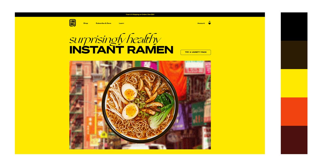
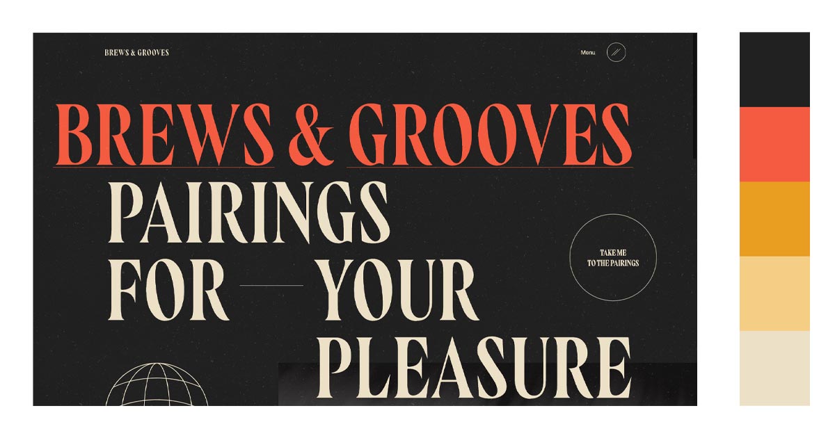
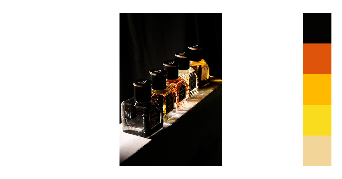
2. Black + Warm Colors
Since black is a neutral color, there are a lot of different colors that go with black. By using warm colors with black, you are creating a contrast to the elements. This makes the warm colors more visible with the dark background
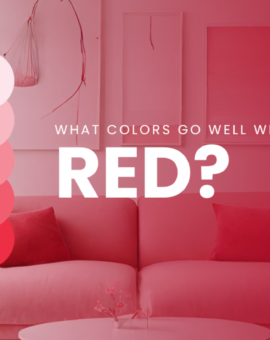
A. Red
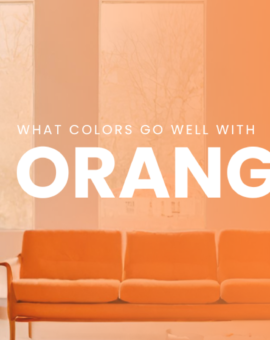
B. Orange

C. Yellow
In this example, the yellow color is the main color with black being used to ground the elements. It delineates the food from the background.
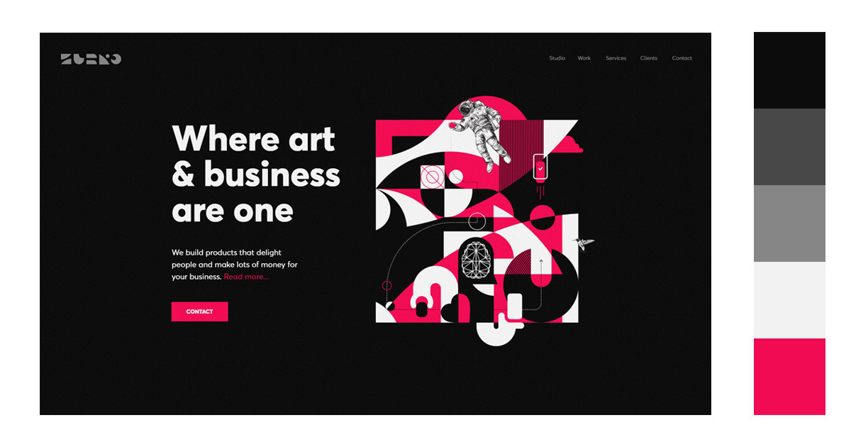
3. Black + Cool Colors
You can use brighter colors for more emphasis.
Here are some colors that go with black you can use using bold and vibrant color palettes.
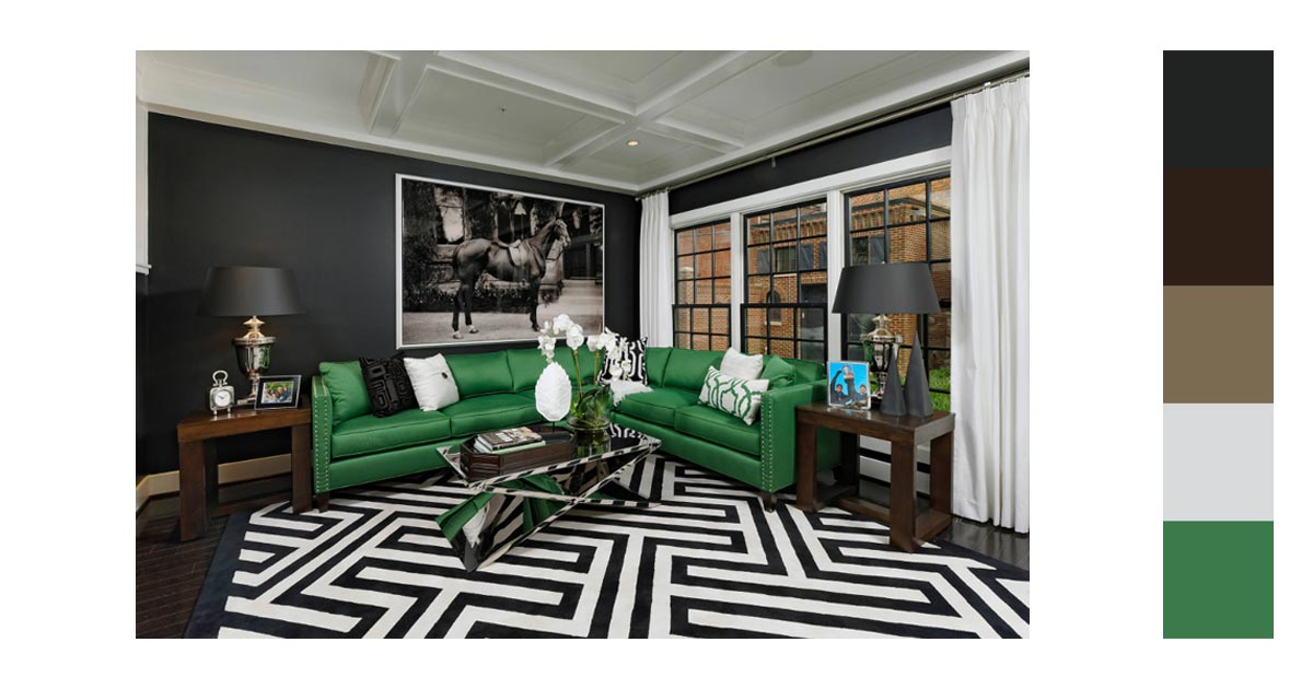
A. Green

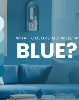
B. Blue

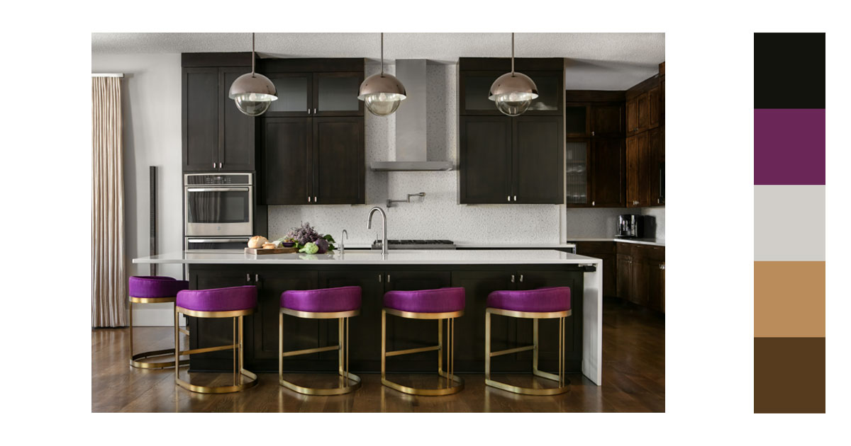
C. Violet
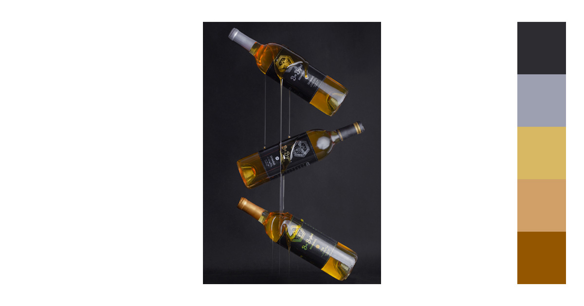
4. Black + Neutrals/Browns
Neutral colors and lighter hues have a soothing effect. Since black is the strongest of the neutral colors and can appear intimidating, use earth tones like browns to help balance out the black for a calmer effect.

5. Black + Pastels
Using pastels gives off the right amount of color vibrancy for your elements to pop. But, its muted quality leads to a more soothing effect. What colors go with black will include pastels.
Using black in your project is not as daunting as you perceive it to be. It takes trial and error to see which color combination works for you or for your client. You have a multitude of colors in different hues and tones to play around with.
You can use remove bg or any background remover to help in your projects. They are easy to use and can be found online.
How Can You Use These Black Color Combinations?
With a clear understanding of what colors go with black, let’s see how we can utilize them.
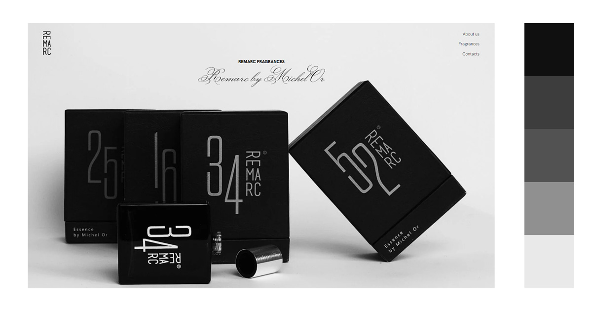
1. ECommerce
Most luxury-focused websites use black color. It exudes elegance, sophistication, and glamor. This gives off the feeling of legitimacy of being a high-class e-commerce website. And, a lot of online buyers are attracted to this color scheme.
Black is also power and authority. E-commerce websites that are focused on technology use black to appear established and a leader in their industry. They use this to build trust with their potential customers.


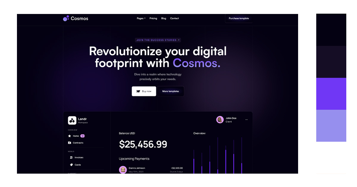
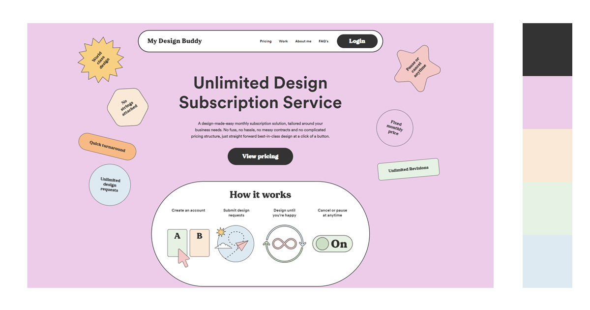
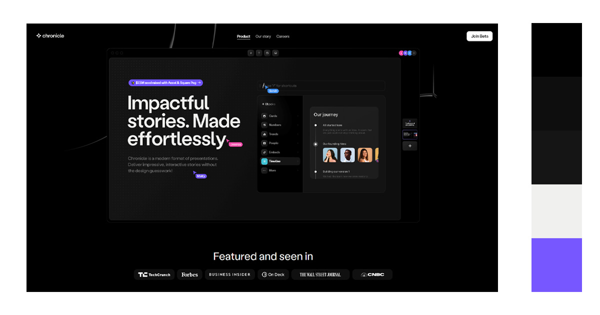
2. Website Design
Since the technology is very advanced when it comes to digital projects, you have a plethora of colors that can be combined with the color black.
Usually though, black is used as a background. This is because a black background makes elements or images pop. They become more visible and catch your viewers’ attention. Black color recedes, so images or bright colors stand out.
Using a black background makes navigating your websites easier. Since it is easier to see bright-colored actionable elements in a dark background.


3. Interior Design
Black is also used in interior design to give a luxurious feel to the room. Especially when you choose black furniture. It is timeless and classic. It also adds a little bit of drama to the room.
Most modern designs call for the black color. It has a timeless elegance that is attractive to a lot of people. Modern black interiors are sophisticated. Adding black elements like light fixtures and furniture must have a sleek and industrial look. Your drapes and linens must have smooth and even texture to complete the look.
Since your interior is dark. Make sure to have enough natural light. Big windows are needed to make your black interior room not appear small or cramped.


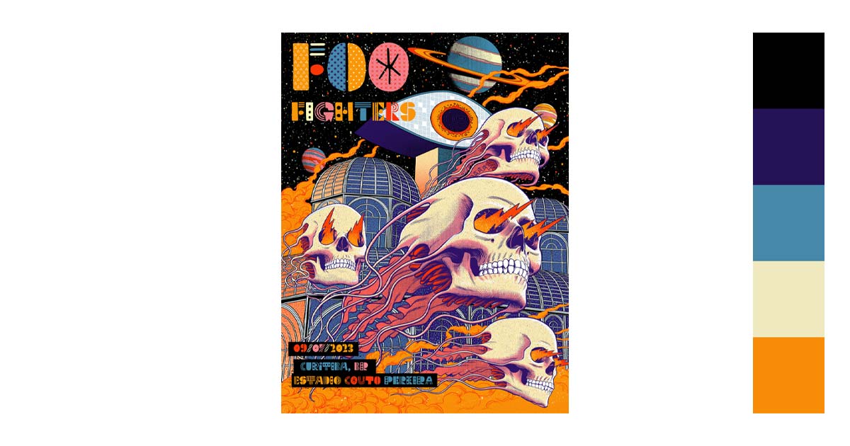
4. Graphic Design
In graphic design, black is mainly used for contrast and emphasis. You can direct your viewers’ attention by using contrasts. It creates a powerful message that can sway your viewers’ actions.
Designers know the impact of colors on people’s emotions. Black is one of those powerful colors. It is authority, power, elegance, and boldness. Using the color in your designs depicts that your product is linked to power. Designers use it to express superiority over other brands.


5. Photography
More often than not, black and white pictures are seen to be more artistic than colored ones. The reason may be that it is harder to compose. You need to focus on shapes, textures, and contrast to create a strong composition.
You can also say that black and white pictures capture an “honest” picture. It reveals the character of your subject since there are no colors to take your attention away.
There is a feeling of nostalgia and mystery in black and white. We often associate them with old pictures. It evokes an atmosphere, in a sense. That is why it will not go out of style anytime soon.


Your Turn

Black is an intimidating color.
It seems all-encompassing and drowning is a legitimate concern, figuratively speaking that is. But everything is surmountable if you only try.
Black may be the color of the unknown. But, it is also the color of power and self-confidence. The color’s duality is what makes it fascinating to use. It has hidden depths that add interest to your work. Use these qualities and take advantage of them.
Who knows what you might end up with? Try it out.