2025 Best Font Pairings
Some things just don’t mix. Oil and water. Sand in your shoes. Pineapple on pizza (debatable).
Typography works the same way. Like food combinations, fashion, or iconic business duos, wrong font pairings will clash and overshadow each other. But get them right, and the chemistry will do all the talking.
Well-paired fonts can stand strong on their own and are still able to complement each other. When it clicks, everything just makes perfect sense.
So, what can you do to make your fonts work together, not against each other?
In this guide, we’ll break down everything you need to know about:
- The psychology behind font pairings,
- Foolproof combinations for different moods,
- Interactive font pairing tools (paid and free to use!),
- Quick tips for matching fonts.
Ready to learn the art of font matchmaking?
Let’s get started.
Unlocking the Secrets of Font Pairing
Many people think that font pairings are as simple as picking two trending fonts from a website or a catalog and calling it a day. Without understanding what makes font combinations effective, your typography can still make a statement – just not in the way you would expect.
1. Contrast Makes Your Design Pop!
To make standout visuals, incorporating variation is key. Pairing different styles and weights immediately grabs the audience’s attention. Like a conductor directing an orchestra, contrast in typography carefully guides the reader’s eye to the most important parts, letting each part have its moment. Don’t overlook the details – invest in a background remover to make your typography shine.
2. Too Many Fonts Is a Recipe for Chaos
The only time when putting too many things together works is in a buffet. The time when you shouldn’t is when you’re making your design. Remember, great visuals convey the message clearly without doing too much.
To be on the safe side, stick to a maximum of three fonts for better readability.
3. Make Every Word Easy on the Eyes
Choosing a font combination can be exciting, but it’s important not to lose track of your goals. Size, spacing, and consistency matter. Eye-catching visuals should not compromise functionality—they should go hand in hand to ensure that the reader has no trouble reading the entirety of the text.
4. Direct Your Audience’s Focus
Effective designs are intuitive; they let the viewer differentiate critical from trivial information, allowing them to interpret the message successfully. Establishing a hierarchy using different font sizes for headings and subheadings is one way to do this.
5. Let Your Fonts Reflect Your Identity
Attractive typography and pretty colors alone do not create a strong brand identity. If anything else, these elements should circle back to your brand personality and emphasize the message you’re trying to achieve. It’s easy to figure out which mood to go for once you have your identity down pat.
Examples of Effective Font Pairings
Clean Font Pairings
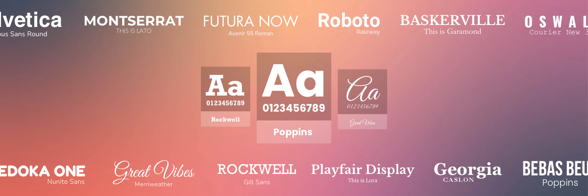
a. Helvetica & Nimbus Sans Round
Easy on the eyes and cuts to the chase, this natural duo thrives on a white background. As one of the modern font pairings that share a similar quality of timeless appeal, it is best applied in formal applications such as websites, editorials, and corporate reports.
To make the most out of this pair, use bold Helvetica for headlines and regular Nimbus Sans Round for body text. The two share similar proportions and lines, which easily creates an effortlessly cohesive look without overpowering the content.
b. Montserrat & Lato
Geometric fonts like Montserrat, in their simplest form, are tidy and simple enough to read, yet they can also take the form of a bold, statement-making header when paired with Lato’s softer lines and slight roundedness, a favorite font choice on the web.
When used together, a looser letter spacing for Lato balances out Montserrat’s tight kerning, making these modern fonts your best bet for a no-nonsense design.
Minimalist Font Pairings
a. Futura & Avenir
The similar geometric qualities of Futura and Avenir can make the combination seem like a risky option. Still, precisely this innate likeness allows the portrayal of an uncluttered yet inviting brand identity.
Both sans serifs exude similarities in style, but Futura’s striking angles provide the sharpness to complement Avenir’s smoother and more refined edges. These two fonts imply progress, ideal for future-forward brands that embody innovation.
b. Roboto & Raleway (Light Weight)

Roboto, a neo-grotesque sans-serif font, radiates a structured mechanical feel attributed to its even stroke widths. As a consequence, it evokes a sense of neutrality applicable to different design purposes. Meanwhile, the contrasting airy feel of Raleway Light Weight’s elongated strokes doesn’t only soften Roboto’s rigidity but also emphasizes visual hierarchy while maintaining a minimalist appeal.
For those looking to blend functionality and elegance, these modern fonts serve their purpose.
Sophisticated Font Pairings
a. Baskerville & Garamond
When it comes to sophistication, Baskerville and Garamond are fonts that go well together. Baskerville is a decorative yet versatile serif that’s neither too ornate for body text nor too plain to command attention for large-scale typography.
Sharp vertical strokes complemented by gentle, flowing curves often make elegant font pairings, as in Baskerville’s high-contrasting lines and Garamond’s fluidity. This combination performs best in luxury branding, packaging, and published layouts.
Elegant Font Pairings
a. Playfair Display & Lora
Playfair Display, inspired by the lettering styles of the 18th century, carries an inherent elegance that combines both readability and aesthetic appeal, best suited for bold and stylish headlines. Lora, on the other hand, delivers organic strokes that ensure a natural yet distinctive flow of supplementary text.
Refined font combinations like this one are ideal for upscale brands and lifestyle blogs looking to strike a good balance between classic and modern aesthetics. Consider using tools that remove background distractions so that the typography remains a focal point.
b. Georgia & Caslon
Both fonts share roots in classic serif typography. Caslon, whose origins started as a staple of 18th-century print-based typography, ultimately inspired the creation of Georgia, a much newer typeface optimized for digital screens.
These two well-defined letterforms offer stylistic differences – Georgia’s high x-height and bold weight give it prominence in headlines, while Caslon’s subtle curves and contrast enable a smooth reading experience for the audience.
This combination is just one of the many elegant font pairings one can choose from, a prime example of what fonts go well together.
Grim/Edgy Font Pairings
a. Bebas Neue & Roboto Mono
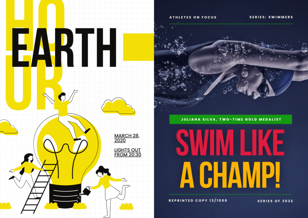
Typography trends of 2025 lean toward contemporary designs with exceptional legibility. One example is Bebas Neue, a popular sans serif font made for bold statements. With its tight use of spacing, its aggressive and authoritative presence makes it ideal for use in headings, album covers, and even streetwear branding.
Its combination with the monospaced and engineered look of Roboto Mono echoes a mechanical presence, providing a calculated synergy – one that looks straight out of a sci-fi movie.
b. Oswald & Courier New 360
The hard-hitting impact of Oswald’s bold verticality and narrow letterforms deliver an unmistakable punch for uppercase-heavy layouts, making it the best choice for banners, artsy album covers, and advertisements that require maximum visibility.
Pairing it with the organic contrast of Courier New’s typewriter-inspired design and monospaced design for secondary text, sprinkle a vintage vibe with just the right amount of attitude.
Font pairings with a similar dynamic work best with sepia-toned palettes and grainy textures.
Energetic Font Pairings
a. Bebas Neue & Poppins
Bebas Neue’s strong visual presence communicates a sense of urgency and energy. Its dominant nature successfully plays out with Poppins’s high legibility and warm aesthetic, resulting in eye-catching displays that ooze silent authority – an effortless choice for concerts and festivals, sports branding, and advertising.
This fusion aligns with current typography trends, where condensed, punchy displays are evened out by smooth and circular proportions for comfortable viewing.
Playful Font Pairings
a. Fredoka One & Nunito
On its own, Fredoka One’s oversized letters can feel overwhelming, making text-heavy sections unpleasant to read. While Nunito exhibits similar rounded edges, it isn’t loud enough to demand attention on its own – straightforward and approachable, it creates a unified look while maintaining visual hierarchy.
Playful font pairings like Fredoka One and Nunito bring a youthful exuberance to designs that require lighthearted sophistication without neglecting readability. This keeps the visuals looking polished and intentional. Together, they work best in brands catered to kids and for those just wanting to inject some personality into their designs.
Futuristic Font Pairings
a. Orbitron & Roboto
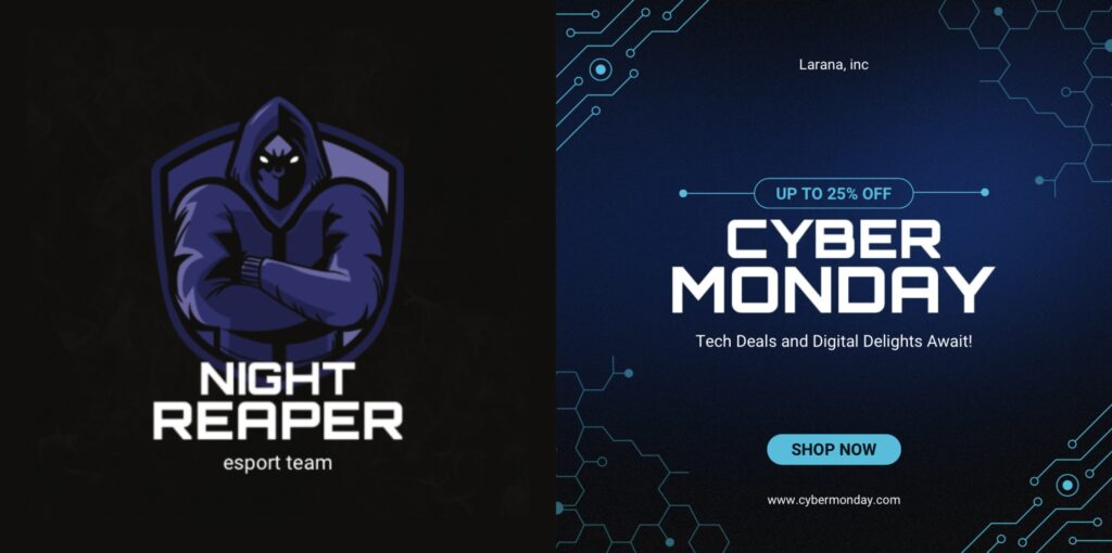
Precision meets human touch in Orbitron and Roboto’s typographic encounter. Both possess consistent x-height and spacing, leading to cohesion.
Angular, sharp, and rigid, Orbitron follows a mechanical, space-age aesthetic, echoing the algorithmic nature of AI, robotics, and cybernetic displays. Softened by the subtle curves and user-friendly letterforms of Roboto, the initial cold and calculated aesthetic brings out a gentle warmth.
This pair is best for projects anchored on technology and innovation, particularly in tech startups, UI/UX design, and eSports logos.
Vintage/Retro Font Pairings
a. Rockwell & Gill Sans

Typography is all about contrasts, and Rockwell and Gill Sans prove that opposites attract. Each has its distinctive style. Rockwell brings muscle to the pair, while Gill Sans is in charge of the charm.
Like a well-aged whiskey, Rockwell is strong and full of character – ideal for headlines. On the other hand, Gill Sans’s light and refined structure imbues a timeless sophistication, moderating each other’s strengths before the design becomes too rigid or too soft.
This serif and sans serif combination is an unexpectedly charismatic pair that brings out the best in projects, including but not limited to architecture branding, corporate settings, and editorial designs.
Romantic Font Pairings
a. Great Vibes & Merriweather
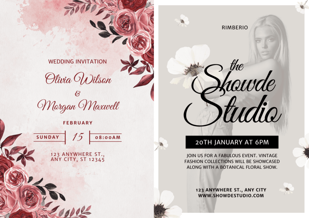
Some font pairings just whisper elegance – Great Vibes with Merriweather is one of those rare duos.
Delicate and romantic, Great Vibes dances with loops and swashes. However, it can become a chore to read in bigger blocks. An ideal secondary font will create a natural division of emphasis without losing the air of literary sophistication. Merriweather’s balanced serifs ensure that under the intricate headline, reading long-form content will remain a breeze.
For reliable wedding invitations, bespoke services, and fashion content, you can count on elegant font pairings like Great Vibes and Merriweather to add that much-needed flair without going overboard.
List of Interactive Font Pairing Generators (Free & Paid)
Font combinations are tricky – they either click or they don’t. Finding the perfect pair takes effort, brainpower, and much trial and error. If you’re unsure where to start, trust a font pairing generator to do the matchmaking for you. At the end of the day, no one will be able to beat the human eye for design, but you might want to use these tools as a starting point to nudge you in the right direction:
FontPair (fontpair.co) (FREE)
Beginner-friendly and direct to the point, FontPair lets you scan through a list of free Google Fonts combinations using a series of filters. Hit it up for some quick inspiration, and edit your choices in real time!
Pros:
- 100% free and user-friendly
- Simple and intuitive interface
Cons:
- No premium fonts (Google Fonts only)
- Limited customization
Fontjoy (FREE)
Using a deep learning model, Fontjoy suggests AI-generated font pairings based on your input. By clicking the “Generate” button, the system rolls out three curated fonts that go well together. A slider lets you control how similar or contrasting you want the fonts to be. Plus, you can lock one font in place to see how it compares to other options.
Pros:
- Interactive and adapts to your preferences
- Encourages you to experiment
Cons:
- Not professionally handpicked
- Licensing restrictions not available
Monotype Font Pairing Generator (PAID)
Monotype is a high-end, exclusive choice for those looking to transcend all possibilities of typography. With access to a thousand premium fonts, expert-approved pairings, and advanced filtering options for accurate font selections, Monotype is a worthwhile investment capable of delivering top-tier typography.
Pros:
- Handpicked by top designers
- Features premium fonts
- Advanced customization
Cons:
- Subscription-based only (licensing purchases required)
- Solid understanding of typography needed
Designs.ai Font Pairer (FREE with PREMIUM OPTIONS)
A great choice for non-designers, Designs.ai Font Pairer helps you lay the foundation for a cohesive and tailored brand identity. Beyond font matching, it’s integrated with other branding tools, such as color palettes and business logos, connecting your typography with a broader marketing strategy.
Pros:
- Smart AI font pairing
- Context-based style recommendations
Cons:
- Little control over specific tweaks
- Limited variety for free users
Google Fonts (FREE)
Google Fonts offers endless options and basic paired recommendations for creatives who have extra time on their hands to experiment with a huge font library. If you want fonts that perform well across the web and in print, it’s the go-to website for trusted and proven typography.
Pros:
- Largest open-source typography library (choose from over 1,500 fonts!)
- Optimized for quick load times
Cons:
- Lacks premium exclusivity
- Inconsistent weights and styles
How to Select the Right Font Pairings for Modern Designs?
Great font pairings captivate at first glance because they simply look right –but a second glance uncovers the deliberate choices that make them so compelling. More than an eye for aesthetics, knowing what fonts go well together requires a grasp of the fundamentals.
Below, we explore the process and share key strategies to help you select purposeful fonts that work together:
Step 1: Understand Your Brand Identity
Before you dive into the massive collections of online font libraries, consider your brand personality.
Is it playful, elegant, or something else?
Who is your target audience?
What emotions are you trying to stir?
Step 2: Identify the Role of Each Font
Now that you’ve assessed what direction you’re going for, it’s best to start with a three-tier font pairing system. The following have specific functions in building visual hierarchy:
- Headline Font
- Used for main titles, headlines are usually the first thing people see. Make sure to keep them impactful with a touch of your brand’s own personality.
- Subheading Font
- These are fonts less intense than the headline but distinct enough to stand out from body text. They usually act as a transition between the title and the content.
- Body Text
- This section should prioritize neutral and legible fonts that won’t leave readers straining their eyes to get through long blocks of text.
Step 3: Experiment with Contrast and Complementarity
Choosing a good combination doesn’t mean you have to stick on the safe side forever. Too similar fonts can make the design feel monotonous; an extreme contrast on one hand can disrupt your message and lead to chaos.
As a general rule, pairing varying font weights for the title and the body (e.g., bold vs. light, chunky displays vs. delicate scripts) renders a natural-looking hierarchy. One powerful tip is to gently guide the viewer’s eye to the next sections through a subtle increase or decrease in text size. Don’t be afraid to mix styles you’ve never tried before (e.g., serif vs. sans serif, modern vs. classic), as they can often create a pleasant, unexpected depth.
If time is an issue, font pairing generators will help you hasten the process.
Step 4: Prioritize Readability
Readability isn’t dependent on font size alone. Contrast, spacing, and context can make all the difference in many cases. For example, light gray text on a white background. can immediately put off readers before they even get a chance to engage with the content. If your design starts feeling busy, you can declutter it with a remove bg tool to eliminate competing elements.
For optimal readability, font size should be at least 14px for web formats and 10pt+ for print. On the other hand, a 1.4-1.6x line spacing is the ideal line height to start with.
Step 5: Test in Real-World Contexts
Now that you have your plan in the works, it’s time to test it out. Mockups and practice websites are a great way to see how your vision compares with reality.
The digital sphere is full of endless possibilities – try experimenting with different social media posts to see what clicks and what doesn’t. Most importantly, use other people’s feedback to improve on your mistakes.
Don’t be so quick to start over, though. Sometimes, all it takes is a minor tweak in spacing and font size to see a clear difference.
Frequently Asked Questions
- How do I select font pairings that match my brand’s identity?
Start with identifiers. What adjectives speak to your brand? Designer Maria Althoff suggests aligning font choices with your brand’s appeal. For example, artsy brands may opt for unique display fonts, while classic, traditional brands should go for serif fonts that exude credibility (e.g., The New York Times).
- How can I ensure my font pairing is readable and effective?
Not all fonts are created equal. What works beautifully in print might not be as effective for web-based platforms. Consider choosing fonts that are both visually appealing and legible. It’s best to have a test audience read them in different contexts for accurate feedback.
- What are the latest typography trends for 2024-2025?
Aside from embracing traditional aesthetics and putting a modern spin on them, designers also predict a growing rejection of minimalism in favor of expressive, experimental, and nostalgic styles. Multi-disciplinary founder Dina Benbrahim of Hello Departures notes the emergence of unconventional typefaces made to defy design norms for political purposes.
- Where can I find inspiration for font pairings?
Design blogs, Instagram, and Pinterest are all treasure troves of fresh, stylish, and niche-based font pairings! And if you need an extra push, you can always rely on font pairing generators to spark that “aha” moment for you.
- How can I test my font pairings in a real-world context?
Try applying your font combination ideas to various projects. These can be in the form of marketing materials, mock-ups of invites, event posters, and the like. Beyond the screen, you can create zines, hang signages under different lighting, or simply just sketch them out on paper to see how they interact outside the digital space.
Need a Bit More Info?
- Why does font pairing matter in design?
Good font pairing creates visual harmony, guides reader flow, and strengthens your message. When fonts clash, they distract. When paired well, they elevate the entire design and make content easier to digest. - How do I know if two fonts work well together?
Look for contrast with balance. Pair a bold headline font with a clean, readable body font. Opposites in weight or style often work best, as long as they don’t compete for attention. - What’s a classic example of a strong font pairing?
Try combining a serif like Playfair Display with a sans-serif like Montserrat. It’s a timeless combo: elegant headline meets modern simplicity—perfect for blogs, portfolios, or editorial content. - Can I pair two fonts from the same family?
Yes, using different weights or styles from the same type family creates a polished, cohesive look. It’s a safe choice when you want consistency without overcomplicating the design. - How many fonts should I use in one design?
Stick to two fonts—one for headings and one for body text. Occasionally, a third font can work for accents, but too many fonts can overwhelm the layout and confuse the reader. - Where can I find ready-made font pairings?
Google Fonts offers suggested pairings. Sites like Fontpair, Canva, and Typewolf also feature curated combos, often with previews, to help you visualize how fonts work together in real projects.
Discover Your Perfect Pairing
Great typography goes beyond what just looks good to the eye. If you can communicate something real, then you’re doing it right.
At the end of the day, graphic design trends including the choice of fonts are merely stepping stones – they provide clues for your design strategy, but they’re not the end-all, be-all of typography. Remember, perfect font pairings don’t exist – strong, intentional ones do. So, don’t chase trends or rely on a font pairing generator alone. By finding the right mix between following a convention of rules and trusting your gut, you’re going to be far more capable of creating typography that looks and feels just right.
Disclaimer: We do not own some of the images, videos, and content being shared on this page. Please note that some of the images, and videos we used have copyrights belonging to their original owners. No copyright infringement intended. If you originally owned the images, videos, and content we shared and distributed on our website, and do not wish to have your work published or distributed should make your wishes known to us. You can email us at hello@removal.ai. We will take your content down and never publish it on any of our pages.
Latest