Design Inspiration: What Colors Go Best With Yellow?
The yellow color is one of the most vibrant and eye-catching colors in the spectrum. Whether you’re aiming for subtle elegance or vibrant excitement, it can be the cornerstone of your color scheme. It can be paired beautifully with other colors depending on the mood or look you want to convey to your audience.
The Yellow Color
Yellow is a bright, warm color situated between green and orange on the visible spectrum. It’s commonly associated with sunlight, warmth, and energy. Produced in light by combining red and green light, yellow can be achieved in pigments through natural sources like ochre, saffron, and turmeric or synthetic compounds.
The name “yellow” originates from the Old English word geolu, which evolved from the Proto-Germanic gelwaz, meaning “to shine,” reflecting its vibrant and eye-catching nature.
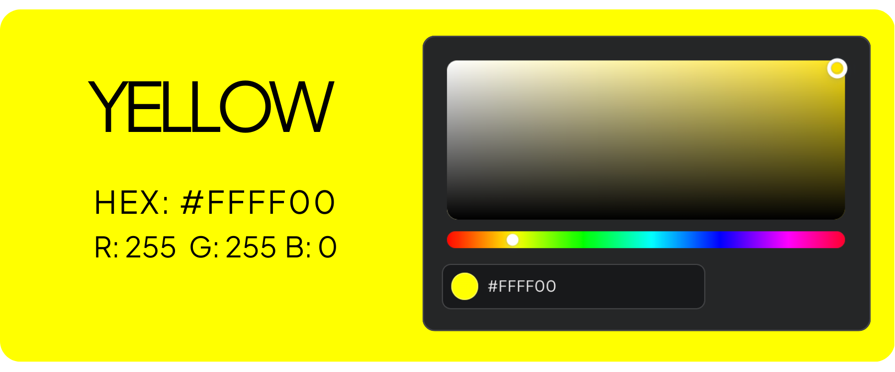
Properties of Yellow
- Hue: Positioned between green and orange on the color wheel.
- Brightness: One of the brightest hues, naturally eye-catching.
- Wavelength: Approximately 570–590 nanometers in the visible spectrum.
- Temperature: Considered a “warm” color, symbolizing warmth and energy.
- Symbolism: Often represents happiness, optimism, and caution.
- Psychological Effects: Stimulates mental activity, increases energy, and enhances mood.
- RGB Notation: (255, 255, 0)
- Hex Code: #FFFF00
Other Shades of Yellow
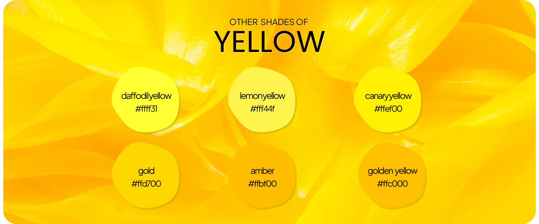
- Daffodil Yellow (#FFFF31): Produced by using pure yellow with a tiny hint of green for a bright floral tone.
- Lemon Yellow (#FFF44F): Produced by adding a touch of green to pure yellow, making it brighter and more vivid.
- Canary Yellow (#FFEF00): Produced by blending yellow with white for a soft, pale variation.
- Gold (#FFD700): Produced by combining yellow with a bit of orange and brown to give it a metallic, luxurious appearance.
- Amber (#FFBF00): Produced by adding a small amount of orange to yellow for a rich, bold look.
- Golden Yellow (#FFC000): Produced by adding a bit of red to pure yellow for a deeper, warmer hue.
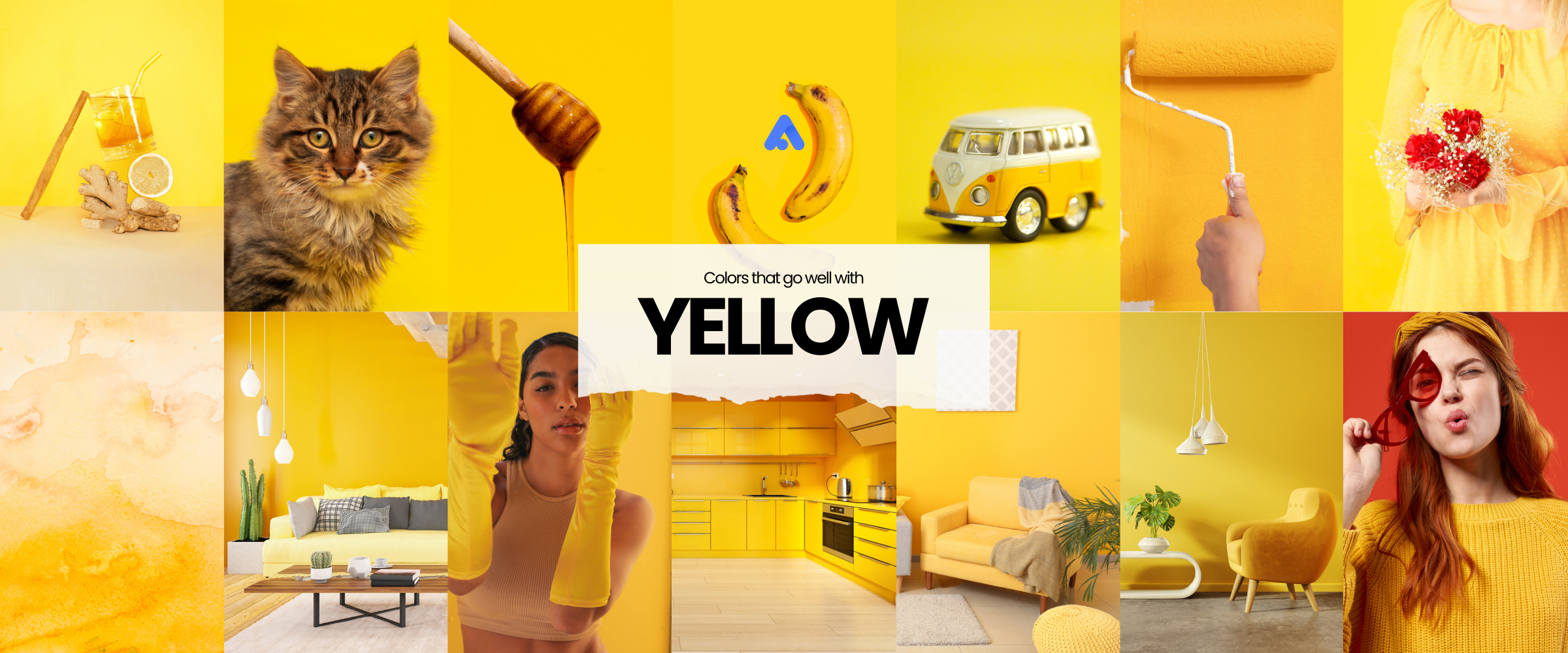
Colors That Go Well With Yellow
1. Green (natural, serene, and rejuvenating)
Green and yellow exist abundantly in nature. Using these colors together creates an organic, calming, and refreshing feeling.

Green and Yellow Color Palette Examples:
- #00322b, #6b5431, #d8ad0d
- #4c6d42, #bb8807, #d8ad0d
- #3c4913, #ba8909, #c5b563
- #25321a, #66773f, #f0c43a
- #3f5043, #83936e, #f2c739
2. Gray (modern, sophisticated, and balanced)
Gray tones down the brightness of yellow. This creates a stylish and professional feel in designs.

Gray and Yellow Color Palette Examples:
- 524e4a, #b8b2ae, #e6cb02
- 968e82, #e3d8c6, #cea324
- 544f54, #b6b0b1, #aa9a59
- 514d49, #d2b242, #ead97d
3. White (fresh, clean, and uplifting)
White enhances yellow’s cheerful vibe, and using a white background will result in a refreshing and airy atmosphere. This combination is ideal for minimalist designs.

White and Yellow Color Palette Examples:
- f3cd45, #ead583, #f4f5f5
- bb8712, #f8d224, #dededd
- 965f2e, #e1b15d, #e5d5c4
- fede63, #faf4ea, #231c15
- d08512, #efbd1f, #f4f1eb
- ecd552, #efdc71, #e0dec6
4. Black (bold, dramatic, and energetic)
Pairing black and yellow creates a high contrast. This can command attention and strike an impact on any design. This pair is often used to create a strong, authoritative presence.

Black and Yellow Color Palette Examples:
- 000000, #262421, #fbe23f
- 171216, #fcc646, #fed24c
- 1c1612, #5a5651, #fcd001
- 272424, #c99825, #fecb03
- 151514, #33312e, #ffcf03
- 171418, #484549, #ecc865
- 08080a, #7a631b, #fff37f
5. Blue (refreshing, calm, and trustworthy)
Blue and yellow are complementary colors that create a vibrant yet harmonious contrast. This combination evokes feelings of trust and dependability.

Blue and Yellow Color Palette Examples:
- 0c569b, #fbb82a, #eee4cd
- 052478, #f9b102, #fed101
- 1f4fb2, #deb01c, #f4e008
- 1e5488, #c76c0c,#ffffa4
- 055293, #fcbf02, #958e8b
6. Purple (luxurious, creative, and regal)
Purple and yellow are often used to convey creativity, luxury, and a sense of royalty. This combination can also evoke feelings of optimism (from yellow) and introspection or spirituality (from purple). Therefore used to create an emotional and engaging atmosphere.

Purple and Yellow Color Palette Examples:
- 3c0660, #31101f, #c6ad31
- efe2f5, #a4a8a5, #f0ce12
- 702c95, #9e61c9, #cc9f18
- 8246a9, #c9a7cd, #fadc4e
- 925dcc, #c6a127, #f0cb14
Check this out: List of sites where you can download free purple background images
7. Pink (playful, romantic, and energetic)

Pink and Yellow Color Palette Examples:
- e20eac, #fdde09
- fec4ce, #fcdf25
- f16f77, #e8998c, #fce193
- e362c0, #f2ef2e, #2549b3
- f8dadc, #f6d885, #fcecc6
- d750b3, #e2bf06
8. Red (bold, passionate, and lively)

Red and Yellow Color Palette Examples:
- f01317, #fbde3e, #f2f1f0
- d02911, #fad444, #ffffff
- e4292b, #f4af41, #fee44e
- ca321f, #ac5b1b, #eab030
9. Orange (vibrant, warm, and enthusiastic)

Orange and Yellow Color Palette Examples:
- fb8205, #feab01, #febe02
- fe7e0c, #fbc029, #fee383
- fc9610, #fdbf18, #feca71
- ec923a, #f4bb2a, #dfd2cb
- c3392e, #e38f36, #f4bb61
- b11819, #ec5805, #f6af0b
Application: How to Use Yellow Color Combinations Effectively?
Now that you have an idea of what colors go best with yellow, here are some examples of how to apply them in your work.
1. Yellow In Graphic Design

Evoke the desired emotions
- Release happy hormones. The yellow color is associated with warmth, sunshine, fun, and happiness. It is very welcoming and could influence better interaction with the audience. If the youth and the young at heart are your target market, you can start building your brand in this color.
- Stimulate appetite. If you are a company that sells food, you should consider using the yellow color because it can stimulate people’s appetite. This is very well-proven by food brands like McDonald’s, Fanta, and Burger King.
- Invite optimism and playfulness. Because the color yellow is a vibrant color, it stimulates It can give a sense of warmth and engage your audience. With its vibrancy, it creates a lasting impression on your audience. It makes you and your site memorable.
Consider your target audience
Since the color yellow is a vibrant and friendly color, it should appeal to younger demographics, family-oriented markets, and industries focused on entertainment, food, and lifestyle.
Be culturally and contextually sensitive in using it
Be aware of the cultural implications of yellow. While generally positive in many Western cultures, yellow can have different connotations in other regions. For example, in some cultures, it may be associated with caution or jealousy.
Avoid using very vibrant shades of yellow
If using yellow as a primary color, it can dominate the website’s background or major sections, creating a bright and cheerful atmosphere. However, be cautious with large expanses of yellow, as it can be overwhelming or strain the eyes if too bright. And if you want to use it as an accent color for buttons, icons, and highlights, you can draw attention to important elements like call-to-action buttons, links, or notifications without overpowering the design.
Using yellow as your background will make your other elements, like images and pictures, pop. A collage of pictures with a yellow background is quite engaging. Also, the background enhances your typography which makes it easier to read and understand. Just make sure that the color of your elements contrasts with that of your background.
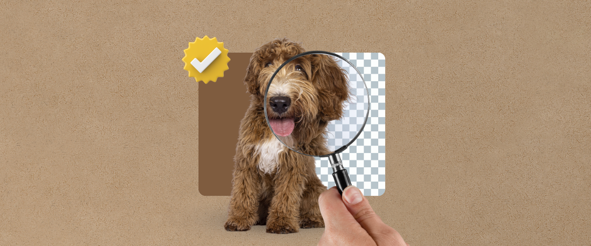
Enhance your photos with Removal.AI – Make yellow pop by removing distractions effortlessly!
2. Yellow In Home Design
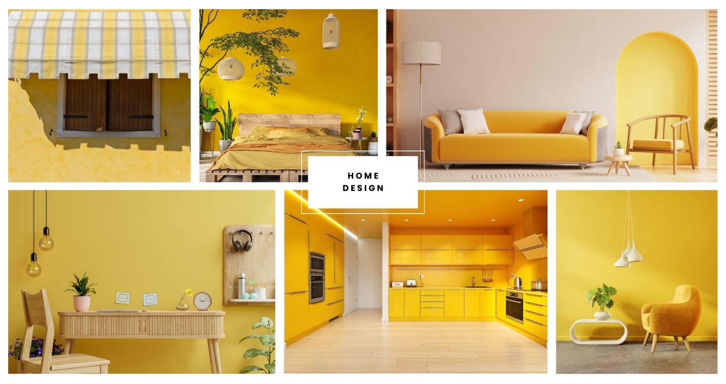
Consider the best areas at home to use it
- Kitchen and Dining Areas: Yellow can stimulate appetite and create a lively atmosphere, making it a popular choice for kitchens and dining areas.
- Workspaces: In offices or study areas, yellow can encourage creativity and mental activity. However, use it sparingly to avoid overstimulation.
- Bedrooms: Yellow in bedrooms can add warmth and positivity. Soft yellows create a cozy, spacious feel, bright yellows add energy but might disrupt sleep, and muted yellows promote relaxation with a lively touch.
Choose the right shades
- Soft Yellows: Lighter, pastel yellows can create a gentle and soothing environment. These shades work well in bedrooms or bathrooms where a calm and relaxing atmosphere is desired.
- Bright Yellows: Brighter yellows can add a vibrant and sunny feel to a space, but should be used thoughtfully to avoid overwhelming the senses. They are great for accent walls or focal points.
- Deep Yellows: Rich, mustard yellows can add a touch of sophistication and warmth, making them suitable for more formal spaces like dining rooms or offices.
Lighting Considerations
- Natural Light: Yellow can enhance the warmth and brightness of a room, especially when paired with natural light. It’s a great choice for rooms that receive a lot of sunlight, as it can amplify the light and create a cheerful atmosphere.
- Artificial Lighting: Be mindful of how artificial lighting interacts with yellow. Warm lighting can complement yellow tones, while cooler lighting may create a stark contrast.
3. Yellow in Product Photography
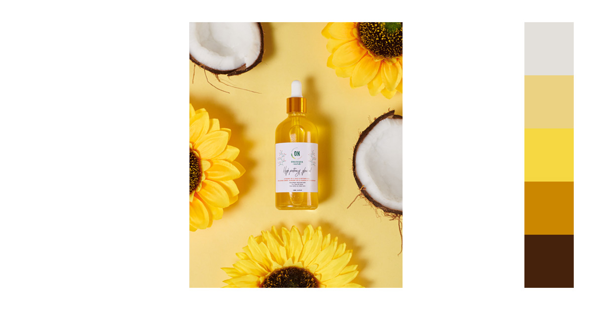
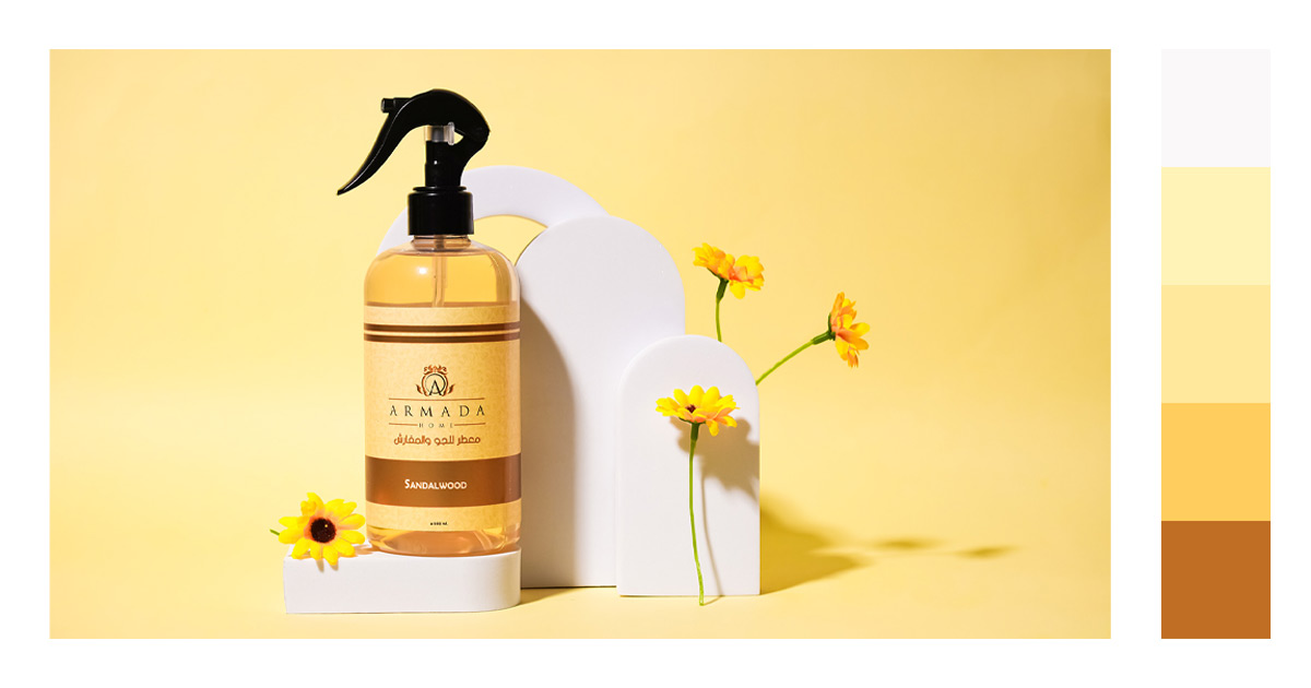
Subject Emphasis and Composition
- Focus and Highlight: Use yellow to draw attention to the subject or specific elements within the frame. This can be achieved through the subject’s clothing, accessories, or background elements.
- Contrast and Balance: Yellow can be effectively paired with contrasting colors like blue or purple to create a visually striking image. This contrast can help to isolate the subject and add depth to the photograph.
Lighting and Color Temperature
- Golden Hour: The natural yellow and golden hues during the “golden hour” (just after sunrise or before sunset) can enhance the warmth and mood of outdoor photographs. This lighting is often sought after for its flattering and warm effect.
- Artificial Lighting: In controlled settings, use yellow lighting to add warmth or highlight specific areas. This can be particularly effective in product photography to evoke a sense of freshness or warmth.
Editing and Post-Processing
- Enhancing or Toning Down Yellow: In post-processing, adjust the saturation and hue of yellow to either enhance its presence or tone it down, depending on the desired effect. This can help to achieve a cohesive look and feel in the photograph.
- Color Grading: Use color grading techniques to manipulate the yellow tones in an image, enhancing warmth or creating a specific mood or style.
The yellow color along with other colors enhances versatility in packaging design. For example, combining yellow with black creates a high-contrast look that’s both striking and legible, while yellow and green can evoke natural and eco-friendly connotations. So if you want to impress these emotions with your customers, create custom packaging designs and boxes with this color and bring them the best unboxing experience.
Expert Tips When Using the Color Yellow
General Design
What colors pair best with yellow in design?
Yellow pairs well with neutral colors like white, black, and gray, as well as contrasting colors like navy blue or purple. These combinations create balance and vibrancy.Is yellow suitable as a background color in digital design?
It depends on the tone and context; light yellow can be soft and pleasant, but bright yellow can be overwhelming. Yellow works well in moderation as an accent or background for minimalistic designs.What colors do not go well with yellow?
Bright colors like red, bright pink, or intense greens can clash with yellow, creating a visually overwhelming effect. Highly saturated tones or other warm shades (like certain oranges) can compete with yellow’s brightness, making the space feel too intense.What color balances out yellow?
Gray, beige, and cool blues balance out yellow, toning down its warmth for a more serene look. These colors help mellow yellow’s brightness, making it feel fresh and welcoming without overwhelming.What color complements yellow?
Purple is yellow’s complementary color on the color wheel, creating a striking contrast when paired. Additionally, deep blues and greens, like navy and teal, complement yellow beautifully for a balanced yet dynamic look.
Try Removal.AI for Free
Photography
How does yellow affect mood in photography?
Yellow brings warmth, happiness, and optimism to photos. It’s ideal for creating inviting and cheerful scenes, especially in lifestyle or outdoor photography.What colors contrast well with yellow in photos?
Deep blues, purples, and greens provide excellent contrast with yellow, making the color pop while adding depth and richness to photos.
Branding
What message does yellow convey in branding?
Yellow symbolizes energy, positivity, and friendliness, making it ideal for brands that want to appear approachable, optimistic, or creative.Which industries use yellow effectively in logos?
Yellow is popular in food, hospitality, children’s products, and retail branding because of its eye-catching and cheerful qualities.
Interior Design
Is yellow a good choice for home interiors?
Yes, but it should be used strategically. Soft yellows work well in living rooms and kitchens for a warm feel, while bolder yellows are best for accent walls.Which colors complement yellow in home decor?
Gray, white, soft blue, and earthy tones like tan or sage green complement yellow beautifully, creating a balanced and inviting interior.What colors go best with yellow furniture?
Yellow furniture pairs beautifully with gray, white, and navy for a sophisticated look. Soft blues, muted greens, and earthy tones like tan or brown can create a harmonious and cozy environment.What colors go best with yellow walls?
For yellow walls, neutral colors like white, light gray, and beige create an airy, balanced space. For a pop of color, soft blues, sage green, or even a muted coral or blush can add interest without clashing with the yellow.
Fashion
How can I style yellow clothing?
Yellow pairs well with denim, neutrals (white, gray), or darker shades like navy or black. Yellow accessories can also add a pop of color to a neutral outfit.What skin tones does yellow suit best?
Bright yellow suits warm skin tones, while pastel or mustard yellow is often more flattering for cooler or neutral skin tones.What colors go best with yellow clothing?
Neutral colors like white, gray, beige, and black pair well with yellow clothing, creating a balanced look. For a bold contrast, try navy blue, deep green, or even purple. Denim is also a classic choice that complements yellow nicely.
Personal and Daily Use
Does wearing yellow improve mood or energy?
Yes, yellow is known to uplift mood and boost energy. Wearing it, especially in the morning, can create a positive and vibrant start to the day.How can I use yellow in my workspace for productivity?
Add small yellow accents like sticky notes, desk organizers, or a yellow mug. Yellow stimulates focus and creativity, making it a great color for a productive atmosphere.What colors pair well with yellow for a calm, personal space?
For a calm space, pair yellow with muted tones like beige, white, soft gray, or pastel blue. This combination maintains a lively feel without being too energizing.How does yellow affect engagement on social media?
Yellow evokes positivity and optimism, which can increase engagement. People are naturally drawn to bright, happy colors, making yellow ideal for captions, highlights, or announcements. Leverage yellow’s attention-grabbing power in your posts with these Creative Instagram Story Ideas!
Explore More Yellow Color Combinations!
Yellow is a fun color. Its sense of enthusiasm is amazing.
Take the time to go beyond your comfort zone and explore various color combinations along with the latest graphic design trends. You’ll be surprised at what you may come up with.
Ready to elevate your visuals? Try Removal.AI’s quick background removal for standout colors!
You might want to read more from this series:
Disclaimer: We do not own some of the images, videos, and content being shared on this page. No copyright infringement intended. If you originally own the images, videos, and content we shared and distributed on our website, and do not wish to have your work published or distributed should make your wishes known to us. You can email us at hello@removal.ai. We will take your content down and never publish it on any of our pages.
Latest