10 Perfect Background Colors for Product Photography
What appeals to customers are not just the business products alone, but the pleasing, overall visual presentation that catches their attention.
It only takes three seconds for a customer to decide whether they will spend their time to check out your product. This short amount of time will determine if your product is worth a second look or will it belong to the never-ending list of skipped advertisements and unnoticed promotions. Therefore, photographers and designers should be able to capitalize and ensure that their product photographs will attract customers and turn that opportunity into a guaranteed sale.
 Image Source: www.anthropologie.com
Appealing photos that affect customer purchasing decisions do not just end by taking high-quality product images. Other elements and most especially the right background to use for product photography and design should be taken into account. It is not always about focusing on the product that creates a positive and lasting impact, but it’s what builds the whole that makes all the difference.
Background Ideas for Your Product Photos
The background you use for product photography will determine the feel and the message you want to convey to your customers. Choosing the best one will not only let your customer efficiently evaluate your products, but it will also help you build your brand identity and make your product stand out among competitors. Here are perfect background color and ideas you can choose to represent your brand:
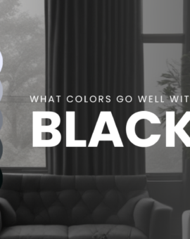
1. Black backgrounds
The color black as the background is typically used by luxury products such as jewelry, cosmetics, and electronics. Not only has it always attracted attention at first glance because it has the darkest shades among colors, but it also highlights the product making every detail highly visible. Depending on the product as the subject, a black background can imply mystery and style.
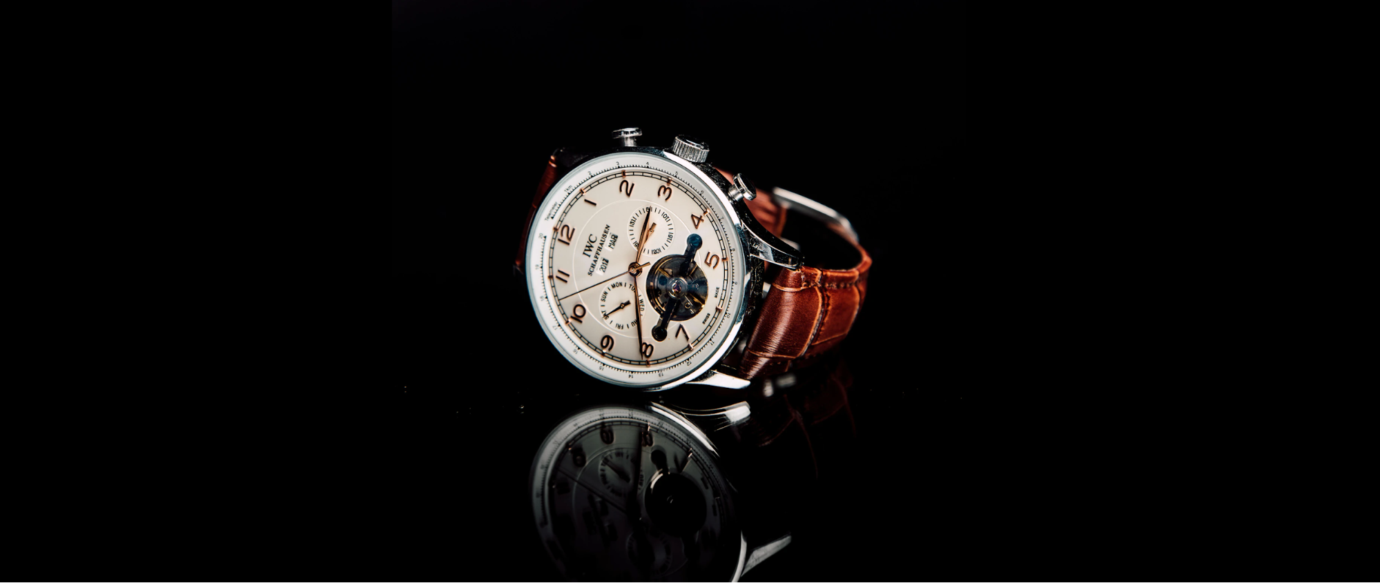
The black background also provides a dramatic effect and possesses a classy and sophisticated appearance. There is something extraordinary about it that allows the products to shine. It also creates shadows and reflection that makes the product presentable and more striking.
2. Bokeh
Bokeh is a Japanese word that literally means “blur.” It is basically the out-of-focus parts of the image that was captured by the fast camera lens. This aesthetic quality directs our focus of attention to a particular area of an image or product that makes it visually appealing. It is an often used technique to create a unique background for product photography.
The Bokeh effect is commonly achieved with the use of the lights in the background; and by just simply highlighting an aspect of a product shot. Whether using it, either way, Bokeh contributes to producing a great product visual that is pleasing and will certainly catch the customer’s eyes and attention.
3. Contextual backgrounds
What can satisfy the human eye will follow to satisfy their desire to buy the product they can already visualize having one of their own. Contextual backgrounds are best suitable to use for apparel and accessory products. By using this method, customers can envision being the person experiencing the same situation or using the same product that was featured.
Contextual backgrounds widen shoppers’ imagination towards a product that will eventually lead them to satisfy their curiosity. So in selecting the contextual background to use, choose the one that can improve human experiences or help address real-life problems. In this way, it will highlight the usefulness of your product and also its other hidden potentials.
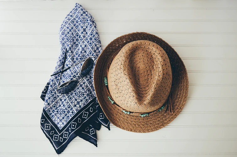
4. Patterns
The use of patterned background is practiced usually in presenting multiple products from an online site that wants to achieve a consistent product appearance. Others even turned their own logo into a patterned background to further strengthen their brand identity. While creating a certain product vibe, a neat and elegant website is maintained.

The patterned background also offers an added flair to your product photography and provides an extra depth and dimension. Do not let your creativity suffer because background removal will already simplify the initial step. Just be cautious not to distract customers by using confusing background patterned as it will not be beneficial in creating a good first impression.
5. Neutrals
If you find the color white too plain for a background, but want to add that little versatility and not too overpowering components to your photos, then a neutral color as the background to highlight your product is the wisest choice. Neutral colors provide a steady and modern style while allowing you to play with the other available elements. It just works for any style and will also for the specific branding you might want to achieve.
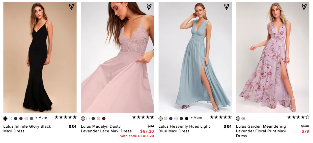
Image Source: www.lulus.com
Though others find it a bit boring, a little creativity can pop up your product with a brighter color to become the focal point in a neutral background. Neutral colors are also the safest choice to use in almost every scenario. It has a welcoming effect and registers a positive influence on viewers.
6. Solid colors
You can never go wrong in choosing solid colors as your product photography background. Solid colors have an attention-grabbing, bold, and attractive attack towards the human eye. You will never be out of color to use and experiment with because it has a wide variety of light, dark and mixed hues you can choose from. The use of some shadow effects and some design twist can totally complement designing every product placement.
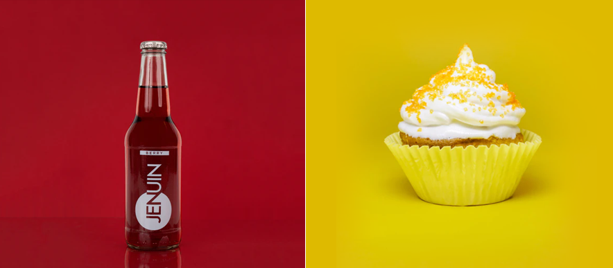
Solid background colors bring life and playfulness to the product, and the use of a two-toned solid color background adds a little dimension to the shots. Solid colors are also used to represent the business brand identity, and through it, the business can gain a good and well-known reputation. It is powerful to use for every idea, and so its potentials to bring positive outcomes are limitless for every business.
7. Textures
Textures used as background delivers the natural look and realism effect to the product photography. The visual quality of smoothness or roughness helps emphasize a specific area to draw customers’ attention to the photo’s most prevailing part. Texture offers excitement to viewers while maintaining a basic and well-organized appearance.
Image Source: www.jared.com
Texture background also indicates vastness, and its broadness allows designers to create variability of looks with their own unique features. Ideas to use as texture background are everywhere, and that even surrounding can be taken as inspiration. Just keep in mind that in using a texture background for presenting your business product, you should develop a presence that can surely call customer attention and engagement in an instance.
8. Tiles
If we talk about resourcefulness in designing, we can’t help but take advantage of the available resources around us. Oftentimes even normal individuals used tiles as a great background to improve the overall appearance of their photos. The same goes for choosing a reliable background color or ideas for product photography. Tiles provide a great deal of creativity that can help attain several great effects.
Tiles also have a long-range of color, dimensions, and distinctive patterns that allow designers to offer an incomparable look that the customers can appreciate. Frequently, products are positioned in the center or a certain area of the tile, and with some additional elements to highlight the product, an exceptional visual experience will be created.
9. Wooden backgrounds
Woods, even in the field of design, has a lot to offer. Wooden Backgrounds invokes rustic and earthiness vibes. It showcases a realistic effect in coordination with the contextual elements. Since it already possesses a realistic view, you can just easily incorporate the product to complete a natural look as a whole and take that perfect shot.
The idle old plank tree, your favorite chair, the table where you eat, and even the floors where you stand all contain the needed touch of woods. Woods are just everywhere, so you can never run out of a venue to achieve that great visual aesthetic. So make full use of the wooden background because it’s definitely worth the try.
10. White
In simplicity, there is so much beauty. The above list of options might beg to differ because they also have so much to offer, but White still tops the list of being the perfect background for every product photo.
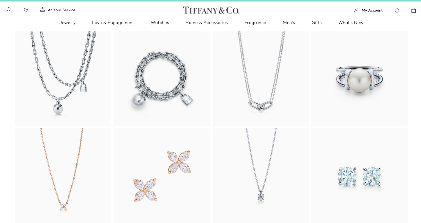
Image Source: www.tiffany.com
The color white can really bring out the best in every image. This plainness continues to promote consistency and offers a clean look. White color as a background has a low impact on the image enabling the product to stand out. It never goes out of trend and always timeless.
White is invoking supremacy, yet it is never hard to achieve. There are a lot of free background remover tools that can help you in this case.
Psychological Impact of Color on Consumers
Did you know that color has a psychological impact on consumer behavior?
Color affects almost every aspect of human life. People react to certain colors because of past experiences and the culture they live in. Color influences emotions, the way people perform, and most especially our day-to-day decisions, including our purchasing behavior. Studies of different individuals and companies showed that focusing on color psychology greatly helps in establishing business branding.
Color Meanings
So as a designer, it’s important to know how people behave towards a particular color. And this will eventually lead you to know how this can help in positively influencing their purchasing decisions. Below are the lists of colors with their corresponding meanings and real-life influence to help you evaluate each of their psychological impact on consumers.
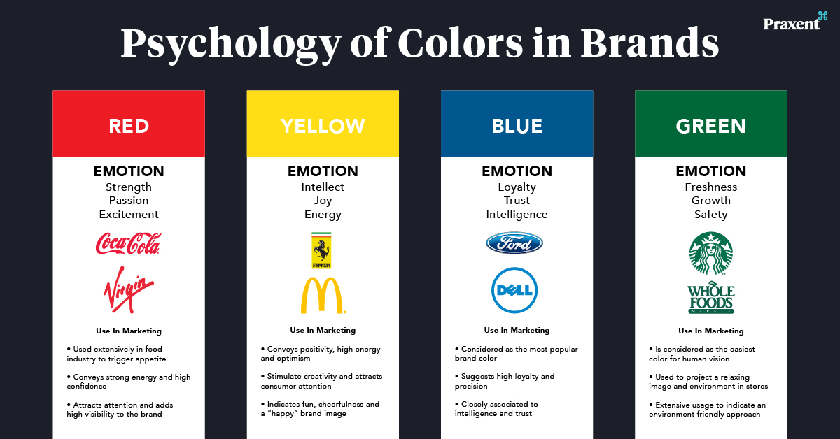
Image Source: www.praxent.com
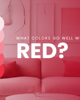
Warm Colors
Red: It is directly linked to love, passion, and power that evoke the strongest emotions, among other colors. The color red stimulates excitement and aggression as well as danger and warning. In competition, competitors prefer to don the color red because of its dominance and are believed to affect winning chances.
Orange: This color is often used in the advertisement to draw attention because of its uplifting vibe. People see it as a bright and happy color. It exhibits energy and warmth and an enthusiastic feeling.
Yellow: When we think about sunshine, we relate it to the color yellow. Yellow is a bright and cheerful color that is associated with hope. It offers complexity, and that’s why it can be interpreted differently.
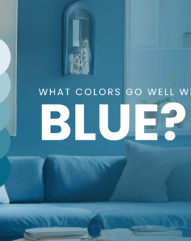
Cool Colors
Blue: The world’s most favorite color is Blue. Everyone loves it. Blue represents calmness and serenity. It provides a feeling of stability and dependability. Offices used this color because it also calls for productivity. Blue is sometimes described as manly, and so it’s the most preferred color by men.
Green: Nature is the best representation of the color green. Green symbolizes new beginnings, growth, and prosperity. It helps in concentration and is said to help improve reading ability. Green is natural and delivers a refreshing atmosphere.
Purple: The color purple has a rich history concerning wealth and royalty. Purple is a rarely used color, so people see it as mysterious and intriguing. People either hate or love it, but others find it comforting and full of wisdom.
Neutrals
Black: This color is the absorption of all colors. Black evokes positive and negative effects depending on human preference and experiences. On a positive note, it represents elegance and fanciness. While on the negative side, it’s a symbol of death and everything connected to evil and negativity.
White: Raising a white flag calls for peace. White, among other colors, brings quietness and concentration. It is also a sign of purity and cleanliness. Designers often use this to create a spacious effect.
Gray: This is commonly used to create a formal and sophisticated appearance. It is a practical color and the most flexible among neutral colors. It can also use to achieve a modern and traditional style.
Brown: Along with the color green, brown also represents the earthy look. It is solid and evokes resilience and strength. The color brown also has the vibe of loneliness, but it is described as a conventional color that brings warmth and comfort.
Human color preference in purchasing a product can be interrelated to the appearance they’re trying to portray. It is closely directed on how we want people to see us or how we want to connect to the world. Color psychology clearly shows that color has the biggest influence on consumers’ purchasing decisions and along with this are the other factors that should be taken into consideration. People’s preferences also differ because of their age and gender and also the price of the product.
In Summary…
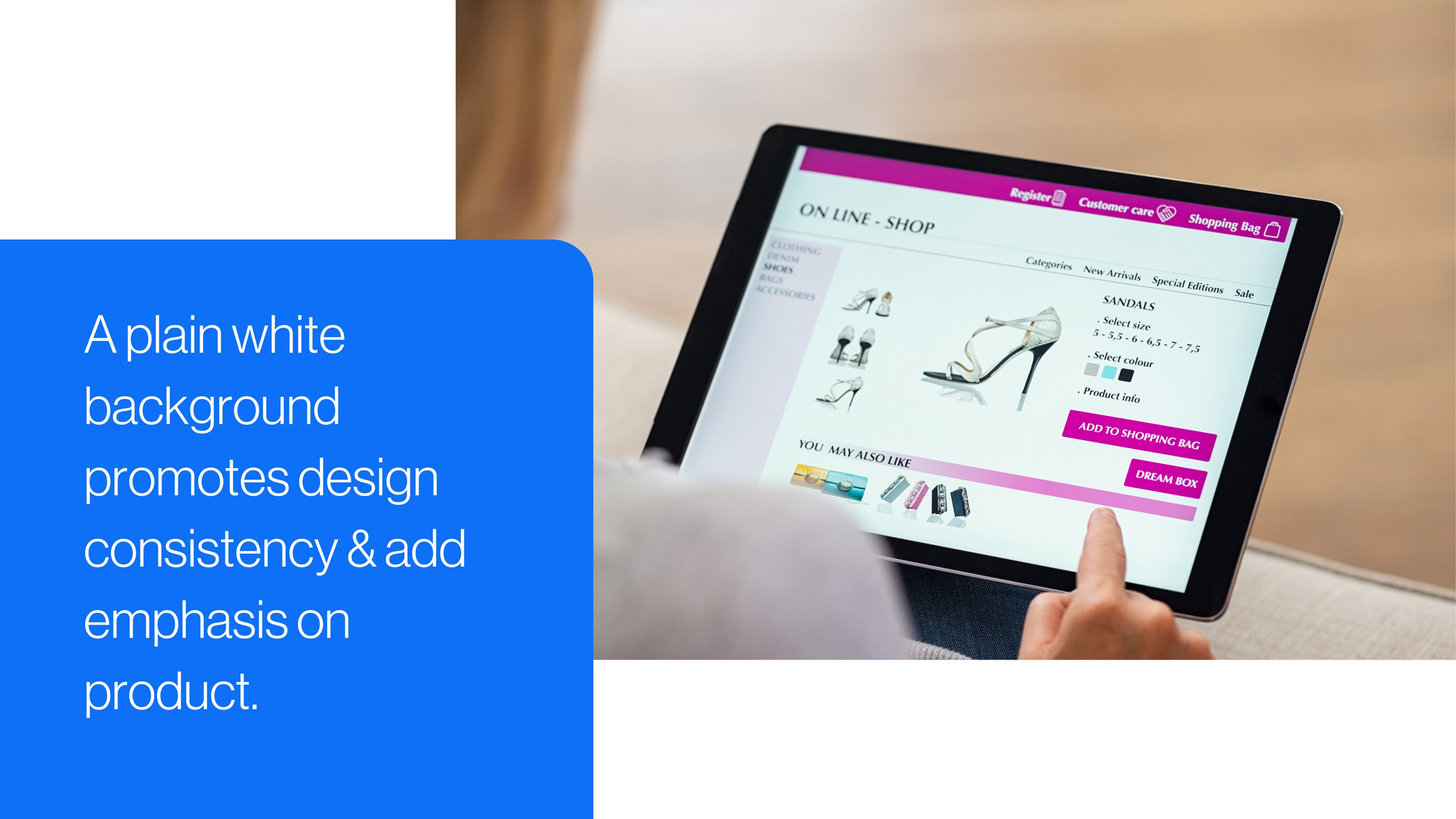
From the many options to choose from, choosing the best background to use can really be confusing and quite challenging. Each one of them offers a unique and different style to capture customer’s attention. So if you haven’t made your mind on what best suits your product, the white background color is highly recommended.
The use of white backgrounds brings flexibility to your design and the needed genuine appeal. It is also cost-effective and requires minimum data to be used in uploading and loading the product site. And even well-known marketplace also requires and prefers to use a plain white background in their product listing since it’s easy to manage and edit-friendly.
You’re Turn…
Practice placing your images in different backgrounds to see which one fits well with your brand. Remove the current background first of your image to create a transparent background. Although, this might be a challenging task especially for those who do not know how to use Photoshop.
That is why there are already available tools online to help ease this process, and Removal AI is just one of the many solutions that aim to help designers efficiently achieved it. Removal.Ai is effective for every type of product if you want a minimalist look. So better try it because it is easy and quick to use.